Graphs and Video Game Matchmaking

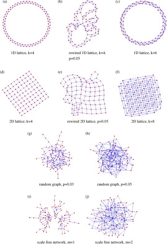
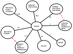
Have you ever had one guy throwing your match in that MOBA (multiplayer online battle arena) game, FPS (first person shooter), or other game? A lot of the time I certainly had this occur, and its not fun. Sometimes, when matched up with teammates of similar skill as well as opponents of similar skill, these result in the best possible matches you can have as things get super close. Zhenxing Chen, a researcher at Northeastern University, has created a matchmaking algorithm that uses familiar items we have learned in class.

The algorithm begins by taking all other players in the que and puts them into a complete graph. Each edge has what is called a “churn” rating. Essentially, this is measured by how much time has elapsed since the last matchmaking decision was made and the time elapsed before the player chose to play the game again. Players are matched by attempting to pair the minimum sum of edges.

This model focuses on maximizing player engagement, rather than on player skill like other matchmaking systems including the “Bradley-Terry” model or the “elo” model. While this may cause some more imbalance in terms of player skill for matchmaking, this model will result in more player engagement, and therefore more player retention.

A phrase commonly used in MOBAs for someone who really wants to play mid

But how do we measure player engagement correctly? Some factors that we can say for sure are both time spent playing and/or money spent playing the game. Additionally, as discussed above, time between sessions can also be a good factor. If a player had a very poor matchmaking experience, this makes it more likely that they will want to quit the game or take a long break from it. However, good matchmaking experiences will make players want to play more, therefore resulting in a shorter time period between matchmaking processes.

There where a few very interesting finds when experimenting with this algorithm. For the scenario of a players total wins plus the total amount of losses is greater than two times the amount of draws, then our engagement matchmaking algorithm is approximately equal to the skill based models discussed previously. However, if it is less than rather than greater than, then skill based matchmaking ends up being the worst form of matchmaking.

When testing out the engagement matchmaking algorithm, it was tested with a random sample of players between 100 to 500 in size. The matchmaking systems used were worst matchmaking, skill based matchmaking, random matchmaking, and our engagement matchmaking. The engagement matchmaking managed to have slightly higher player retention than all the other forms of matchmaking.

It is very cool to see how graphs can be used for video game matchmaking like this, especially when it is within your favorite hobby. Graphs can be very useful in the most unexpected ways!

Source: https://arxiv.org/pdf/1702.06820.pdf

Shortest Path for Road Networks using Dijkstra’s Algorithm

Road networks are essential for transportation in many states, cities, towns, and villages. People travel on roads everyday in order to get to work, to school, to business meetings, to transport their goods, etc. A big problem in road networks is finding shortest paths between various locations. A motivating example of why we want to find shortest paths between various locations in road networks is google maps. Ever tried using google maps to get the fastest direction from your house to school? Google maps tries to find the shortest path that gets you there the fastest.

Shortest path problems are inevitable in road network applications such as city emergency handling and drive guide handling. I am going to look at how to tackle these problems, using graph theory which we learned in lecture to give a representation of the network and an efficient algorithm for finding shortest path from every node to every other node.

A way to tackle these shortest path problems in road networks is to use Dijkstra’s shortest path algorithm. Dijkstra’s Algorithm is a graph search algorithm that solves the single-source shortest path problem for a graph with non negative edge weight, producing a shortest path tree. For example, suppose the vertices of the graph are cities, the edges are direct roads, and the edge weights are driving distances between pairs of cities. Dijkstra’s algorithm can be used to find the shortest route between one city and all other cities.

The search space of Dijkstra's algorithm on a road network, for a given source and target.
The search space of Dijkstra’s algorithm on a road network, for a given source and target.

Dijkstra’s algorithm works as follows.

Step 1: Start at the ending vertex by marking it with a distance of 0, because it’s 0 units from the end. Call this vertex your current vertex, and put a circle around it indicating as such.

Step 2: Identify all of the vertices that are connected to the current vertex with an edge. Calculate their distance to the end by adding the weight of the edge to the mark on the current vertex. Mark each of the vertices with their corresponding distance, but only change a vertex’s mark if it’s less than a previous mark. Each time you mark the starting vertex with a mark, keep track of the path that resulted in that mark.

Step 3: Label the current vertex as visited by putting an X over it. Once a vertex is visited, we won’t look at it again.

Step 4: Of the vertices you just marked, find the one with the smallest mark, and make it your current vertex. Now, you can start again from step 2.

Step 5: Once you’ve labeled the beginning vertex as visited – stop. The distance of the shortest path is the mark of the starting vertex, and the shortest path is the path that resulted in that mark.

Dijkstra's algorithm in stages
Dijkstra’s algorithm in stages. Highlighted green part is the nodes included at each step and the highlighted red edges are the shortest edges included in the algorithm for the tree.

Dijkstra’s algorithm provides us with a very efficient way to find shortest path. This algorithm is a very useful practical algorithm for finding shortest paths in road networks. Using graph theory, we can represent these road networks as vertices and edges, with edge weights, which gives us a representation of the networks in which we can use dijkstra’s algorithm to find the shortest path from a vertex to every other vertex.

References

https://zenodo.org/record/3375123#.Xa_N-ChKg2w

https://www.researchgate.net/figure/The-search-space-of-Dijkstras-algorithm-on-a-road-network-for-a-given-source-and_fig2_262319862

https://study.com/academy/lesson/dijkstra-s-algorithm-definition-applications-examples.html

The Use of Networks to Analyze Disease Spread

As we have learned in class we can represent data in the form of networks which we can use to better understand systems. One such useful application of networks is in the analysis of how disease spreads among the population. One study from 2005 called “The Impacts of Network Topology on Disease Spread” uses various random networks to do just that.

In the study it randomly generated four different types of networks of 500 nodes with similar amount of edges, but randomly assigned. The following types of networks were exactly like the ones we learned in class:

(i) – The Erdős–Rényi model (1960) which we learned in class as Gnp. As we know these random networks have low clustering coefficients and a binomial degree distribution.

(ii) – Regular lattices where each node is connect to k nearest neighbours to form either a grid of an array. These networks has a high clustering coefficient, but relatively high average path length since nodes only connect to their nearest neighbours.

(iii) – Rewired lattices (Watts-Strogatz 1998) where we start with a low-dimensional lattice (grid or array) and rewire to introduce randomness (“shortcuts”). By rewiring this introduces more clustering and short paths, thus lowering the average path length.

(iv) – Scale-free networks that have a power-law tail in their degree distribution. These networks have small average path lengths and low clustering.

The types of networks randomly generated in the simulation.

The following are the properties of the various networks randomly generated with a set amount of vertices (nodes) and similar amount of edges. It is interesting to note that the average path length.

Network type n (vertices) M (edges) K (degree) C (clustering) D (length) S (significance)
Random graph (RG) 500 1905 (33.9) 7.62 (2.71) 0.02 (0.00) 5.67 (2.19) 4.47 (0.25)
Scale-free network (SF) 500 1990 7.96 (8.18) 0.07 (0.00) 2.93 (0.02) 5.60 (0.04)
1D lattice (1D) 500 2000 8.00 0.64 31.69 1.39
2D lattice (2D) 500 1865 7.46 0.23 8.00 1.84
Rewired 1D lattice (1DR) 500 2000 8.00 (0.35) 0.62 (0.00) 8.19 (0.45) 1.59 (0.02)
Rewired 2D lattice (2DR) 500 1865 7.46 (0.33) 0.21 (0.00) 4.95 (0.05) 1.96 (0.01)

The nodes in these networks representing susceptible individuals to diseases and the edges representing a potential method of transmission for the disease. An infected node has a certain probability to infect all its neignbours after each time step. After a node infects another node, there is a time delay until that node becomes capable of infecting other nodes. Even after that, there is a time latency until an infected node becomes immune to the disease, thus non-infectious. Initially one node is infected in a network and the researchers analyzed how the disease spread through the network. They ran many simulations with varying infection probability on all of the types of graphs found that network types had an impact on how fast the epidemic spread. From fastest to slowest rate of infection:

  1. Scale-free network
  2. The Erdős–Rényi model (1960) (Gnp )
  3. Rewired 2D lattice
  4. 2D lattice
  5. Rewired 1D lattice
  6. 1D lattice
Visual graph showing how the epidemic spread for different networks. Probability of infection = 0.1, latent period = 2 time steps, infectious period = 10 time steps.

It is interesting to note that scale-free networks resulted in the largest epidemics for any level of infection. It reached the maximum epidemic size of 500 sooner than the other networks for any probability of infection. 1D lattices never reached the max epidemic size and grew linearly.

The averaged results from 10 simulated epidemics for each network.

It is important to ask why is it that epidemics spread quickly in scale-free networks but spread poorly in 1D lattice networks. The high average path length in 1D lattices and low average path length in scale-free networks helps explain that. In 1D lattices the high average path lengths prevents the infectious nodes from spreading the infection to distant clusters. The infection only grows outwards from the inital cluster. In scale-free networks, the low average path lengths enable infectious nodes to infect far away clusters which help quicken the spread of the infection. It now becomes clear why the rewired 2D lattice and rewired 1D lattice spread infections better than their non-rewired counterpart. The rewiring introduces more shortcut paths which lower the average path length which helps spread the infection faster.

Although the these were simulations on randomly generated networks, they show how understanding networks, random networks in this case, can help us understand real life problems.

References:

Shirley, Mark D.f., and Steve P. Rushton. “The Impacts of Network Topology on Disease Spread.” Ecological Complexity, vol. 2, no. 3, 2005, pp. 287–299., doi:10.1016/j.ecocom.2005.04.005.

Homophily and Dating – Why your new partner might be similar to your ex(es)

A majority of the young adults that fall within the age ranges of 18 and 30 in this day and age are all jumping on the same wagon of folks that are looking to get into a relationship or should I say relationships (make note of the plural). With the plethora of dating apps available to the masses, people are quick to start a relationship with someone they think is a compatible match for them. These people are also quick to end it if they no longer think it’s going to work out due to “compatibility issues” that are realized a few weeks/months/years into the relationship. It is for this reason you might observe that in your own relationships (or the relationships of your friends), you tend to date people that are similar to you, which could also be the answer as to why your current partner may be similar to your ex(es). We will take a look at an article by Nicola Davis that tries to figure out the reason as to why new partners are often like exes and see homophily’s prevalence in dating.

In the article “Just my type: why new partners are often like exes,” Davis talks about how research has been done by psychologists that confirm people date others that have a personality similar to their own. This may seem like an obvious point, but it also provides some reasoning as to why an individual’s “former and new partner tend to be alike in character.” It is from the results of their study that they can not only predict who will get together with who, but also the chance of a relationship succeeding. From this, we can see how apparent homophily is when it comes to choosing a partner – people want someone that is ” interested in the same things and have the same attitudes to life ” as them. However, when the relationship fails with one partner, people might end up choosing another one that has characteristics similar to the ex. In this cycle of break-ups and hook-ups, people will always end up choosing some individual that is similar to every single one they’ve chosen before. It then follows that there is a potential that friends similar to you in personality/character got into a relationship with one of your exes, or maybe even one of your potential partners.

Finding a partner that is truly compatible with you is often a laborious task. Individuals often think their next partner will be better and different from the last when in reality, they’re most likely to be similar in some way, shape, or form. After all, birds of a feather DO flock together whether you expect it or not. This then begs the question of whether or not one should date someone that is similar to them in character. At the end of the day, if you want a relationship (whether it’s romantic or platonic) to last, it would be better if you and your partner have the same interests/attitudes on life, or else you’ll end up with incessant arguments and a broken heart.

LINKS –

https://www.theguardian.com/science/2019/jun/10/just-my-type-why-new-partners-are-often-like-exes

Where’s the world busiest airport?

As online shopping becomes a trend, there is more and more businesses rely on cargo transportation. Air cargo plays an important role in providing fast and high quality services in international transportation, so it makes me wonder which airport is the world’s busiest airport.

A social network could be used to represent the air transportation system. Each node in the network refers to an airport, and each edge refers to a direct flight between 2 airports. Degree centrality and betweenness centrality are taken into the calculation in finding the world busiest airport. When degree centrality is being calculated, the number of nodes connected to each node is measured. The greater the amount of neighbor nodes which directly connect to the object, the greater value of degree centrality the object would have. A higher degree centrality of a node means that the airport which the node represents has more operation flights with other airports. Betweenness of airport A measures the number of shortest paths from all airports to all other airports in the network that pass through the airport A. In other word, betweeness indicates how important an airport is as a intermediate broker in the network. A hub airport is usually evolved from an airport with high betweeness centrality.

In order to analyze the airport transport network, a research team combined data from Star Alliance, Oneworld, and Sky Team and built a massive network of 1060 airports and 5580 routes in 173 countries.

The Airport Transport Network

The degree centrality is calculated by the same research team. I would like to share the top 20 airports which has the greatest degree centrality in the world here.

The top 20 airports with the highest degree centrality

As we can see here, Istanbul Airport in Turkey has the highest degree centrality, followed by the Beijing Capital International Airport in China and Chicago O’Hare International Airport in the United States. According to the data shared by the same research team, Istanbul Airport in Turkey had 33.55 times more connectivity than the average 7.78 degree centrality in the world. Beijing Capital International Airport and Chicago O’Hare International Airport have 27.7 higher connectivity than the average.

Betweenness centrality has been calculated by the research team as well. I will select the top 20 airports in the world which has the highest betweenness centrality to share it here in comparision with the top 20 airports with the highest degree centrality.

The top 20 airports with the highest betweenness centrality

The top 3 airports with the highest betweeness centrality is the same as the top 3 airports in the degree centrality ranking. The correlation between degree centrality and betweness centrality makes sense in this context. The average betweenness degree is 6019.90 among 1060 airports in the world. The betweenness degree of Istanbul Airport is 19.61 times higher than the average, followed by the Beijing Airport which is 19.61 times higher.

In addition, the study also found that United States and China had the largest share in the global network. The sum of the degree centrality and the sum of the betweenness centrality both acount for roughly half of the entire network. In developing countries, there is more and more airports are under construction due to the growth of the demand in global business. The airport transportation network might look different in 10 or 20 years from now and some of the airports with high betweenness might become the new centralized hub globally. As it is now, based on the current betweenness and degree centrality, the busiest airport in the world is Istanbul Airport in Turkey.

References

Song, M. G., & Yeo, G. T. (2017). Analysis of the Air Transport Network Characteristics of Major Airports. The Asian Journal of Shipping and Logistics, 33(3), 117-125. doi:10.1016/j.ajsl.2017.09.002

Effects of Creating, Merging, and Closing of Airlines in Graph Theory

Airlines fly to and from many places across the world. Most airlines have a headquarters, where most of their flights arrive and depart from. In 1993, there were eight major airlines operating in the United States. However, in 2015, only three of the original eight major airlines still exist, with a few new additions created along the way. The reason for the drop is that many airlines have merged together or ceased operations. The interesting part that will be shown in the following section is the effects that these mergers and closures have had on the maps of airline routes, in relation to graph theory. We will look at betweenness and degree specifically, as they relate to the topics covered in CSCC46. 

Firstly, an airline route map can be represented using a graph connecting a flight from city A to city B using an edge. This representation will be used for the remainder of this blog post. 

The below table shows the degree of the top 10 airports between 1990 and 2015. Recall, the degree represents the number of flights to and from an airport. Some observations can be made from the data below. Between 2000 and 2010, a major merger between Northwest Airlines and Delta occurred. CVG was Delta’s major hub before the merger, but around the time of the merge, many cuts were made due to financial troubles in both companies. This is reflected in the table below, as CVG is not present in the 2010 column, indicating the number of flights to and from CVG declined substantially as a result of the Delta merge. 

We can also see an overall increase in the degree of each airport over time. This is attributed to more flight traffic, as well as airlines increasing the number of flight paths as mergers happen.

Top 10 airports by Standardized Degree, by year

Rank1990200020102015
1ORD3.64ATL3.97ATL3.88ATL4.13
2ATL3.07ORD3.25ORD3.66ORD3.98
3DFW2.88DFW3.15DFW3.43DFW3.56
4PIT2.35IAH2.96DTW3.26CLT3.44
5STL2.21CVG2.77LAS2.87LAS2.82
6CLT2.20DTW2.63CLT2.85IAH2.80
7DEN1.99STL2.45IAH2.84DTW2.77
8DTW1.70CLE2.21DEN2.60DEN2.74
9MSP1.65EWR2.05MSP2.53MSP2.54
10IAD1.62MSP2.01MCO2.27PHL2.43

The next table shows the betweenness of the top 10 airports between 1990 and 2015. Recall, the betweenness of an airport is how much that airport is found on the shortest path between two other airports. Essentially this represents how much an airport is a flight hub (a major airport for flight connections). One major change that can be seen is the increase in betweenness of ATL between 1990 and 2000. This is attributed to ValueJet starting operations out of ATL as their main flight hub. Delta also massively expanded its operations in ATL to turn ATL into their hub. As expected, the top 3 airline hubs are present across most of the years from 1990 to 2015.

Top 10 airports by Standardized Betweenness, by year

Rank1990200020102015
1ORD4.79ATL6.39ATL3.64ATL3.79
2ATL3.29DFW2.99ORD2.87ORD3.49
3SFO2.40DTW2.52DFW2.79DFW3.33
4DFW2.24IAH2.45LAS2.59CLT2.86
5PIT2.01ORD2.17IAH1.86LAS1.91
6CLT1.92CVG1.25DTW1.73IAH1.32
7DEN0.90STL0.92CLT1.62DEN0.74
8MSP0.88MSP0.81DEN0.77DTW0.74
9IAD0.83DEN0.75MSP0.71MSP0.68
10STL0.70LAX0.71SFO0.68PHL0.52

However, there is a slight decline in overall betweenness of the top 10 airports from 1990 to 2015. The reason for this is due to the creation of more mini flight hubs, and the expansion of flights across cities. This can be seen in the below graphic, as there are less larger circles and more medium sized circles, showing the creation of more mini flight hubs between 1990 and 2015. 

In essence, the effects of creating, merging, and closing airlines is an interesting topic to look at from a graph theory perspective. We have seen how these effects change the degree and betweenness of airports in a flight path graph. This topic will be interesting to watch as more airlines are created, merged together, and shut down in future years. 

References:

Ciliberto, F., Cook, E. E., & Williams, J. W. (2018). Network Structure and Consolidation in the U.S. Airline Industry, 1990–2015. Review of Industrial Organization, 54(1), 3–36. https://doi.org/10.1007/s11151-018-9635-y

Google Map and Graph Theory

Google map is the most popular mapping service in the world. Its two main features are real-time traffic conditions and route planning for traveling by foot, car, bicycle and air, or public transit. My topic is that how Google map ultilizes the graph theory to navigate users to their destinations.

In the context of CSCC46, a map can be represented as a weighted and undirected network or graph. It has nodes and edges. Similarly, Google Map can be viewed as such with nodes as locations and edges as roads. Oftentimes, people want to get to some places as fast as possible. Therefore, the Dijkstra’s algorithm comes in handy when calculating the shortest path between places. When the algorithm does is that, given a weighted graph, a starting point and an endpoint within the graph itself, the algorithm finds a path at minimum weight. In the case of Google map, it finds the fastest route from one point to the other as the pictures shown below.

Of course, each edge has different weight. Not only does the map take distances beween nodes into account, but also it considers the traffic volume of the road. As the pictures shown below, the red segments indicates that the traffic volume is high and the green ones mean the road is clear. Because sometimes, a fastest path does not mean a shortest path. By considering the traffic volume as another weight of edge, Google map calculates fastest paths as accurate as possible.

This example demonstrates that the pratice of information network plays an important role in our daily life. By studying it, we can have a deeper understanding how the individual entity interacts with others and how they are grouped together to become a network so that it can be an important reference when a new technology is being developed.

Reference: https://magazine.impactscool.com/en/speciali/google-maps-e-la-teoria-dei-grafi/

Can neural responses predict friendships?

We saw in class various examples of homophily, where we could observe some social tendencies and that describe a particular group of people. But how deep are these tendencies? Do these tendencies reflect similarities in perception and interpretation as well?

The Psychology department at the University of California, Los Angeles conducted a study lead by Dr. Carolyn Parkinson to analyze neural homophily. The study consisted of scanning participant’s brains during a viewing of different videos and compare it across multiple groups of friends. These videos were from different genres from comedies to politics.

The results suggested that the similarity of neural responses within a group of friends is extremely high, and the similarity decreases when the distance in the social network increases. So birds of a feather not only flock together but also perceive and respond similarly in different scenarios.

Thus, the data of the mental process showed that it is feasible to predict if two people are friends. In the brain scanning process, it can be detected the brain regions involved in people’s reasoning and emotional response, which are formed based on people’s expectations, knowledge and interests. Interest, in particular, is one of the factors that is considered while looking at homophily.

Algorithms to recognize possible friendships based on common traits and social tendencies already exist, however, it could be more efficient if it could recognize (neural) response patterns. This study showed that there are different ways to detect similarities across social networks and the possibility of homophily prediction.

Links:

https://www.nature.com/articles/s41467-017-02722-7

https://www.futurelearn.com/courses/social-media/0/steps/16055

Tencent’s influence on the digital market

In light of the most recent events regarding Blizzard Entertainment and their decision to take a pro-China stance and censor their community, I wanted to investigate how much influence does China have on digital entertainment companies.

Tencent is the world’s largest games publisher, it is both an internet and entertainment giant in China, similarly to Google. However gamers are likely more familiar with Tencent’s involvement to a growing number of game developers and publishers.

In context to CSCC46 the following illustration depicts a weighted undirected graph showing the amount of investment and ownership Tencent has over major entertainment/gaming companies. The nodes in this case would be the company entities themselves such as Tencent, and the edges will signify that Tencent has had relations with the other company, while the weight of the node will represent the % in which Tencent has invested and is involved with the company’s hierarchy. Additionally some triadic closures between companies can be formed to symbolize the genre that the companie accomadates with their products, as they could be considered rival companies.
(For better understanding, I will also add the name of the game that is most commonly associated with the company)

By analyzing the relational ties and how much influence Tencent has over existing and up and coming developers and publishers, we can start to see and speculate how economically terrible it may become for the entertainment district is monopolized by Tencent’s political stance

References:
Messner, Steven. “Every Game Company That Tencent Has Invested In.” Pcgamer, PC Gamer, 4 Oct. 2019, www.pcgamer.com/every-game-company-that-tencent-has-invested-in/.

How many conversions does it take to clear up gossip?

Gossip is something that is really common between schools around the world. Students love to spread this type of information to their peers of the partial stories they know which ends up spreading to other groups of people like wildfire. To find out the true story, the students would need to tell each other the partial bits they know about it which would combine into the full story. This course comes in to play as we can use graph theory to determine how many conversions would need to take place in a group for every person to know the full story.

We can assume that everyone knows one part of the story and we want everyone to know the full story. Let people be vertices in a graph and the edges between them be the number of calls they make. To simplify this problem, we can assume that their will only be 2 ways calls (no group calls). In this blog post, I will answer the question of: How many calls must be made for n people to allow everyone to know the full story?

The numbers on the edges between the vertices represent the order in which the calls take place. This means the lowest number has the highest priority and so the paths taken will choose the highest priority edges first.

Consider the following graph:

There is a problem in this graph as B never hears D information. As you let information pass through D, D’s last call with A is also A’s last call and the same goes for C. Thus there is never a call to B telling D’s information.

We can try fixing this graph by defining the following.

“A gossip scheme is an ordered graph where there is an increasing path from any vertex to any other.” – Nate Gildersleeve

An example of this would be:

In this graph of 4 people, information can be passed around to anyone. We can see that C’s call to B happens after C’s call to D and thus B hears D’s information so the problem in the first graph has been solved here.

A method that can be used to find out how many calls it takes is that everyone calls one person in turn and then that same person calls everyone back. This would mean that the first person everyone called knows the whole story now and then he would be able to call everyone back to tell them the whole story. 

For this approach, there would be

Let n be the number of people

=> n – 1 call’s going into that person  [exclude the person being called]

=> n – 1 – 1 call’s going out    [last call-in doesn’t need to be called again]

=  (n – 1) + (n – 1 – 1) 

=  2n – 3

For a group of 5 people this would look like:

We can actually improve this slightly by the following approach.

“If every person calls one of four people, then have those people share their information with each other and finally call everyone back”- Nate Gildersleeve

The following graph is more efficient than the one mentioned earlier.

This will improve our formula to 2n – 4.

In the world of gossip that we live in today, you now know how many conversions it will take to clear it up efficiently from the teachings of graph theory and deriving an undirected weighted graph for it.

References:

http://web.pdx.edu/~caughman/Gossip.pdf