Homophily and Dating – Why your new partner might be similar to your ex(es)

A majority of the young adults that fall within the age ranges of 18 and 30 in this day and age are all jumping on the same wagon of folks that are looking to get into a relationship or should I say relationships (make note of the plural). With the plethora of dating apps available to the masses, people are quick to start a relationship with someone they think is a compatible match for them. These people are also quick to end it if they no longer think it’s going to work out due to “compatibility issues” that are realized a few weeks/months/years into the relationship. It is for this reason you might observe that in your own relationships (or the relationships of your friends), you tend to date people that are similar to you, which could also be the answer as to why your current partner may be similar to your ex(es). We will take a look at an article by Nicola Davis that tries to figure out the reason as to why new partners are often like exes and see homophily’s prevalence in dating.

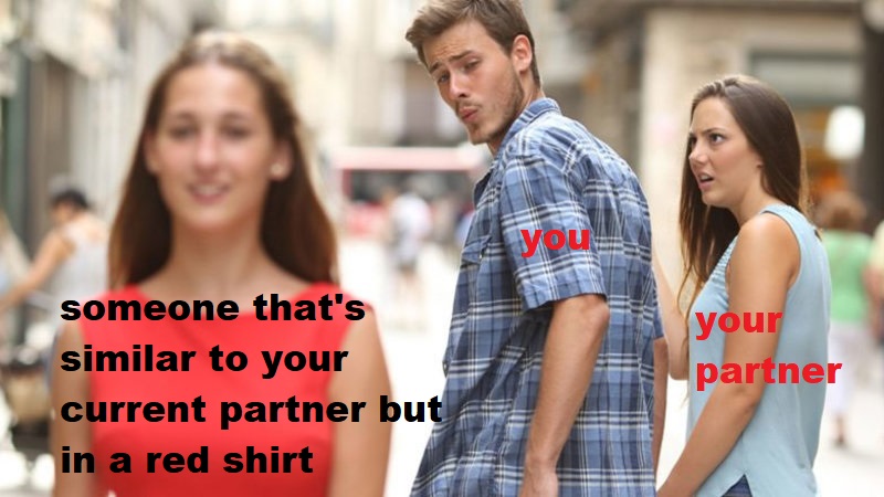
In the article “Just my type: why new partners are often like exes,” Davis talks about how research has been done by psychologists that confirm people date others that have a personality similar to their own. This may seem like an obvious point, but it also provides some reasoning as to why an individual’s “former and new partner tend to be alike in character.” It is from the results of their study that they can not only predict who will get together with who, but also the chance of a relationship succeeding. From this, we can see how apparent homophily is when it comes to choosing a partner – people want someone that is ” interested in the same things and have the same attitudes to life ” as them. However, when the relationship fails with one partner, people might end up choosing another one that has characteristics similar to the ex. In this cycle of break-ups and hook-ups, people will always end up choosing some individual that is similar to every single one they’ve chosen before. It then follows that there is a potential that friends similar to you in personality/character got into a relationship with one of your exes, or maybe even one of your potential partners.

Finding a partner that is truly compatible with you is often a laborious task. Individuals often think their next partner will be better and different from the last when in reality, they’re most likely to be similar in some way, shape, or form. After all, birds of a feather DO flock together whether you expect it or not. This then begs the question of whether or not one should date someone that is similar to them in character. At the end of the day, if you want a relationship (whether it’s romantic or platonic) to last, it would be better if you and your partner have the same interests/attitudes on life, or else you’ll end up with incessant arguments and a broken heart.

LINKS –

https://www.theguardian.com/science/2019/jun/10/just-my-type-why-new-partners-are-often-like-exes

Where’s the world busiest airport?

As online shopping becomes a trend, there is more and more businesses rely on cargo transportation. Air cargo plays an important role in providing fast and high quality services in international transportation, so it makes me wonder which airport is the world’s busiest airport.

A social network could be used to represent the air transportation system. Each node in the network refers to an airport, and each edge refers to a direct flight between 2 airports. Degree centrality and betweenness centrality are taken into the calculation in finding the world busiest airport. When degree centrality is being calculated, the number of nodes connected to each node is measured. The greater the amount of neighbor nodes which directly connect to the object, the greater value of degree centrality the object would have. A higher degree centrality of a node means that the airport which the node represents has more operation flights with other airports. Betweenness of airport A measures the number of shortest paths from all airports to all other airports in the network that pass through the airport A. In other word, betweeness indicates how important an airport is as a intermediate broker in the network. A hub airport is usually evolved from an airport with high betweeness centrality.

In order to analyze the airport transport network, a research team combined data from Star Alliance, Oneworld, and Sky Team and built a massive network of 1060 airports and 5580 routes in 173 countries.

The Airport Transport Network

The degree centrality is calculated by the same research team. I would like to share the top 20 airports which has the greatest degree centrality in the world here.

The top 20 airports with the highest degree centrality

As we can see here, Istanbul Airport in Turkey has the highest degree centrality, followed by the Beijing Capital International Airport in China and Chicago O’Hare International Airport in the United States. According to the data shared by the same research team, Istanbul Airport in Turkey had 33.55 times more connectivity than the average 7.78 degree centrality in the world. Beijing Capital International Airport and Chicago O’Hare International Airport have 27.7 higher connectivity than the average.

Betweenness centrality has been calculated by the research team as well. I will select the top 20 airports in the world which has the highest betweenness centrality to share it here in comparision with the top 20 airports with the highest degree centrality.

The top 20 airports with the highest betweenness centrality

The top 3 airports with the highest betweeness centrality is the same as the top 3 airports in the degree centrality ranking. The correlation between degree centrality and betweness centrality makes sense in this context. The average betweenness degree is 6019.90 among 1060 airports in the world. The betweenness degree of Istanbul Airport is 19.61 times higher than the average, followed by the Beijing Airport which is 19.61 times higher.

In addition, the study also found that United States and China had the largest share in the global network. The sum of the degree centrality and the sum of the betweenness centrality both acount for roughly half of the entire network. In developing countries, there is more and more airports are under construction due to the growth of the demand in global business. The airport transportation network might look different in 10 or 20 years from now and some of the airports with high betweenness might become the new centralized hub globally. As it is now, based on the current betweenness and degree centrality, the busiest airport in the world is Istanbul Airport in Turkey.

References

Song, M. G., & Yeo, G. T. (2017). Analysis of the Air Transport Network Characteristics of Major Airports. The Asian Journal of Shipping and Logistics, 33(3), 117-125. doi:10.1016/j.ajsl.2017.09.002

Effects of Creating, Merging, and Closing of Airlines in Graph Theory

Airlines fly to and from many places across the world. Most airlines have a headquarters, where most of their flights arrive and depart from. In 1993, there were eight major airlines operating in the United States. However, in 2015, only three of the original eight major airlines still exist, with a few new additions created along the way. The reason for the drop is that many airlines have merged together or ceased operations. The interesting part that will be shown in the following section is the effects that these mergers and closures have had on the maps of airline routes, in relation to graph theory. We will look at betweenness and degree specifically, as they relate to the topics covered in CSCC46. 

Firstly, an airline route map can be represented using a graph connecting a flight from city A to city B using an edge. This representation will be used for the remainder of this blog post. 

The below table shows the degree of the top 10 airports between 1990 and 2015. Recall, the degree represents the number of flights to and from an airport. Some observations can be made from the data below. Between 2000 and 2010, a major merger between Northwest Airlines and Delta occurred. CVG was Delta’s major hub before the merger, but around the time of the merge, many cuts were made due to financial troubles in both companies. This is reflected in the table below, as CVG is not present in the 2010 column, indicating the number of flights to and from CVG declined substantially as a result of the Delta merge. 

We can also see an overall increase in the degree of each airport over time. This is attributed to more flight traffic, as well as airlines increasing the number of flight paths as mergers happen.

Top 10 airports by Standardized Degree, by year

Rank1990200020102015
1ORD3.64ATL3.97ATL3.88ATL4.13
2ATL3.07ORD3.25ORD3.66ORD3.98
3DFW2.88DFW3.15DFW3.43DFW3.56
4PIT2.35IAH2.96DTW3.26CLT3.44
5STL2.21CVG2.77LAS2.87LAS2.82
6CLT2.20DTW2.63CLT2.85IAH2.80
7DEN1.99STL2.45IAH2.84DTW2.77
8DTW1.70CLE2.21DEN2.60DEN2.74
9MSP1.65EWR2.05MSP2.53MSP2.54
10IAD1.62MSP2.01MCO2.27PHL2.43

The next table shows the betweenness of the top 10 airports between 1990 and 2015. Recall, the betweenness of an airport is how much that airport is found on the shortest path between two other airports. Essentially this represents how much an airport is a flight hub (a major airport for flight connections). One major change that can be seen is the increase in betweenness of ATL between 1990 and 2000. This is attributed to ValueJet starting operations out of ATL as their main flight hub. Delta also massively expanded its operations in ATL to turn ATL into their hub. As expected, the top 3 airline hubs are present across most of the years from 1990 to 2015.

Top 10 airports by Standardized Betweenness, by year

Rank1990200020102015
1ORD4.79ATL6.39ATL3.64ATL3.79
2ATL3.29DFW2.99ORD2.87ORD3.49
3SFO2.40DTW2.52DFW2.79DFW3.33
4DFW2.24IAH2.45LAS2.59CLT2.86
5PIT2.01ORD2.17IAH1.86LAS1.91
6CLT1.92CVG1.25DTW1.73IAH1.32
7DEN0.90STL0.92CLT1.62DEN0.74
8MSP0.88MSP0.81DEN0.77DTW0.74
9IAD0.83DEN0.75MSP0.71MSP0.68
10STL0.70LAX0.71SFO0.68PHL0.52

However, there is a slight decline in overall betweenness of the top 10 airports from 1990 to 2015. The reason for this is due to the creation of more mini flight hubs, and the expansion of flights across cities. This can be seen in the below graphic, as there are less larger circles and more medium sized circles, showing the creation of more mini flight hubs between 1990 and 2015. 

In essence, the effects of creating, merging, and closing airlines is an interesting topic to look at from a graph theory perspective. We have seen how these effects change the degree and betweenness of airports in a flight path graph. This topic will be interesting to watch as more airlines are created, merged together, and shut down in future years. 

References:

Ciliberto, F., Cook, E. E., & Williams, J. W. (2018). Network Structure and Consolidation in the U.S. Airline Industry, 1990–2015. Review of Industrial Organization, 54(1), 3–36. https://doi.org/10.1007/s11151-018-9635-y

Google Map and Graph Theory

Google map is the most popular mapping service in the world. Its two main features are real-time traffic conditions and route planning for traveling by foot, car, bicycle and air, or public transit. My topic is that how Google map ultilizes the graph theory to navigate users to their destinations.

In the context of CSCC46, a map can be represented as a weighted and undirected network or graph. It has nodes and edges. Similarly, Google Map can be viewed as such with nodes as locations and edges as roads. Oftentimes, people want to get to some places as fast as possible. Therefore, the Dijkstra’s algorithm comes in handy when calculating the shortest path between places. When the algorithm does is that, given a weighted graph, a starting point and an endpoint within the graph itself, the algorithm finds a path at minimum weight. In the case of Google map, it finds the fastest route from one point to the other as the pictures shown below.

Of course, each edge has different weight. Not only does the map take distances beween nodes into account, but also it considers the traffic volume of the road. As the pictures shown below, the red segments indicates that the traffic volume is high and the green ones mean the road is clear. Because sometimes, a fastest path does not mean a shortest path. By considering the traffic volume as another weight of edge, Google map calculates fastest paths as accurate as possible.

This example demonstrates that the pratice of information network plays an important role in our daily life. By studying it, we can have a deeper understanding how the individual entity interacts with others and how they are grouped together to become a network so that it can be an important reference when a new technology is being developed.

Reference: https://magazine.impactscool.com/en/speciali/google-maps-e-la-teoria-dei-grafi/

Can neural responses predict friendships?

We saw in class various examples of homophily, where we could observe some social tendencies and that describe a particular group of people. But how deep are these tendencies? Do these tendencies reflect similarities in perception and interpretation as well?

The Psychology department at the University of California, Los Angeles conducted a study lead by Dr. Carolyn Parkinson to analyze neural homophily. The study consisted of scanning participant’s brains during a viewing of different videos and compare it across multiple groups of friends. These videos were from different genres from comedies to politics.

The results suggested that the similarity of neural responses within a group of friends is extremely high, and the similarity decreases when the distance in the social network increases. So birds of a feather not only flock together but also perceive and respond similarly in different scenarios.

Thus, the data of the mental process showed that it is feasible to predict if two people are friends. In the brain scanning process, it can be detected the brain regions involved in people’s reasoning and emotional response, which are formed based on people’s expectations, knowledge and interests. Interest, in particular, is one of the factors that is considered while looking at homophily.

Algorithms to recognize possible friendships based on common traits and social tendencies already exist, however, it could be more efficient if it could recognize (neural) response patterns. This study showed that there are different ways to detect similarities across social networks and the possibility of homophily prediction.

Links:

https://www.nature.com/articles/s41467-017-02722-7

https://www.futurelearn.com/courses/social-media/0/steps/16055

Tencent’s influence on the digital market

In light of the most recent events regarding Blizzard Entertainment and their decision to take a pro-China stance and censor their community, I wanted to investigate how much influence does China have on digital entertainment companies.

Tencent is the world’s largest games publisher, it is both an internet and entertainment giant in China, similarly to Google. However gamers are likely more familiar with Tencent’s involvement to a growing number of game developers and publishers.

In context to CSCC46 the following illustration depicts a weighted undirected graph showing the amount of investment and ownership Tencent has over major entertainment/gaming companies. The nodes in this case would be the company entities themselves such as Tencent, and the edges will signify that Tencent has had relations with the other company, while the weight of the node will represent the % in which Tencent has invested and is involved with the company’s hierarchy. Additionally some triadic closures between companies can be formed to symbolize the genre that the companie accomadates with their products, as they could be considered rival companies.
(For better understanding, I will also add the name of the game that is most commonly associated with the company)

By analyzing the relational ties and how much influence Tencent has over existing and up and coming developers and publishers, we can start to see and speculate how economically terrible it may become for the entertainment district is monopolized by Tencent’s political stance

References:
Messner, Steven. “Every Game Company That Tencent Has Invested In.” Pcgamer, PC Gamer, 4 Oct. 2019, www.pcgamer.com/every-game-company-that-tencent-has-invested-in/.

How many conversions does it take to clear up gossip?

Gossip is something that is really common between schools around the world. Students love to spread this type of information to their peers of the partial stories they know which ends up spreading to other groups of people like wildfire. To find out the true story, the students would need to tell each other the partial bits they know about it which would combine into the full story. This course comes in to play as we can use graph theory to determine how many conversions would need to take place in a group for every person to know the full story.

We can assume that everyone knows one part of the story and we want everyone to know the full story. Let people be vertices in a graph and the edges between them be the number of calls they make. To simplify this problem, we can assume that their will only be 2 ways calls (no group calls). In this blog post, I will answer the question of: How many calls must be made for n people to allow everyone to know the full story?

The numbers on the edges between the vertices represent the order in which the calls take place. This means the lowest number has the highest priority and so the paths taken will choose the highest priority edges first.

Consider the following graph:

There is a problem in this graph as B never hears D information. As you let information pass through D, D’s last call with A is also A’s last call and the same goes for C. Thus there is never a call to B telling D’s information.

We can try fixing this graph by defining the following.

“A gossip scheme is an ordered graph where there is an increasing path from any vertex to any other.” – Nate Gildersleeve

An example of this would be:

In this graph of 4 people, information can be passed around to anyone. We can see that C’s call to B happens after C’s call to D and thus B hears D’s information so the problem in the first graph has been solved here.

A method that can be used to find out how many calls it takes is that everyone calls one person in turn and then that same person calls everyone back. This would mean that the first person everyone called knows the whole story now and then he would be able to call everyone back to tell them the whole story. 

For this approach, there would be

Let n be the number of people

=> n – 1 call’s going into that person  [exclude the person being called]

=> n – 1 – 1 call’s going out    [last call-in doesn’t need to be called again]

=  (n – 1) + (n – 1 – 1) 

=  2n – 3

For a group of 5 people this would look like:

We can actually improve this slightly by the following approach.

“If every person calls one of four people, then have those people share their information with each other and finally call everyone back”- Nate Gildersleeve

The following graph is more efficient than the one mentioned earlier.

This will improve our formula to 2n – 4.

In the world of gossip that we live in today, you now know how many conversions it will take to clear it up efficiently from the teachings of graph theory and deriving an undirected weighted graph for it.

References:

http://web.pdx.edu/~caughman/Gossip.pdf

Schizophrenic Brain Function Network Analysis

In class we learned about small worlds, clustering co-efficients, and path length. Throughout our class discussions we often used social media, and social networks as examples. But graph theory is a far-reaching field and the topics we covered in class can also be used in various other networks; including the brain function network.

In an article published in May 2019 titled “Brain Network Analysis of Schizophrenia Based on the Functional Connectivity” researchers outline how graph theory can be used to identify the effects of schizophrenia on the brain function network. In their study, the researchers analysed the Magnetoencephalography (MEG) of 9 patients with ‘normal’ brain activity and 9 patients who had been diagnosed with schizophrenia. MEG is a neuroimaging technique for mapping brain activity by recording the magnetic fields created by the electrical impulses within the brain [2]. In the introduction the authors note that, “High efficiency analysis of small world network topology has become the main way to analyze brain function network.” This is due to the high connectivity and efficiency of the human brain function network. The goal of the study was to compare the small world properties of the schizophrenic brain function network against that of the ‘normal’ brain network. This was achieved by first mapping the brain function connectivity network in a resting state with MEG. Since the brain function connectivity network can fluctuate over time, even in the resting state, the study used a sliding window technique to capture the left temporal and frontal MEG signals of the 18 patients in a resting state with their eyes closed.

[3]

The researchers then processed these signals in order to produce binary and weighted networks. From these networks they calculated the average shortest path length and the average clustering coefficient. The study found that the ‘normal’ human brain shows increased small world properties when compared to the schizophrenic brain. The healthy patients brain function networks had comparatively smaller shortest path lengths and higher clustering co-efficients. Graph theory analysis of the brain function network can produce significant results for better understanding schizophrenia, an often crippling disease. This study shows that patients with schizophrenia have decreased small world properties in their brain function networks, which may result in a slower information exchange rate and lower efficiency.

The study outlined above highlights how graph theory can be used not only to help us understand the overall structure of the social world, but also naturally occurring biological structures. The human brain is an extremely complicated organ that we do not fully understand. However, through the use of graph theory we can better understand the healthy structures and patterns that exist within our brains and how variations within those structures (such as decreased connectivity) can impact our health. Schizophrenia, among many other mental illnesses, is both poorly understood and potentially incapacitating. Knowing that graph theory can be used to provide better diagnosis and to possibly move us closer to providing assistance to those impacted by the disease highlights how deep of an impact graph theory can have, not just in understanding the world around us, but also in using that understanding to significantly help those in need.

RESOURCES:

[1] X. Zhang, L. Wang, Y. Ding, L. Huang and X. Cheng, “Brain Network Analysis of Schizophrenia Based on the Functional Connectivity,” in Chinese Journal of Electronics, vol. 28, no. 3, pp. 535-541, 5 2019.
doi: 10.1049/cje.2019.03.017
URL: http://ieeexplore.ieee.org.myaccess.library.utoronto.ca/stamp/stamp.jsp?tp=&arnumber=8812649&isnumber=8812608.

[2] Magnetoencephalography . In Wikipedia. Retrieved October 12, 2019, from https://en.wikipedia.org/wiki/Magnetoencephalography

[3] Brain Map: Temporal Lobes. In Queensland Health. Retrieved October 12, 2019, from https://www.health.qld.gov.au/abios/asp/btemporal_lobes

Great Memes are Just Diseases

In today’s media-driven and ever-connected digital landscape, it is hard to understate both the prevalence and significance of memes in our modern society. From mindlessly filling up your instagram feed, to serving as fuel for the protesters in Hong Kong, memes are now a common and effective way of communicating ideas en masse.

As such, it could be insightful to understand just what separates a great, or viral, meme from all the others. In a 2013 paper by Weng et al., they found that they were able to predict the virality of a meme based on whether it spread like a simple or complex contagion. Complex contagions often start with a very small probability of adoption, but can increase this probability with multiple exposures. This behaviour lends itself to a ‘trapping’ effect within communities, where it spreads quickly within the community but becomes difficult to leave it, based on the principles of Structural Trapping, Social Reinforcement, and Homophily (as discussed in class).

Memes that spread like simple contagions however, are much more akin to diseases. In this situation, each individual exposure carries the same probability of adoption, but that base probability is often significantly higher than those of complex contagions. As a result, these memes don’t falter and stew in 1 or 2 communities, but quickly infect the whole network.

Based on this understanding of meme virality as a symptom of its contagion type, Weng et al. were able to build a ML model that could predict which memes would take off based on its initial spread amongst communities. In the following diagram, we can see that the non-viral meme (a complex contagion) was heavily-concentrated in one community, but was unable to find a decent footing in any others. In contrast, the viral meme (a simple contagion) did not have as heavy a concentration in any single community, but did manage to gain a decent spread amongst several communities. We can then see the results of these spreads as the viral meme was able to infect a plethora of new communities on a regular basis (notice the prominent circles with a redder hue). Meanwhile, the non-viral meme was relegated to it initial community (dark blue circle) and did not have anywhere near as much of an impact on the few other communities it did get into.

In conclusion, we can clearly see that, as a by-product of the way social communities (which are just social networks) interact, it is more optimal for a meme to loosely relate to a wide variety of people than to strongly relate to any one group. Indeed, this revelation may seem quite intuitive, but it is nice to have this intuition grounded in data and empirical analysis. After all, if we still can’t beat the common cold, how could we ever hope to beat Pepe the Frog?


References

Lilian Weng, Filippo Menczer, and Yong-Yeol Ahn. Virality Prediction and Community Structure in Social Networks. Nature Scientific Report. (3)2522, 2013.
Companion Webpage found at: https://lilianweng.github.io/virality.html

Git & Graph Theory

Version control systems are a staple of modern software development. With popular applications like Git and SVN, almost all production-level software written today is managed with version control systems. However, what is not as well-known is that at the heart of these systems is a beautiful and practical application of graph theory.

The commit history of any version control repository can be represented as a directed acyclic graph, where each node is a revision of some source code, and the edges are links in time pointing to the previous commit made. The main branch of this repository, often named master, is essentially a straight chain of commit nodes, with each edge linking commits to its previous commit dependency.

The tree-like structure of this particular repository comes from the ability to “branch” off certain nodes in the master branch, which allows parallel lines of development. The interesting part is when we consider the actions of “merging” and “rebasing”, which turns the graph from a tree to a directed acyclic graph. 

A typical graph of a repository’s commit history.

Merging is the act of taking two branches and combining them together, constructing a new node in the commit history containing the combination of changes made on both branches.  Note this still forms a directed acyclic graph, since every edge is only ever directed backwards in time- there is no way to form a cycle in this case.

Merging seen in action.

Rebasing, on the other hand, constructs a new edge, rather than a new node. When branch A is rebased onto branch B, the head of branch A modifies its edge to point to the tail of B, essentially replaying changes made to the source code in a new order.  Note this also still forms a directed acyclic graph!

Rebasing seen in action.

While Git is infamous for its terse and confusing commands, the model behind it is quite interesting!

https://medium.com/girl-writes-code/git-is-a-directed-acyclic-graph-and-what-the-heck-does-that-mean-b6c8dec65059