Introduction
Technology has continued to impact us in every aspect of our lives and with its latest developments, it is no surprise that multi-billion dollar sporting industries have begun to feel these affects. Basketball, in particular, is a high intensity sport where even gaining a distance of a few yards from your opponent can result in a game winning basket. To win more games, these large sporting franchises have employed the use of technology (graph theory in particular) to help their players win more games. Starting from 2015, as cameras became more advanced, teams were able to gather data such as speed, distance to ball, directional movement, and touches. Furthermore, this data was used to analyze players’ performances and coaches were able to tweak their player’s performances and roles accordingly. One such way of analyzing a basketball match is to understand passing. Basketball is a team sport, and the team is connected through passing the ball. However, while a team can use passing statistics to improve their players, opposing teams can use the same passing statistics to play better defense. Let’s take a look.
Analysis
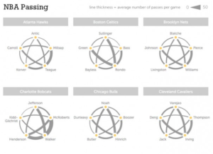
The graphic below depicts the number of passes between each of a team’s starting 5 players. These are an accumulation of passes over an entire game, where a thicker line represents a larger amount of passes. Here are a few examples:
One very interesting example is the following graph depicting the passes between the Minnesota Timberwolves:
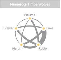
As you can see, the thickest line is between players Kevin Love and Ricky Rubio. Interestingly enough, this was the season where the Minnesota Timberwolves actually built their whole team around these two young stars. This graph was a warning sign for the Timberwolves’ head coach. He could finally quantify just how dependent his team was on just two players. Using statistics, the coach employed tactics to involve other players in the game so the passing would be more spread out and have a decreased discrepancy. On the other hand, when opposing teams analyzed the Minnesota Timberwolves, they were able to see just how many passes took place between just two players. Players became mindful of this, and the partnership’s effectiveness dwindled due to a higher focus on two players by the opposition’s defense. This example shows us just how important graphs can be in sport, for both the teams and their oppositions.
Conclusion
As we saw above, graphs can be used both as a crutch to improve a team’s performance, but also can be employed as a weapon to create tactics against an opposition. Visualizing graphs and analytical content allows coaches to optimize their game plan ahead of games and allows for useful insight to improve player’s performances. This type of data is useless without graphs to visualize them, which shows us how much graph theory (learned in class) can help out in real world examples.
Sources
Website:https://rockcontent.com/blog/the-power-of-sports-data-visualizing-passes-between-nba-players-offers-new-game-insights/