Categories
Uncategorized

A closer look at the congestion of the King Street Pilot

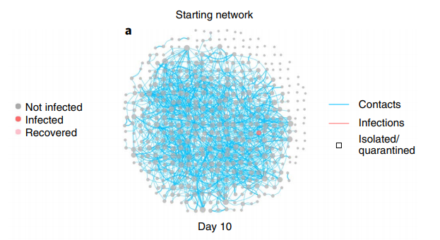
In class, we had looked into congestion and how adding or removing lanes can easily cause more or less congestion, depending on the setup of the traffic lanes. In particular, we discussed a bit about the rumours of better traffic in New York despite 5th Avenue being shut down. Relatedly, we also discussed the King Street Pilot Project, where streetcars on King Street were given special priority, allowing for quicker and more reliable TTC streetcar service.

The project stretches from Bathurst St. on the west to Jarvis St. on the east. Given that streetcars are given priority on King Street, any traffic intending to move on the west-east corridor then must go through one of the other streets north/south of King, which also affects north-south traffic as well. The question then becomes, was the pilot a success in any way, and does this success significantly redirect traffic away from King Street and cause further congestion on all those other streets?

Firstly, in the annual summary of the King Street Pilot, it notes a rise in streetcar timeliness:

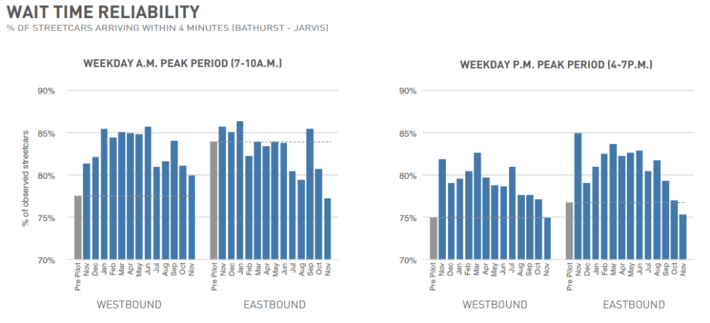
as well as streetcar travel times:

so overall, for commuters of streetcars, the project is a success.

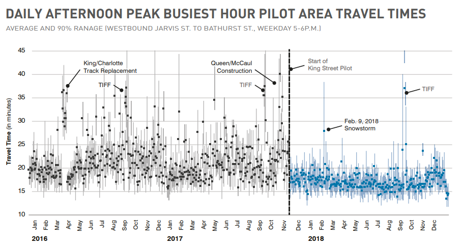
However, let us also look at the traffic surrounding King St. In terms of travel time,

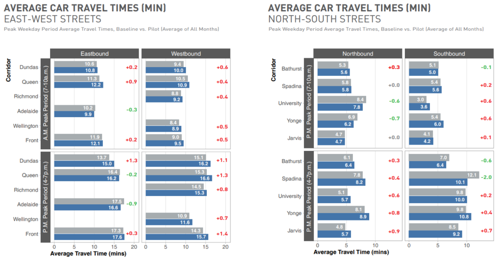
Counting the minutes, most of them have a delta of less than a minute, with the rare view adding over a minute of traffic and lessening two minutes of traffic, so it’s not significant. In terms of travel volume,

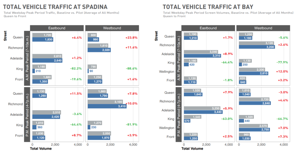
We see that unlike Braess’s Paradox, the removing traffic from King Street did not cause an overall decrease of traffic; to the contrary, there is a nontrival percentage of additional drivers in the roads surrounding King Street. But, despite this increase of traffic, as seen above, the travel time does not significantly increase.

Overall, I think we can agree that the King Street Pilot project has been a success for the streetcars, and I only wonder if they would be extending this concept to other waterfront streets as well.

Categories
Uncategorized

Covid spread predictive simulations on a UK town

https://www.nature.com/articles/s41591-020-1036-8

Here we can see a paper on some simulations, predicting the differences on how COVID spreads throughout a UK town (Haslemere), where they compare the spread between no intervention and contact tracing prevention. In this network graph, each person represents a node and each contact an edge, as shown by the image below.

I think it should be fairly obvious that without intervention or prevention, the number of cases explode (left networks), while with contact tracing and quarantine, the number of cases increases but at a vastly slower rate (right networks).

In this graph, we can first see that the graph is not connected: there are nodes near the edges of the circle that come into no contact with any other node, and as expected they never get infected, though this is just a simulation and thus not overly realistic as most nodes come into some sort of contact with other nodes.

However, excluding the outside nodes, we can see that the core of the graph is very much interconnected. While not exactly like a bowtie as in the network of the internet as this graph is undirected (and thus cannot be SCC by definition), we can assume that there is most likely a huge connected core with smaller connected subgraphs scattered around. This of course implies that infections spread quickly with all the interconnected contacts, and indeed as seen on the left simulations it’s what happens.

Consider instead the method of quarantining the infected, as per the right simulations. Although the core of the graph is connected at first, by quarantining various nodes we will eventually (depending on how connected the graph is) segment the huge connected core graph into smaller subgraphs, or more precisely, into different components. This allows the infected to be localized and thus slows down the rate of infection.

Furthermore, by segmenting the graph, we destroy local bridges and this also aids in slowing the rate of infection. Each infected node will need a longer distance (more contacts) to spread to any other node. Eventually, if enough local bridges are deleted, bridges start being deleted and this will result in the above scenario where we’ll have smaller components.

I enjoyed how we could apply the knowledge of graph theory to actual contact tracing and actually apply the theory in explaining why it would work, and I found it fascinating that even on a fairly basic level without going into too much detail, we could find connections between course work and current events. I look forward to learning more about the network of contagions and epidemics later in the course and see how we can contrast that with what I have put here so far.