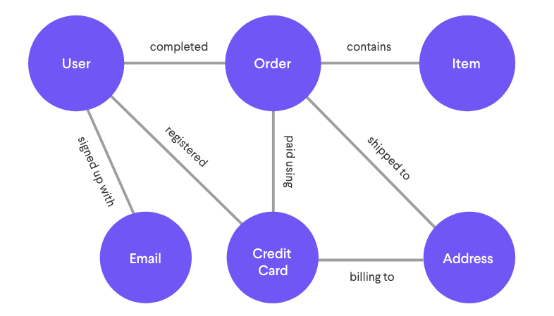
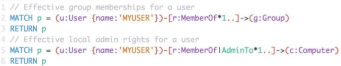
A company called Ravelin offers services towards wire fraud detection. Wire fraud is defined as crime done electronically; you may know it as stealing credit card information. This is the process by which scammers would acquire credit card information from unsuspecting victims and use them as their own payment methods. Ravelin attempts to mitigate the damages by compiling a database of various data such as persons and spending habits to graph trends. Normal spending behavior may differ from person to person, but it is predictable in sense of a pattern. Ravelin uses this information to build a graph network using nodes and edges. By doing so, the resulting graphs will form trends and patterns which differ between normal activity and those which exhibit malicious activity.
A typical graph structure of user information that would be collected from a real human consumer
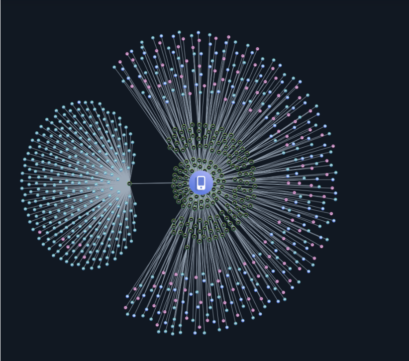
One of the graphs may look at what you use your credit card for and connect your credit card transfers as edges to the recipients that are nodes. “Fraudsters” as Ravelin labels them are typically strongly connected component, which is to say they typically know each other, or are using the same methods and tactics. Because they operate similarly with each other their patterns are very distinct but spontaneous. In one example, a spontaneous large amount of orders on multiple computer generated accounts were made to a book store with a shipping address that all lead to the same location. Upon detecting a sudden influx of the exact same transaction, further research found the destination to be a market for illegal goods as well as a forum where the fraudsters planned the whole ordeal.
Other techniques include monitoring growth of a network, since family doesn’t often multiply; their growth is slow in contrast to the fast growing scale in which a scam operation needs to turn a profit. As you may have surmised, placing multiple orders on the same account will look suspicious, while placing multiple purchases on multiple generated accounts will also seem suspicious when paying with the same credit card. These bridges connecting the graph from customer, payment, and location are obvious signs that fraud has taken place. They are easy to spot and typically can be traced back to fraud rings, which are criminals who work together.
Multiple accounts and purchases made over a single device or payment method is a likely sign of stolen credit card informationMultiple accounts generated from a single device to exploit a system by posing as many individual customers
In summary, graph networks are can be used to run analytics and determine the probability in which fraud may be taking place. The connections which exhibit fraud typically form graphs which differ in shape compared to normal user activity. Fraud networks are clustered, grows very quickly, and has smaller number of bridges relative to the size of connected clusters. This makes them easy to detect and narrow down fraudulent cyber activity.
When it comes to performing analysis on unstructured data we usually forget how much data there is to perform computation on and how much it relies on scale computing. The terms like Big Data, Map-Reduce, and Parallel programming get thrown around commonly nowadays and many engineers are working towards building computer architecture which will help enable efficient computation of unstructured data and tackle large-scale problems. Intel and Katana Graph Team have started a collaboration to port and optimize the Katana Graph Engine on Intel Xeon for scalable processing. What this will do is enable users to exploit high-performance, scale-out parallel computing and compute large problems with unstructured data such as network analysis with unmatched efficiency. In the modern era unstructured datasets are very common in social network analysis, security and authentication, biomedical and pharma applications and many more.
Katana Graph
One key usage of large unstructured data sets and performing network analysis that we all are aware of by now is epidemiological studies for modeling the spread of infectious diseases like COVID-19. The Katana Graph Engine performs computation on any problem involving connected data and hence all network analysis will be enabled through this upgrade. The Katana Graph Engine has been widely used as a major defense contractor to implement a system that will detect real-time intrusion in computer network(s) and performs heavy data mining on how users interact in the network and analyze their patterns. All of these tasks take long time if you consider the number of users to be in billions and which is why concepts such as Parallel Programming and Big Data exists where we enable the use of extra hardware to increase efficiency.
The collaboration of Intel and Katana Graph Engine is just one example of how many companies are looking ahead into the future and see the need for heavy network analysis on unstructured data. Many are starting to adapt to idea of using such technologies to gain better information through Machine Learning and Artificial Intelligence to improve their software. Through network analysis and quick network analysis it will enable us to discover interrelations between sets of metrics which is not possible today and there are layers upon layers of insights that can be derived from a single data point. There is data hidden inside data and there are unique connections between these layers depending on how one perceives it. Therefore I believe this is an exciting collaboration of hardware and software which could revolutionize how we perceive network analysis the extent to which it can be performed.
This article (Leadership networks in Catholic parishes: Implications for implementation research in health) presents differing social networks of two parishes’ leadership structures: Sacred Heart and Holy Cross. The former parish is run by an order and the latter by a diocese. What I found interesting is the clearly distinct difference in distributed leadership vs. leader-centred frameworks respectively by analyzing the collaboration networks of each parish. Evidently, Sacred Heart is shown to have almost complete density of collaboration between their leaders with a density of 0.96 (Fig 1.1); whereas, Holy Cross has a density of 0.65 (Fig 1.2).
Fig 1.1 Sacred Heart collaboration on parish events and activities.Fig 1.2 Holy Cross collaborations on parish events and activities.
Although the sparsity of collaboration in comparison to Sacred Heart would usually indicate less communication overall, the strength of the ties are also taken into consideration. They define strong ties as collaboration on either a daily, weekly, or monthly basis and weak ties on an annual basis. The Strong Triadic Closure property is evidently present in the networks; in fact, all the nodes are a part of a single cluster for each. Despite the stark difference in collaboration density, their corresponding discussion networks have similar density with Sacred Heart having 0.68 and Holy Cross having 0.66. This is, at least in part, due to the proportion of strong ties in Holy Cross’ collaboration network being higher than Sacred Heart’s; clearly, it is significant enough to affect the flow needed to transmit information across the leadership members. They note that ties between leaders at Holy Cross were more likely to be strong, either daily or weekly. This seems to imply an inverse relationship between the necessity of frequent communication and required ties for flow of information.
It seems there is a trade off between the centrality of the ordained leaders and increasing the capacity of the parish to organize programs. This naturally follows from the necessity of additional leadership responsibilities being dispersed to lighten the duties from any single person. At Sacred Heart we see that the three most central leaders in the collaboration network are not ordained but rather religious or laity (Fig 2.1). In contrast, two of the three most central leaders at Holy Cross are ordained (Fig 2.2). To compute the centrality they used flow betweenness centrality which not only accounts for shortest paths but all possible paths. This grants a more accurate depiction of the flow of information however this was likely only possible due to the small sample size; with a larger set of nodes, computing the flow betweenness centrality would be too costly.
Fig 2.1 Most between central leaders in Sacred Heart’s collaboration network.Fig 2.2 Most between central leaders in Holy Cross’ collaboration network.
Making use of social network analysis has proven to be a useful method of discovering the key members that would be able to share and implement programs. However, it also uncovers some trade offs that should be considered for leadership responsibilities in a parish.
Reference
Negrón, R., Leyva, B., Allen, J., Ospino, H., Tom, L., & Rustan, S. (2014). Leadership networks in Catholic parishes: Implications for implementation research in health. Social Science & Medicine,122, 53-62. doi:https://doi.org/10.1016/j.socscimed.2014.10.012
With the National Hockey League season ending a couple weeks ago, it would be a good time to estimate how teammates influence scoring by using network analysis. I grew up watching hockey and I have always wondered how we could use standard, readily available metrics in such a way to accurately see a players ability to perform. The curiosity has only grown bigger as I have taken more practical courses for network analytics like CSCC46.
It is known that box scores in any sport can never tell the whole story of the game and so deeper analytics should always be done to truly know how the team and players performed. There has also always been a place for advanced analytics in hockey where they use standard metrics from the boxscores to calculate advanced analytics such as Corsi. However, it gets really interesting when you can use standard metrics from these boxscores and start to apply network analysis to it, directly relating to CSCC46 course material. This is precisely what Oppenheimer attempted to do, using standard metrics to calculate a single analytic that can give you a good understanding of the players performance on the team.
2014-15 New York Islanders Shot and Passing Network
Oppenheimer was able to calculate betweenness and make it meaningful for hockey by visualizing scoring as a directed network where the nodes represent players and the edges represent primary assists to and from each players’ goals. The above diagram depicts this but the edges reflect shot and passing instead of primary assists. This calculation will show us that if the player has a high betweenness, it means their production is really high as they score and assist frequently and their assists are sometimes distinct too but you also start to see if some players rely on other players for their scoring. Sometimes however, this analytic gets meaningless if the team is stacked in the sense that they have a lot of players who can produce. This is because, betweenness is a relative metric hence it is relative to the players’ team and so being on an offensive team, the player can be deemed less influential than they really are.
With all that said, I believe this is the start of applying network analysis to the game of hockey and there is a lot to explore in this field and further analyze a players production to see if they would be a good fit for another team. The really cool thing about betweenness is that it can also be applied to other sports in virtually the same way and you can play around with different types of edges and nodes. I hope to see more research in this as I would love to see the world of analytics in hockey and possibly alter how teams are built forever.
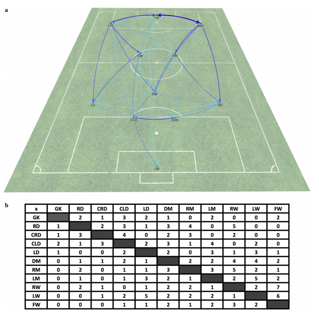
As an avid viewer of sports, I am always seeking ways to see how the concepts I learn in class could be applied in evaluating sports performance. Regarding graph theory, the authors Ribeiro, Silva and co have attempted to create a graph-based mathematical model that can better display micro and macro analysis of player performance.
In the piece, the authors first explain why graph theory can be applied to sports. As most sports are cooperative in nature and require the movement of some sort of ball, they are ripe for use in graphs. One of the key fallouts of regularly used statistics for sports that the authors bring up is that they do not properly represent spatial scales (Ribeiro et al., 2017, p.1690). For instance, while passes completed by a player in a soccer game may help in knowing how well a player can pass the ball, it does not reflect how well the player gets the ball down the pitch. A player could complete low risk passes but some may favour a player who makes less passes accurately but gets the ball into scoring position.
For the graphs themselves, the authors present two possible graph types to choose.
Two different graphs we can use to evaluate sport performance
In reference to weighted graphs, the authors mention how graph weight could be relevant in context. For instance, weight could be used as the count of passes made between players in a soccer pitch. Additionally, the authors present an application of graph theory that uses weighted graphs and their associated adjacency matrices to evaluate a soccer team’s passing performance.
An example of graph use for a passing network in soccer
In this example, the authors use nodes to display players and wider edges to demonstrate weights of how often a pass is made between two players. In doing so, the authors display how some common graph calculations could better explain player performance in this context. Degree centrality, for instance, is how many edges that include a node (Ribeiro et al., 2017, p.1694). Using this, we can see in how many passes a player is involved in. Another key value could be the betweenness centrality, which is how often a node appears in the various shortest paths between any pair of nodes (Ribeiro et al., 2017, p. 1694). This helps to show how involved a node/player is in the passing network. By using graph concepts, like node degrees, the authors are showing us the application of graphs in assessing sport performance.
Overall, while the authors demonstrate the effectiveness of graph theory in evaluating a soccer team’s passing network, they also identify some key issues with generalizing their models over different sports. First, it is not easy to use the same node and edge classifications for a sport with little to no passing (Ribeiro et al., 2017, p. 1694). An example that I immediately thought of as I read the piece was American football. Outside of laterals, the majority of passing in the sport is done by the quarterback and so using passes as edges in that graph model may not work as most edges would come from one node.
Another key issue is that their models and the other studies they referred to in their piece do not properly demonstrate the variance of player performance in different situations (Ribeiro et al., 2017, p. 1694). As an example, their models do not display player performance over time (Ribeiro et al., 2017, p. 1694). Regarding this, I think a way to incorporate time into the graphs is to break up the passes done over various periods of time. While this would result in a multitude of graphs, it does give us the opportunity to see how our pass networks differ as time progresses. In the example above with soccer, if a player’s degree centrality falls immensely over time, we would see this as the amount of edges originating from the node decreasing over time. As such, it may make sense for a coach to then substitute the player after a certain amount of time.
I personally found this piece interesting because it gives us an application of graph theory we have not seen in class and it also shows some issues with using graphs to represent other contexts. By showing us how the application of graph theory in sports, it also brings up the importance of properly defining our nodes and edges when creating a mathematical model. While their model works well with models based around passing, there is work needed to be done to properly evaluate other sports networks.
References:
Ribeiro, J., Silva, P., Duarte, R., Davids, K., & Garganta, J. (2017). Team Sports Performance Analysed Through the Lens of Social Network Theory: Implications for Research and Practice. Sports Medicine, 47(9), 1689-1696. doi:10.1007/s40279-017-0695-1
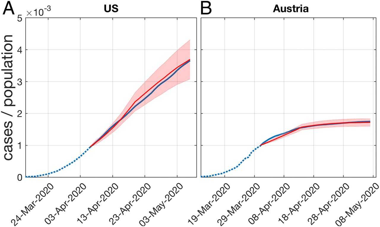
In the midst of a global pandemic, we have seen many countries implement different measures to try to eradicate the virus. As we learned in lecture and as discussed in the article, viruses spread through social networks and can spread easily through strongly connected components. As a result, the article “A network-based explanation of why most COVID-19 infection curves are linear” by Turner, Klimek, and Hanel intrigued me because it was a network-based explanation for the spread of COVID-19 as well as a network-based explanation for prevention measures.
The first measure that we have all heard is a lockdown as seen in early March in Ontario. Turner et al suggest that in order for a person to become infected with the virus they must satisfy two criteria as seen below:
There is a social interaction between an infected and a susceptible person and
This contact is intense enough to lead to disease transmission.
Assuming a realistic contact network with degree 5, there is an average of 7.2 critical contacts per person. With lockdown measures, this reduces the number of critical contacts of each person to 2.5 people. Essentially, given a social network where nodes are people and edges are intense contact as defined above, a lockdown removes many edges hence limiting the ease of spread throughout the network.
Here we can see the results of the US, who did not implement lockdowns during the given timeframe and Austria, who did. We can conclude that bringing the number of critical contacts down to a household amount like 2.5 can dramatically change the course of the pandemic.
Now after the first wave, many places began to ease up on restrictions. Places like Ontario began to reopen businesses and lifted much of the lockdown as numbers began to drop. To prevent cases from flaring up again, another measure known as “Social Distancing” was implemented.
As discussed by Turner et al, social distancing is another way of removing those edges between nodes hence creating a more sparse network. Even though more people were seeing each other, social distancing should limit the spread because those interactions would not satisfy criteria 2 as defined above. However, we know that humans are social beings and the longing for meaningful social interactions was immense after months of lockdown. Holidays, birthdays, and other events eventually caused a lot of those edges to appear again, creating more strongly connected components hence we have entered the second phase of this pandemic.
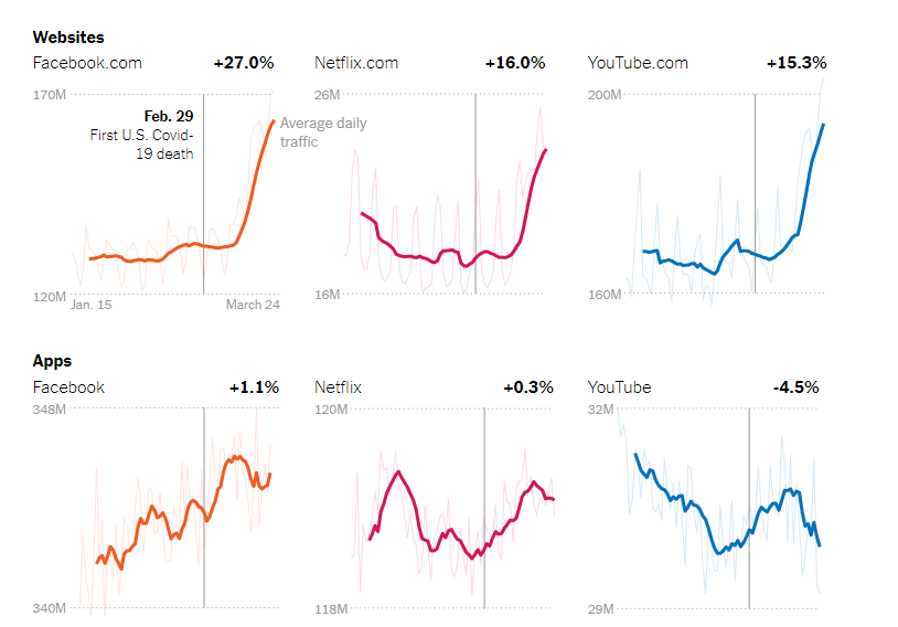
With the recent pandemic, people are forced to be confined to their homes much more than before. Self isolation to prevent the spread of the virus by the population caused a drastic change in many peoples’ lives, especially the lives of people who are very used to going outdoors for entertainment. This unprecedented and abrupt change in lifestyle impacted the lives of many people. People working at home, the reliance on deliveries in order to avoid human contact, the pandemic has shaped our world to force us to be able to live by ourselves.
As a result of more people flocking online for entertainment, this confinement changed how people used the internet. According to the New York Times, Facebook saw a 27% increase, Netflix saw a 16% increase, and YouTube saw a 15.3% increase in users on their already massive userbase.
Obviously with social media platforms such as Facebook and Twitter, its average daily users along with the businesses that run a page had to change how they managed these platforms as well. The coronavirus led to significant discussions online. Roseman University of Health Sciences conducted a research on these discussions, and suggests that understanding these discussions can help institutions, governments, and individuals navigate themselves during the pandemic. Their method of research implemented AI to analyze Twitter data in the United States from March 20th to April 19th of 2020, and mainly focused on COVID-19 discussions.
The following figure shows the social network graphs of topics with a dominant influence, along with the top 10 words that associated with the topic. The node size per word is proportional to the weight of the edges connected to it. The analysis shows that among the 5 topics, the closeness centrality measure is highest for emotional support, indicating that it is likely associated with each of the other discussions.
The discussion of mental health is important during this period of time, as the feeling of isolation and loneliness is hugely amplified in those who are not used to this style of living. As social media is known to create echo chambers and bubble type communities, the negative effects of social media use was also amplified.
The following heatmap shows the average sentiment score of the states in the country. Darkness of the state colors associated with negative sentiment scores, and lighter colors associated with positive sentiments scores.
Their research done indicated that positive sentiment outweighed negative sentiment. Public sentiment data is important to the efforts towards the coronavirus relief, and can help guide government workers and businesses with information allowing them to make impactful decisions.
What we can take away from these results is that adapting to an issue of this scale is very difficult. The pandemic’s impact on the healthcare sector in every country is immense, and the timing could not have been worse for the global economy. People now need more emotional support than ever, and the social changes that resulted from this forced the population to find new ways to interact with peers and loved ones. With the grimness of the statistics of the pandemic, and increased stress from the uncertainty of how the situation is, people can only hope for things to get better. But with the capabilities of technology and scientists today committing to a cure and solutions to the many problems, we can have faith that everyday life will go back to normal soon.
I have seen that this blog is filled with posts about video games, but if there is one thing I miss most about quarantine life is the ability to sit down with a small group of friends in-person and play a board game or two. In my opinion, board games are a much more enjoyable social activity than online gaming, not to say that is bad, and comes with a plethora of options to chose from including your traditional most points win to ruining said friendships with deceit. The things I look for in a game when introducing to friends is ease of entrance, because explaining rules for half an hour is not fun, and how good I am at the game, because I like winning. Ticket to Ride ticks off the first checkmark easily and the second is fulfilled by the article I have selected looking at the network of the gameboard to maximize the chances of winning.
The gameboard for Ticket to Ride: Europe, the version of the game discussed
To fully understand the game rules, click here, but for the sake of conciseness, I will only briefly go over scoring in the game. You earn points by completing connections between two cities, completing given routes between two specific cities and having the longest continuous chain of train cars. The article goes on to change the gameboard into a network simply by representing cities as nodes and possible connections as edges.
To build strategy, the article focuses on several aspects. The ones of most interest to this course is node and edge Betweennessand Connectivity. Betweenness is a key part of the game as it allows one to plan routes and occupy territory that is most likely wanted by one’s opponents. Connectivity is important to help prioritize isolated locations that may prove difficult to build towards.
Top 5 edges based on edge betweenness
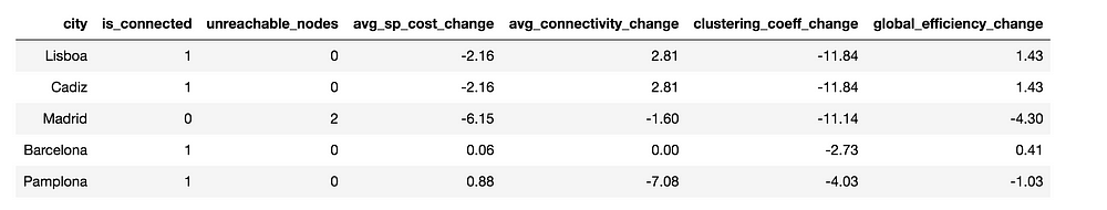
When looking at betweenness of nodes, high betweenness signifies lots of traffic through that city as many shortest routes run through it, so players should expect a lot of opponents to also want to go there. Cities such as Wien and Frankfurt are examples and are a priority to get early. Edge betweenness shows a similar pattern where lots of routes run through them, so it’s important to grab them before having to take a long detour.
Node connectivity of certain cities
When looking at connectivity of nodes, there are two key cities found, being London and Madrid, as if either of them is blocked, Edinburgh, Cadiz and Libona are all cut off from the board, giving them significantly more value to players who have routes going there. Edge connectivity is also important when looking for completing routes, even thought London-Edinburgh is the only route that disconnects the network. That being said, occupying certain routes makes the shortest paths between some cities much longer, such as Kobenhavn-Essen increasing average shortest path cost by 7.34%.
The article goes into much more detail about which routes to prioritize, alternate scoring strategies and how to block opponents effectively, but even with just barebones network analysis, the strategy of the game is elevated to another level. Understanding where players will tend to go and priorities for building allows one to more thoroughly plan out their route and adds more skill to the overall game. There probably is a whole other layer to this with game theory and common knowledge, but that is for another time.
Overall this article provides good insight into how strategy evolves from network analysis and understanding the importance of connectivity and traffic flow. This example from a board game can be expanded into the real world and establish priorities based on similar facts. Either way, just remember, it’s just a game, having fun is most of the reason to play.
MMORPGs are one the most popular and interesting genres in the video game industry. World of Warcraft, Black Desert Online and Destiny have been prominent examples of this genre for years. One the most unique features of MMORPGs are the virtual communities, most of the time referred to as Clans, that are created due to the nature of this genre, which promotes completing missions and quests with other players. One thing that has been interesting to me about these communities, are the characteristics and personalities of them and how they differ from each other. How do they recruit players and communicate with each other? Fortunately for us, there have been a research done by Markus Schatten and Bogdan Okreša Ðuri ́c from University of Zagreb about this exact subject by using analytical techniques and graph theories we are learning in CSCC46.
In this study, they observed and collected data from players, which were mostly students from three countries, for one month. After data collection, they used social network analysis (SNA) techniques to find patterns of organizational behavior among successful players.
The analysis of their data found multiple interesting player behaviors. For example, players usually describe their relationship with other players using characteristics like, Friend, Enemy and Blacklist. Another finding showed that communities are usually created among people who have the same interests. For example, players who try to complete the same mission, acquire the same items or have similar goals usually tend to group together. Analyzing chats and communications also showed that people who are on the same or similar real-life geographical locations, tend to use in game chat and whisper functionalities with each other more than others.
This study shows that analyzing player behaviors in games, specially player to player behaviors, can show many interesting facts which can be very useful to game developers to better optimize and design their games for their audience. It can also help scientists better understand how people communicate and interact with each other in virtual worlds.
Ever since I was young, playing video games was one of my favorite hobbies and it still is today. Over the years I have spent with this hobby, I have played various games that spanned a wide array of genres and have seen certain games come in and out of relevancy over time. And as I observed these patterns, I noticed I was asking myself “What games are currently popular? Why did certain games become relevant/irrelevant?”. As such, I wanted to see how applications of network analysis could help me in my quest to gain a larger perspective of the gaming community.
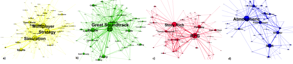
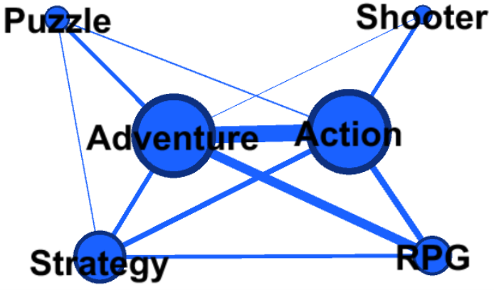
Luckily, Xiaozhou Li and Boyang Zhang of Tampere University have responded to my desire with their January 2020 study “A Preliminary Network Analysis on Steam Game Tags: Another Way of Understanding Game Genres”. In their study, they examined the largest PC gaming platform known as Steam and their user-defined tagging system. The gist of the system is that users can assign tags that they feel represent a game the best (for example, some might tag the game “Call of Duty” as an “Action” and “Shooter” game) and frequently applied tags will become featured categories for that game. Li and Zhang analyzed this tagging system by building a network of game tags, creating an edge between tags if they both were applied to a game. They then performed community detection to see how tags grouped up into communities and labeled the communities based on highest centrality nodes within each community, as shown by Figure 1.
In terms of content related to CSCC46, this study applies the concepts of community detection and PageRank, although the latter has not been discussed yet as of writing this blog. One interesting thing to note is how Li and Zhang performed community detection. They used a method called the “Louvain method” as opposed to the Girvan-Newman algorithm studied in class. Subsequently, the concept of betweenness also appeared in the study; edges with high betweenness connected game tags that usually are not used together. PageRank was used to evaluate the importance of the game tags within the network, much like how PageRank was originally used to rank search query results in search engines.
Figure 1: The resulting communities of tags, split into 4 groups: a) Strategy & Simulation Games, b) Puzzle & Arcade Games, c) RPG Games, d) Shooter GamesFigure 2: A graph showing the connections between the most popular tags.
So why would this information be interesting? Couldn’t you just load up a site like SteamCharts and see what are the top and trending games? Well, yes, you could. But that doesn’t give as broad of an image. The data that Li and Zhang extracted from their study would be useful for game developers as they can see what games people are playing currently. It can provide insight into what kinds of games are currently hot on the market or if there are any genres that are gaining traction. And while the data quality may have been marred by incorrect tagging, it still shows how the wisdom of crowds still provided data that was relatively accurate. Overall, I feel that if this information were frequently updated, publicly available, and covered a broader scope of platforms, it would be an incredibly useful tool for developers and gamers.
References
Li, Xiaozhou & Zhang, Boyang. (2020). A preliminary network analysis on steam game tags: another way of understanding game genres. 65-73. 10.1145/3377290.3377300.
In class, we learned about the various uses for graphs and Dijkstra’s algorithm. This made me consider how graphs are used in video games, considering the clear and visible variables that they use, and how much easier it would be to collect data from a game than it would be in real life. Graphs can help find relationships with variables and Dijkstra’s algorithm can be used to find the maximum distance between those variables. One use of these tools relating to video games would be for recommendations. Specifically, I will discuss about champion recommendation in the video game League of Legends.
League of Legends is Multiplayer Online Battle Arena (MOBA) game where two teams of players battle each other with characters called Champions. Players select Champions based on the roles they prefer to take to aid their team in the fight. There is a large inventory of Champions players can choose from. To ensure players try a variety of Champions, the developer of the game may wish to recommend other Champions that may suit the play style of the player. A naïve way to recommend Champions would be to compare the key attributes between the player’s most used Champion and other Champions in the Champion roster, finding one that shares the most features. However, using graph theory, it is possible to generate a network to find recommendations using the player base instead of the Champions themselves.
Suppose a player, who enjoys playing with Champion A, also enjoys playing with Champion B. Then it is very likely other players who enjoy playing Champion A may enjoy playing with Champion B. However, to generate a graph that strongly supports these predictions would require a lot of player data. Luckily, the game has a large player base, reaching 100 million unique monthly players at one point in 2017 (Spezzy 2020).
Typical attribute-based recommendation
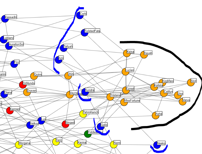
By having every Champion in the game be represented as a node and the weighted connection between two Champions be represented by the edges of the graph, we can find a much better representation of champion picks in general. These connections can be found by using the most played champions for every player in a given sample. If two champions appear in the same top five most played champions for a player, it can be concluded that there is a connection between them.
Example of connections per champion (Williams 2020)
While a graph like this would seem useful at first glance, it has its issues stemming from the mechanics of the game. Recommendations from this graph will most likely recommend champions who are in the same role as other champions since players tend to dedicate themselves to playing certain positions. A quick fix to this problem is to find each player’s top three Champions per role instead. We can then use Dijkstra’s algorithm to find champions with minimal distance from each other to give out much better recommendations than we would have with an attribute-based recommendation system.
Recommendation graph that skewed towards champions of the same position (Williams 2020)
In conclusion, graphs and Dijkstra’s algorithm allow for much better champion recommendations by taking advantage of the large amount of data from video games. I believe that this idea could also be extended for other recommendations services by checking what items or choices are chosen by users in common and recommending them to other users.
Sources:
Williams, J. J. (2020, September 20). Graph Networks for Champion Recommendation (League of Legends). Retrieved October 15, 2020, from https://towardsdatascience.com/graph-networks-for-champion-recommendation-league-of-legends-189c8d55f2b
S. (2020, August 03). Did you know? Total League of Legends Player Count – UPDATED 2020. Retrieved October 15, 2020, from https://leaguefeed.net/did-you-know-total-league-of-legends-player-count-updated-2020/
I’ve lately become quite fascinated by the financial world. This is generally a broad topic and includes subtopics such as equity markets, supply and demand curves, business acquisitions, etc.
What I have been observing recently is that a lot of mainstream financial analysis revolves around stock markets, mainly due to the rise in retail investing. In fact some great blog posts from this very class in past years do a great job of applying network analysis to equity markets.
However, I’ve personally seen a lack of blog posts and publications about a more socioeconomic and encompassing topic: venture capitalism. In a nutshell, venture capitalism is the concept of funding start-ups and early stage companies by individuals or firms with investment capital. I find this topic incredibly interesting because it involves substantial sums of money (often millions or even billions of dollars) transacted by a relatively small number of individuals or firms. During my exploration, I came across what I found to be an extremely relevant paper by researchers in the Department of Sociology at Tsinghua University in Beijing.
This paper explores how a small-world network can be formed to accurately model the relationships between Chinese venture capitalist (VC) firms. As we know from class, small-world models aim to maintain high clustering with short paths at the same time. This helps model real social networks more accurately. While the paper is quite expansive, I’d like to focus on how the model was developed, its key properties, and how it was validated.
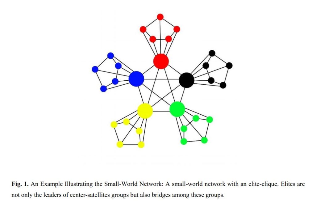
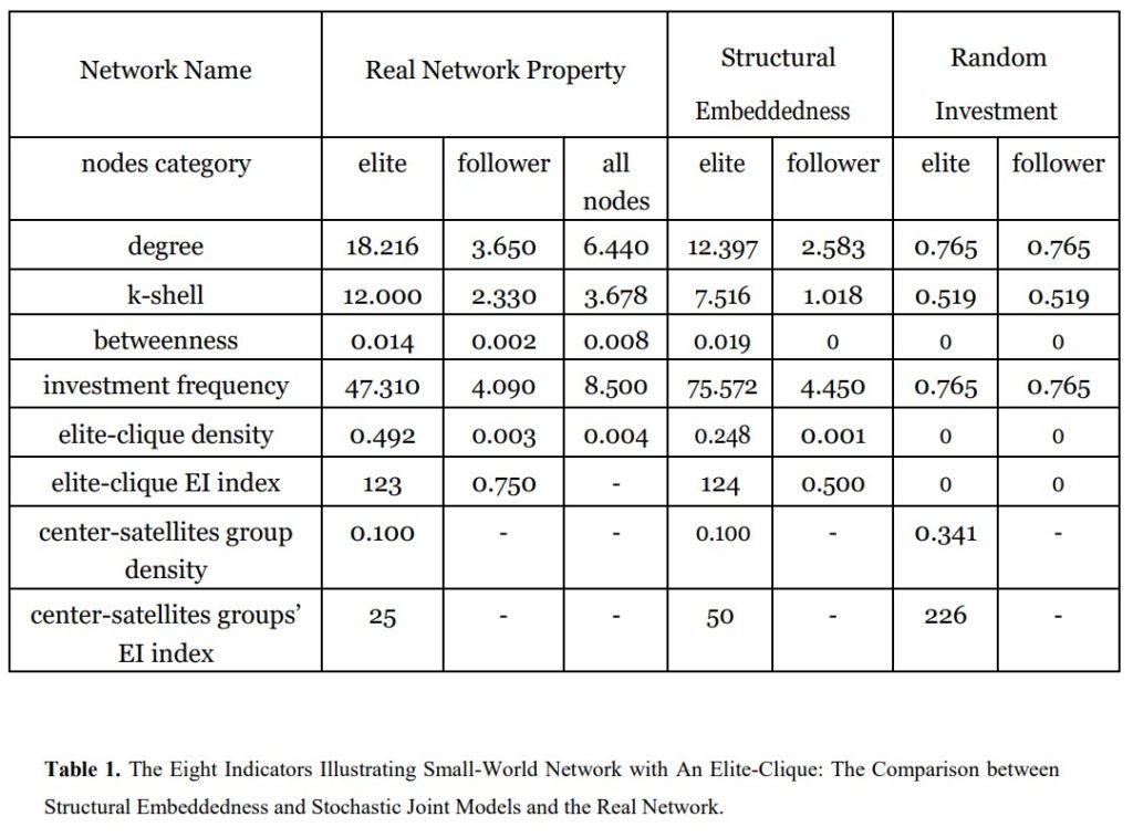
The researchers first observed existing firms in the Chinese VC industry via the SiMuTon Database to establish properties that must be reflected in the model. For example, they observed that there are few major firms (referred to as ‘elites’) that lead smaller groups. These smaller groups are connected by these elites, and therefore the edges between elites are actually bridges (as discussed in lecture) because removing them would break up the VC network. Furthermore, because of government intervention in China, there is a lot of uncertainty in the VC industry. Therefore, there is evidence of many alliances between VC firms to form higher trust and stability. These ideas were combined to form a small-world model representing the Chinese VC industry, which can be illustrated by the following example:
The ties between firms were determined by two factors. Firstly, the probability of an edge increased when two firms were mutually invested in some other. This uses the concept of relational embeddedness. The other factor uses structural embeddedness theory which says the probability of an edge increases proportionally to the number of common neighbours.
I find it very interesting that this development process followed the examples of small-world models we’ve seen in class. In particular, models such as Watts & Strogatz or Kleinberg’s use observations from experiments such as Milgram’s small-world experiment or the Columbia small-world study to help advance the accuracies of said models. Kleinberg’s model used the observed fact from Milgram’s experiment that as people sent their letter forward, the distance between the source and target typically halved.
Finally, the model they developed was tested against a random model to determine if any features are noteworthy or not. This is similar to using Gnp as we have in class. It was also tested against the real data which showed that accounting for embeddedness helped significantly boost the accuracy of the overall model compared to the random model.
References
Gu, W., Luo, J., & Liu, J. (2019). Exploring Small-World Network with an Elite-Clique: Bringing Embeddedness Theory into the Dynamic Evolution of a Venture Capital Network. ArXiv, abs/1811.07471. https://arxiv.org/ftp/arxiv/papers/1811/1811.07471.pdf
In lecture, we learned about “small-world” networks which are graphs characterized by high clustering and short paths. We were also shown how to construct them using Watts & Strogatz model. However, I wanted to see an example of a small-world network occurring in real life. After some searching, I came across a journal article “Local Interactions and the Emergence of a Twitter Small-World Network”, written by Eugene Ch’ng.
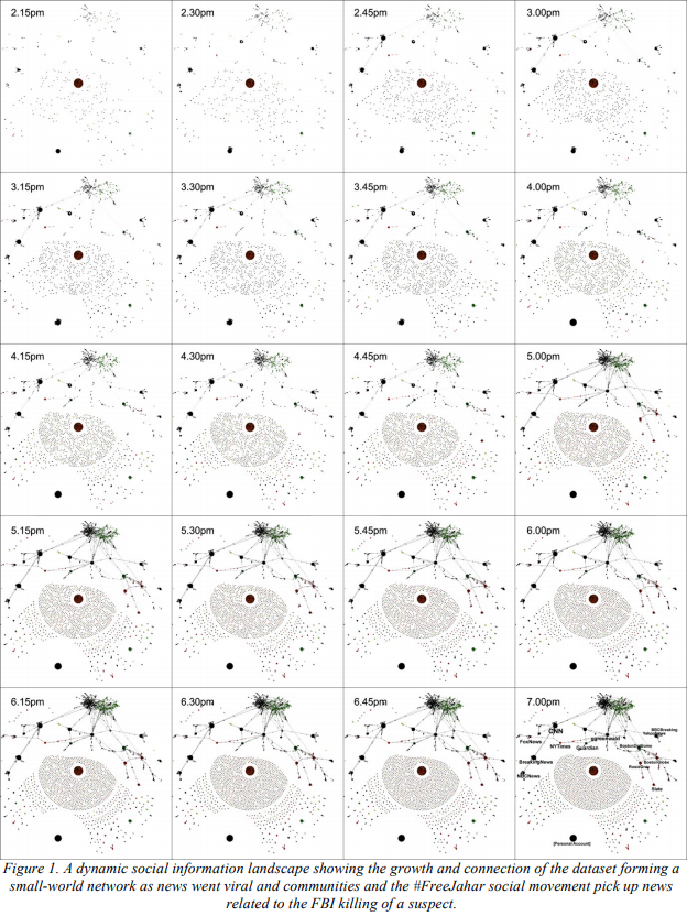
The paper was published in 2015 and the researcher analyzed Twitter activity relating to one of the suspects of Boston Marathon bombing back in 2013, Dzhokhar Tsarnaev. There was a small group of people who insisted on his innocence under the hashtag #FreeJahar which caused a lot of controversy. So, the researcher proceeded to collect data from Twitter over the course of five hours using #FreeJahar and related hashtags and words. Using the data, he constructed a directed graph which had two types of nodes: a user node and tweet node. If edges went from a user node to a tweet node, that meant the user published that tweet and if an edge went from a tweet node to user node, it meant that the tweet mentioned that user.
The researcher showed that in the time period of five hours a small-world network formed from the dataset. The large cluster at the top represents interactions between users relating directly to #FreeJahar. This cluster includes both conversations between the supporters and the opposers of the movement. We can see there are smaller clusters forming under the large cluster. These smaller clusters were centered around activity from news channels. As time went on the clusters started to become more clustered and more connections began to form between each cluster. The data below the small-world network are various isolated interactions relating to #FreeJahar.
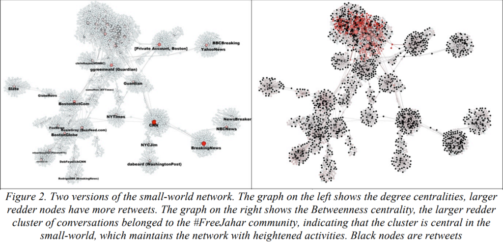
The properties of the networks the researcher found was interesting. The left graph compares nodes by their degrees. The nodes with the highest degrees are the news channels, which makes sense as people typically retweet news stories. The right graph shows the betweenness of the nodes, and the nodes in the main cluster had the highest betweenness. Ch’ng concludes that since the nodes in the main cluster have the highest betweenness, these nodes are the ones creating and maintaining the small-world network. This was confirmed when eventually, Twitter accounts belonging to the main cluster got suspended and he saw that the small-world network broke apart. He also noted that in the right graph, there is two ‘sub-clusters’ inside the big cluster, one denoting the supporters (red) and the other the opposers (green). Formation of this big cluster happened because the supporters and opposers would interact in the form of arguments.
In conclusion, the author of the paper states that the formation of small-world networks on Twitter during a news event could help people that are supporting or opposing a cause. For example, if a Twitter account is spreading misinformation, the suspension of that account can contribute to the fragmentation of the small-world community. This causes path lengths between users to become longer and make it harder for misinformation to spread. Although this article was published in 2015, I thought it is very relevant today, as many crises today are being brought to our attention today through the use of social media.
We all made friends throughout our lives, some made more friends, some made less. But do you know that you actually have less friends than you thought you had? Now to illustrate this, think about the friends you have on social media, whether its Facebook, Instagram, Twitter, Wechat, most likely you will realize that you have connections to more people than you actually talk to and consider as friends.
This is based off of the friendship paradox, a form of sampling bias which states friends of a person tends to have more friends than the person thinks. This observation was first talked about in 1991, where a sociologist Scott Feld, conducted a study on social networks of people. His study was to take a deep dive into the average number of friends a person has in their own network and compared it with the average number of friends this person’s friends have. He concluded that the average number of person’s friends is always higher than the average number of friends for this person.
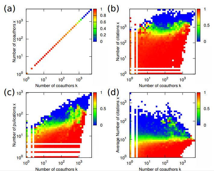
Another example conducted by Young-Ho Eom and Hang-Hyun Jo at Aalto, in which one study they conducted was taking two academic networks, where scientists are linked if they have co-authored papers together. A graph was generated where each node is a scientist and was represented in a paradox holding probability they defined as h (k, x) where k is the degree and x is the node characteristics.
Graph a is a representation of numbers of coauthors, graph b is for the number of citations, graph c is the number of publications and graph d is the average number of citations per publications.
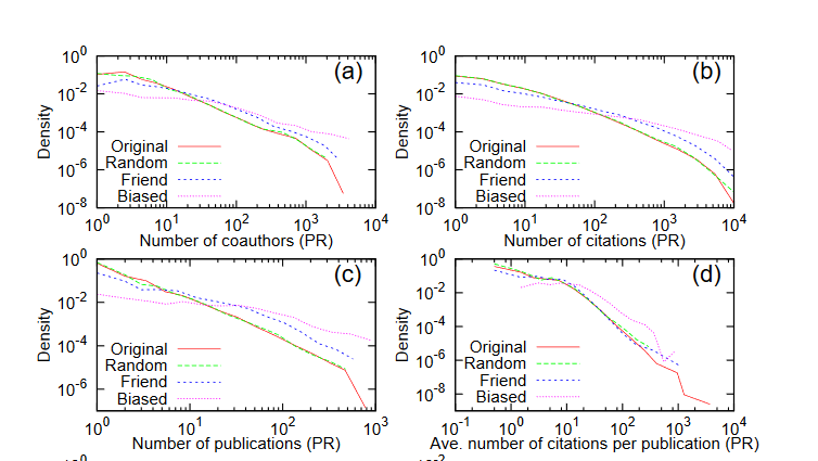
Later on in the study, they conducted using different sampling strategies to see if other sampling methods yield the similar results. Here are the characteristic distributions of the sampled data in the network using different sampling methods.
The common observations from the graphs, which are degree distributions, is that the denser the distributions, the better sampling it implies for the high characteristic nodes. Also, in most cases, the friend sampling shows a better result than random sampling, but one area, which is the average number of citations per publications in the network. As we can see in graph D, that the degree characteristic correlation is very small, around 0.07, but still yields very good results in comparison to other methods.
As expected, looking at a specific scientist and compare it to its co-authors, it reflects the results of the friendship paradox, where the co-authors have more co-authors than the selected scientist. The reason behind this paradox is because of how the graphs are constructed and how the ties between nodes structured.
Do not feel inadequate about “having less friends than your friends”, since most people are actually in similar positions. Just remember friends are all about the quality not the quantity.
Sources:
ArXiv, E. (2020, April 02). How the Friendship Paradox Makes Your Friends Better Than You Are. Retrieved October 17, 2020, from https://www.technologyreview.com/2014/01/14/174587/how-the-friendship-paradox-makes-your-friends-better-than-you-are/
Eom, Y., & Jo, H. (2014, April 10). Generalized friendship paradox in complex networks: The case of scientific collaboration. Retrieved October 17, 2020, from https://arxiv.org/abs/1401.1458
Using the knowledge of graph theory, one could generate a network of entity relationships that appear in daily news articles and analyze the connections between such entities. Such a network can be constructed using the following method as outlined by Marcell (2020):
Extract entities from news articles and define them as the nodes of the graph. Entities could either be a person or an organization.
Link pairs of entities that appear on a news article together or add to the weight if such a link already exists.
Using the above method, we would arrive at a network of people and organizations along with their degree of relationships denoted by the edges. An example of such a network would be the following
Graph generated using news from the UK during March 26, 2020. Source: https://towardsdatascience.com/building-a-social-network-from-the-news-using-graph-theory-by-marcell-ferencz-9155d314e77f
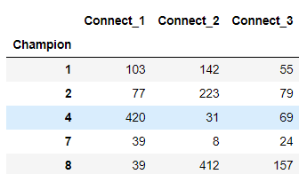
There could be several questions that can be answered through the construction of such a network. For example, one point of discussion could be along the words of “how is person X and person Y related”? Questions like such could be answered by analyzing the connections that are present in the graph. For example, if there exists a link between person X and person Y, we could derive that they have been directly involved in an event described in a news article. Also, if there does not exist a direct link, but there is a mutual entity that connects person X and Y, then we can conclude that it is very likely that person X and Y know each other in real life. Along with describing the relationships between two entities, the connected components that form during the construction of the graph could be used to categorize entities into related groups. Marcell (2020), using the network derived from news articles posted in the UK, was able to categorize the news topics into eight themes (US politics, Australian academic institutes, and so on). The categorization was derived using carefully visualizing the connected components that are present in the network.
Furthermore, we could analyze the popularity or influence that a person has on media using the network. Such an analysis is straight forward and deals with the connectivity of a given entity to other entities. Specifically, if a given entity has paths leading to several entities in the graph, then we can conclude that that entity is quite popular in the news media. This ties back to the idea of degrees of separation discussed in the lectures. The Bacon number is a related phenomenon that also deals with the degree of separation but specifically in Hollywood. It was found that only 12% of all the actors in Hollywood cannot be tied to Bacon using co-appearances. The same theory could be used to answer who has been the most influential person on the News by analyzing the links between the entities in the constructed graph.
In conclusion, graph theory could be employed in the news to analyze the relationship between entities that appear in the news media. Relationships between two particular entities, categorization of the entities into news topics, and the degree of influence of entities are only a few derivations that are possible using the news network. In theory, one could potentially extend this construction into several other industries to achieve insightful derivations that answer questions that are specific to that industry.
References:
Ferencz, Marcell (April 13, 2020). Building a Social Network from the News using Graph Theory. Retrieved October 17, 2020, from https://towardsdatascience.com/building-a-social-network-from-the-news-using-graph-theory-by-marcell-ferencz-9155d314e77f
When work from home and study from online courses become many people’s new daily life, you may find out that being active and keeping in touch with people start to become harder and harder. While practicing social distancing is crucial and required to beat the coronavirus in many countries, being socially connected is still very important for people’s mental health. You probably put much more efforts than ever to stay in touch with your close friends, family and colleagues during this stressful period. However, even you can make more texts or video calls with the family and close friends, surprisingly you may find yourself start missing lots of interactions with people, especially, with strangers or some people you barely know. How come? It’s actually quite normal because you are probably missing your weak ties.
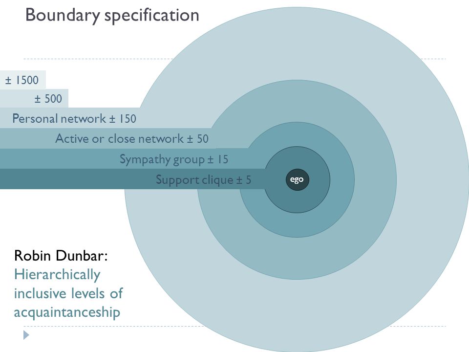
Many people do not realize that they actually belong to a much wider and complex social network than they believe they belong to. According to Robin Dunbar’s study, the average number of individuals’ stable social relationship is 150. Only around 50 of 150 relationships can be defined as the close network, the remaining are likely to be counted as your weak tie relationships. Think of the barista that you have small conversations many times a week, the the people you meet when you walk the dogs, or some people you see at the gym, they are all your weak ties.
Some people think maintaining the weak ties relationship could be useless, but the truth is that weak ties play an important role in everyone’s life. Baumeister and Leary point out that human being needs belongingness, the fully satisfying relationship.Weak ties relationship greatly help people to expand their friend circle and feel less alone. Moreover, weak ties could bring people more information and opportunities. Mark Granovetter’s study shows people could find some unique job opening information from their weak tie network. Also, Gillian and Elizabeth’s study shows that the interactions with people’s weak ties network could even contribute more happiness to individuals than people interactive with close friends or family members.
During the COVID-19 pandemic, social distancing may let everyone has a high chance of losing some parts or even all of these weak tie interactions. According to the article Why You Miss Those Casual Friends So Much, people normally will have around 11 to 16 interactions with their weak ties each day. Stay connected with your strong ties is obviously crucial and beneficial. Still, you can keep in mind the importance of the weak ties and maintaining your weak ties could bring you some additional surprises.
If you would have said your future goal was to be a “Youtuber” two decades ago, everyone would have thought you have lost your mind. However nowadays, “about 3 in 10 American children want to be a Youtuber, and lesser preferences include being a teacher, astronaut, and a musician. [1]” Being an established Youtuber is not easy, Youtube has over a billion users, totaling 228575 distinct user channels, 400249 user recommendations, and 400249 Youtube recommendations [2]. Youtube remains to be competitive by utilizing its click-through-rate with its accurate video recommendation algorithms. These numbers are indeed daunting for some of us who would want to start a youtube channel in hopes of earning money. Then, the common question of all YouTubers is “How can I get more views?”
In the study by Yonghyun Ro, Han Lee, and Dennis Wan, nodes in the network represent a youtube video. Two nodes are connected with a directed edge if one video recommends the other. The researchers study the technique of PageRank, which allows them to observe a pattern for a highly viewed video for the categories. The PageRank algorithm works as so: each video on youtube is given a PageRank, which represents the number of other videos it connects to via edges. The more outgoing edges it has, the more links that particular video has, and hence it will have a higher PageRank. However, there is a slight problem to this, it becomes very easy for others to forge the PageRank of a video so that their PageRank is higher. This introduces the Random Surfer Model, which randomly picks a video to visit, and goes to the videos that it’s linked to and then picks another video randomly, so on. It keeps a score of how many times a video has been visited, those videos that have more links are visited more frequently. This brings up another problem: what if all videos are not connected via a link? Then it limits us to only visit that specific cluster of videos and disregard the rest of the videos. This is solved by occasionally resetting the random surfing by its damping factor so that it does not disregard any of the videos.
The researchers analyzed the total PageRank score of Youtube around 750,000, where each video has its own PageRank score. Youtube allows each video to have about 20 recommended videos. Then, if video A is one of the recommended videos of video B, there is a directed edge from B to A. As understood from the PageRank algorithm, if a video has a higher PageRank score means that the video is related to many other videos in the network. Thus, it will have a larger influence than other videos within the network and will be recommended to a larger percentage of the users.
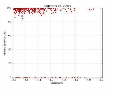
Above is the data that compares the PageRank of a video to its views and its video length. The graphs have x-axis as the PageRank score in log10 base and y-axis is the percentile of each video feature (views and length). From the graphs, notice that there is a high correlation between the PageRank score and the views associated with the video i.e the higher the PageRank score the higher the views for the particular video. On the other hand, if we take a look at the graph that compares the PageRank of a video to its video length, we notice that there is a relatively low correlation. This tells us that most of the videos that have a high-influence and high PageRank scores are usually a shorter length video compared to the other videos.
So, next time your uploading your youtube video and you find yourself asking “How can I get more views?”, be sure to remember this algorithm and focus on increasing the PageRank of your video!
What would you do if your paycheque was in millions? Perhaps you’d buy a mansion, a Ferrari or pay off all your student debt. But with a lump sum of money comes other big issues, which is why a lot of people decide to hide their money in secure offshore companies. The Panama Papers scandal reached headlines back in 2016 when 11.5 million documents of the world’s fourth biggest offshore law firm were leaked. According to the Guardian, these included accounts pertaining to the hidden wealth of the world’s most prominent leaders, celebrities and politicians such as Vladimir Putin, Nawaz Sharif and several others. While using the services of offshore companies aren’t illegal, the files raise fundamental questions about the ethics of such tax havens – and the revelations are likely to provoke urgent calls for reforms of a system that is arcane and open to abuse.
In our lecture this week, we talked about the ‘six degrees of separation’ and how for any pair of people, there is a friendship path between them. This would mean that it is easy to find patterns that show connections among different people. However, a 2020 research study conducted by an assistant professor, Mayank Kejriwal, concluded that the Panama Papers network of offshore entities and transactions were all disconnected and did not contain any triangular structures. It is precisely this disconnectedness that makes the system of secret global financial dealings so robust. Because there was no way to trace relationships between entities, the network could not be easily compromised. This study was performed with a focus on structure as a means of expressing and quantifying the complexity of the underlying system.
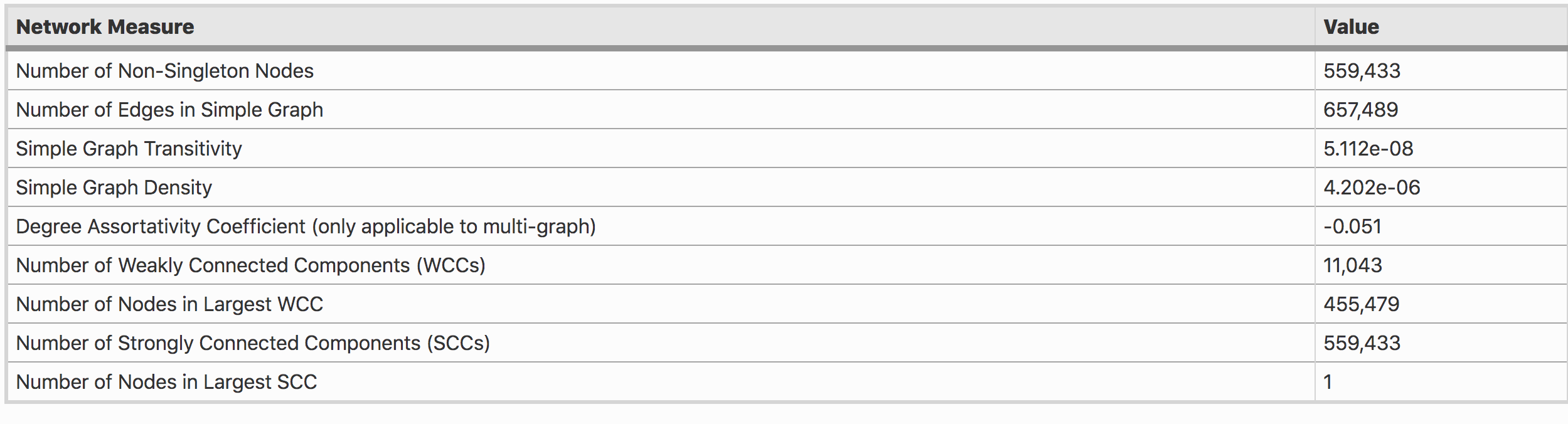
In his research, Kejriwal calculated the density, weakly connected components (WCC) and strongly connected components (SCC) of the network. Table 1 shows that there are no non-trivial SCCs in the graph G (every node falls in its own SCC when partitioning the graph into SCCs). He also calculated the transitivity of G which is the fraction of all possible triangles present in the graph. Transitivity for multi-graphs is not well-defined; hence, it is only shown for the simple network equivalent of the Panama network. Overall, the network is extremely sparse and unlike social networks, the transitivity is also very low.
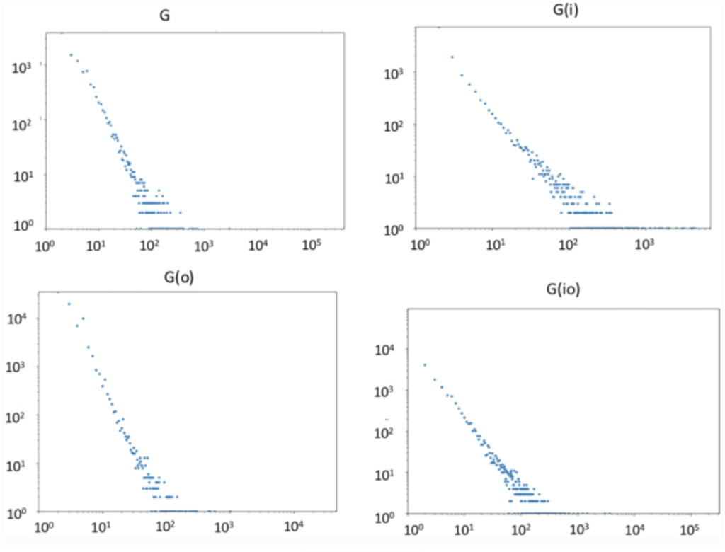
Table 1: Network MeasureFigure A: Connected component size distributions of G, Gi, Go, and Gio. The x-axis is the number of nodes in a connected component and the y-axis is the frequency of that size in the dataset
The above figure shows a lack of connectivity, and a systematic distribution of component size, which is an indication that the networks are dissimilar from social networks which tend to be connected (or almost connected). In other words, the Panama Papers do not seem to exhibit any ‘small-world’ phenomenon.
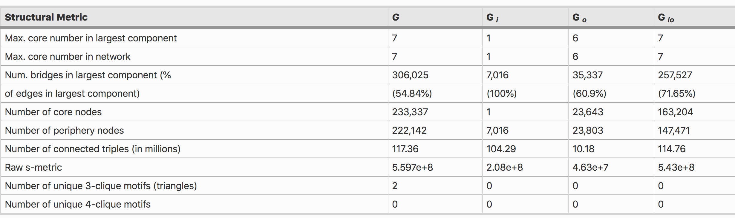
Table 2 shows that the number of bridge edges in the network are very high (and sometimes extreme in the case of Gi which is 100%). This suggests that every edge in the largest component in Gi is a bridge.
Table 2: Structural Metric
In particular, the lack of small-world phenomena in all selectively constructed and higher-order networks seems to be suggesting that a different theory is at play in this dataset, and that disconnectedness is a fundamental, emergent feature. Assuming the connected components proportionally capture some level of corrupt activity, corruption itself would seem to be a rather robust phenomenon, since targeting a few nodes would not bring the whole structure ‘down’. Even more disturbingly, data suggests that the larger components would also have limited utility in cracking down on overall illicit activity. Finally, we should consider the dynamic nature of entities: offshore companies can quietly and quickly change ownership and beneficiaries in many jurisdictions, intermediaries can be replaced or shut down, and new shell companies can emerge, all in short order. Robustness is, therefore, an inherent feature of this system in more ways than one.
Since small world phenomena did not occur in a single network, and the distribution of connected components seems to follow a clear and consistent trend throughout, it suggests a stark difference between patterns exhibited in small-world networks.
According to Kejriwal, even if you randomly connect things, in a haphazard fashion and then you count the triangles in that network, this Panama network is even sparser than that. He also added, “Compared to a random network, in this type of network, links between financial entities are scrambled until they are essentially meaningless (so that anyone can be transacting with anyone else).”
These reasons are why it is challenging to crack down and trace the network of these systems.
Unsurprisingly, the spread of epidemics and network analysis go hand in hand but this article in particular caught my attention due to its bold and perhaps even controversial application of graph theory to a morbid question:
How many Americans need to die before every American knows one of the dead?
Adam Rogers – Death Cuts the Degree of Separation Between You and Covid-19
I thought at first that it was a bit of a silly question, one that we really shouldn’t have to ask. But I decided to I give the article a chance: it was the best lead I had relevant to current events.
At first they took a relatively simple approach to the analysis: Take the number of people a person is likely to know on average. Find the percentage of one death out of that total and multiply that by the entire population. This depended very heavily on the definition of “number of people a person knows on average” and estimates ranged from 546, 000 all the way to 1.6 million people.
Obviously, that isn’t entirely accurate, but it’s the caveats they introduce afterwards that present interesting subtleties about networks that apply to all sorts of analyses about them. For instance, the way disease spreads isn’t uniform or random. In class we’ve already learned that the structure of the graph in it of itself isn’t even close to the inherently random processes that generate a graph like Gnp, so it’s not hard to consider that the processes that spread information or illness would depend on the outside context that nodes live in. Certain cohorts or clusters are far more susceptible to COVID-19 just based on the foci they are involved in or who they are (i.e. older adults or the elderly). Furthermore, the mutual interaction of clustering and homophily lead to a phenomenon termed in the article as overdispersion, which is a statistical term for greater variance than expected for a particular variable. This causes the number of people that need to die to go up, because even as the deaths spike, certain communities may remain isolated from the direct effects of the pandemic.
Besides the context, the structure of networks plays a role as well, causing the number of people that need to die to be lower than we expect given the simple analysis above. Particularly it is the uneven distribution of degree, analogous to the funneling described in Milgram’s experiment related to the fact that certain people have more connections than others. In this article, it was termed the friendship paradox the idea that your friends probably have more friends than you. The unfortunate conclusion is however, that people who have a certain “centrality” in the network also have a greater risk of getting sick – and because they know more people, and such a death would mean that the less people overall would need to die before everyone knew someone personally.
Finally however, they bring up that even without all the caveats and extra reasoning about the context of these graphs the theoretical problem we are fundamentally trying to solve is NP-complete. The problem can be called the Minimum Dominating Set and can be framed as:
“For a given graph, what is the minimum set of nodes such that every node in the graph has at least one neighbor in that set?”
It is distinct from the “Vertex Cover” problem (which was covered in the CSCC63 Computational Complexity course) where we ask:
“For a given graph, what is the minimum set of nodes such that every edge in the graph has at least one endpoint in that set?”
Regardless, both are NP complete, as prove by Richard Karp in 1972 (if you’re interested, you can try to prove this using a linear reduction from the set-cover problem, see the the section on computational complexity). This is to say, of course, that even the simplest version of the problem we proposed cannot be solved in polynomial time, only approximated.
Which perhaps brings me back to my initial thought about this topic. While its analysis may be intellectually stimulating, and provide an opportunity to ponder tricky problems, it really isn’t the reason why such a question is asked in the first place. Because in reality, even if we were able to answer such a question efficiently and present the answer to people, it wouldn’t change the very psychological problem that lead to all of this thinking in the first place – that people choose not to listen to the facts and choose not care when it doesn’t affect them personally. Perhaps, it is not the sheer number of connections, but the weight those connections hold that requires a collective understanding.
dis·in·for·ma·tion | \ (ˌ)dis-ˌin-fər-ˈmā-shən : false information deliberately and often covertly spread (as by the planting of rumors) in order to influence public opinion or obscure the truth
Coined by Joseph Stalin, disinformation (or dezinformatsiya) emerged during the early days of the Stalinist regime. Used in both World War II and the Cold War, the act of deception is rooted in warfare. Although, this isn’t to say that disinformation can only be in the form of deception. Propaganda, similar to disinformation in its utilization, can be used to influence its audience by misrepresenting the truth or selecting facts and arguments to invoke a specific emotion.
In the present day, we have the term “fake news”, popularized by Donald Trump; describing the spread of misinformation on the Internet and by the media. Unlike disinformation, misinformation can start and be spread by misguided people who sincerely believe in the content they are uploading. The virality of information on the Internet is rapid and widespread as there are many connections between the different communities.
One of the biggest disinformation campaigns in recent times is Trump’s claim that mail-in voting increases the risk of voter fraud. Although I am not well-versed in politics nor the US political system, it was interesting/amusing/terrifying to see many media outlets and academic fact checkers cover this story throughout the year.
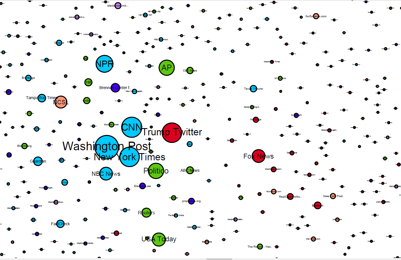
In a very recent publication on the 1st of October, Harvard researchers analyzed over 55,000 online media stories, 5 million tweets, and 75,000 posts on public Facebook pages about this claim.
This network map represents all online media outlets for 2020 on the topic of mail-in voter fraud. The nodes are sized by inlinks from other media sources, location is determined by the linking relations of all media sources, and colour is determined by their side on the debate.
On the Internet, disinformation can be spread rapidly and easily, so it is of the utmost importance to find a solution. We cannot change the fundamentals of the communication network because all information would be affected, but rather we must focus on the integrity and policies in place to prevent both misinformation and disinformation from spreading.
If you have ever played an online multiplayer game, you probably have played against or with a cheater. Cheating in Video or PC games isn’t a new phenomenon. In this article, we are going to analysis the social network of cheaters and find out some interesting behavior of cheater’s social network compare to non-cheaters.
Usually the behavior of an individual is heavily influenced by his social ties. With this assumption, we believe that cheaters should tightly connected to other cheaters in the social network. In addition, cheating in a game often treated as an unethical behavior, and majority of the players do not like to play with a cheater. Therefore, non-cheaters should have a different social network with cheaters.
To understand the position of cheaters in the social network, we analysis the Steam Community (A social network platform for steam users i.e. the player who plays the games that sales on Steam)
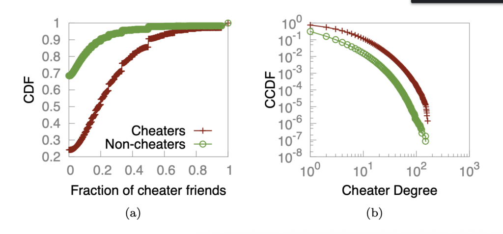
By looking at the commutative distribution (CDF: f(x) = P(X <= x)) of fraction of cheater friends and Complementary Cumulative Distribution (CCDF: f(x) = P(X > x)) of cheater degree (number of friends are cheaters). We can easily see that nearly 70% of non-cheaters have nearly no friends with cheaters, while 70% of cheaters have at least 10% cheaters as their friends. In addition, cheaters have overall higher probability friends with cheaters than non-cheaters.
We noticed that the cheaters often propagated via direct influence from other cheaters.
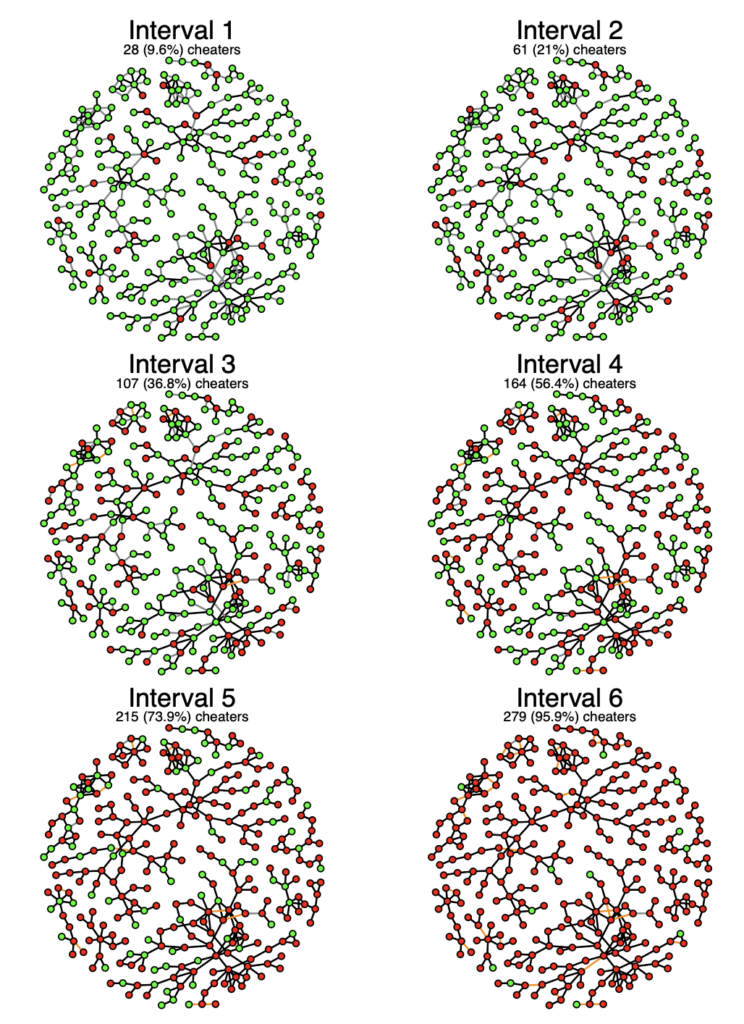
This figure shows that the spread of cheating behavior of monitored user group in Steam over a 1-month period, split into 6 intervals. The red node represents cheaters and the green node represents non-cheaters. Edges represents the friendship between users. Gray are newly formed friendship in the future interval, and orange are the edges that have been deleted from previous interval.
The graph shows that how rapidly the influence can be, out of the 279 cheaters at the end of the Interval 6, only 28 were cheaters a month before, resulting clusters of cheaters in the network.
As we can see that cheaters seem to form another social network with other cheaters that embedded in the overall player community. Also, even cheaters are often an anti-social behavior, it seems like it can also rapidly influence other non-cheat players to cheat.
Reference:
BLACKBURN, JEREMY, et al. Cheating in Online Games: A Social Network Perspective. https://www.cse.usf.edu/dsg/data/publications/papers/cheating_TOI.pdf
Bitcoin is an online currency and its popularity has been growing in recent years. It was create to be a purely online cryptocurrency, which has been decentralized as an electronic currency, and it was first introduced to the public in 2008 on the domain name Bitcoin.org. The growth of this currency did not accelerate until 2015 to 2018. It peak in the late 2017, where 1 Bitcoin was worth nearly twenty thousand dollars USD. After three years, the value of a single Bitcoin did drop; nonetheless, it is still worth an impressing fourteen thousand dollar USD. As the value of each Bitcoin rose, the interest of people mining and using them as virtual currency also increased. Mining for Bitcoin became a very common phrase, where people visualize programmers online digging large data worth of riches with a fantasy pickaxe. In reality, Bitcoin mining is performed by high-powered computers that solve complex computational math problem some of these problems are so complex that it is impossible to be solved by normal computers.
Interests:
The uniqueness of the Bitcoin online transaction is the users and their transactions can remain anonymous, while in traditional bank records all transactions between all users. The connection and users of normal banks would create an intriguing graph to analyze; however, the graph between anonymous Bitcoin users will be much more interesting to analyze. Each user of Bitcoin contain their special key that allows them to access their Bitcoin account anonymously, yet all the transactions of these anonymous nodes can all be accessed and tracked publicly, which can provide an unusual graph.
User Analysis:
The main contributors to Bitcoin’s success are the data miners and the users who use and bank them. Many type of contributers:
The user that deposits Bitcoins into the bank and receives a public key
The user that incorporates his public key and allows bank to track his transactions
The transactions that allows the network to flow
The transactions between the miners and transaction block
The linking of transactional blocks
In the following simple graph displays the micro transactions between users, banks and miners.
From this simple depiction of a simple Bitcoin transaction, the user’s relationship with Bitcoin forms the structure of a bowtie. The interaction of each user and other users forms a strongly connected component. The public key received from the bank to each user and the transaction blocks formed by users can represent as the IN of the structure. The OUT structure of this bow-tie structure would be the miners. The Tube connecting the miners to the transaction block allows new currency to flow back into the network.
Graph Analysis:
In the following data graph shows the visualization of the user network. The large clusters shows the external incomes, such as Bitcoins received from other clusters. The edge between any two nodes represents at least 200 transactions.
The nodes are colored by category: blue nodes are mining pools; orange are fixed-rate exchanges; green are wallets; red are vendors; purple are bank exchanges; brown are gambling; pink are investment schemes; and grey are uncategorized.
The three main clusters in this graph are between satoshi, mtgox and deepbit/slush. Satoshi is the pseudonymous of the inventor of bit coin, as he holds a large share of the Bitcoin transaction between him and other users should be most frequent. Mtgox is arguably the second largest cluster center in this graph as they are a Bitcoin exchange base for Japan that process most bank exchanges. Deepbit/slush are large mining sites for Bitcoins, they provide new funding for rest of the graph, resulting them to become the third largest cluster hot zone. These three large clusters form a strongly connected graph. The connection between each cluster centers forms strong ties as they contain millions of transactions.
Conclusion:
In conclusion the graphs show the characterization of the Bitcoin network, focusing on the user to user transaction with no real identification of each user other than a public key. To accomplish this task, the analysis of the new clustering heuristic of each graph. This shows the intricate network of Bitcoin transaction and the connection between anonymous users.
Reference:
Meiklejohn, S., Pomarole, M., Jordan, G., Levchenko, K., Mccoy, D., Voelker, G. M., & Savage, S. (2013). A fistful of bitcoins. Proceedings of the 2013 Conference on Internet Measurement Conference – IMC ’13. doi:10.1145/2504730.2504747
As the election for the next president draws near, there is more attention in the media. The importance of media is very high as it is a means of communication for everyone around the world. It is supposed to report the truth for recent events, which is why it is important that the news is true. If the news isn’t true, then it is considered fake news and can affect real life events such as the election. This can lead to a devastating result such as the election of an unworthy president. Another recent event in which fake news has impacted real life events is the spreading of false information regarding COVID-19. There are countless fake news about the current virus such as “Dark skin people are protected from the infection” or “Hand sanitizer can’t kill viruses”. If people believed in the former and decided to go to the public without safety measures, it would result in a higher chance of getting the virus and may result in death. This is why it is important that fake news is ceased and deleted as soon as possible to save people around the world.
The challenges of identifying fake news can be broken down into three parts:
Unverifiable Data
Huge Volume of Data
Evolving Behaviours
The use of algorithm detection often leads to false-positives and incorrect results near the edge cases(scenarios where the shared news is hard to determine as it is on the borderline). Instead, a better approach is to calculate a reliability score for each content. Automatically allow or disallow the content if the reliability score is high or low respectively. When the reliability score is around the middle, use graph theory to identify the likelihood of fake news.
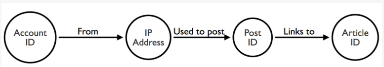
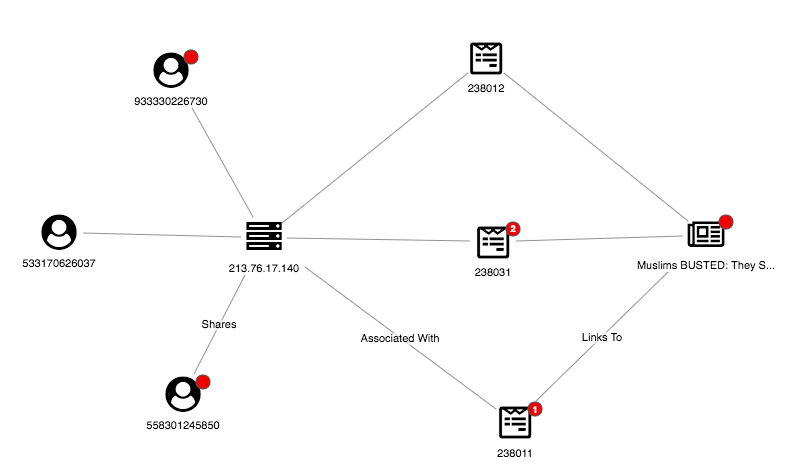
Such a graph is created using three nodes with the relationship shown in figure 1:
Account(age, history, connections)
Post(Timestamp, flags/reactions, IP address)
Article(Host URL, author)
Figure 1: Generic graph structure
These three nodes can help to find various connections that can be an indication of whether the content is fake or not. For example, accounts that are relatively new and share a content should be flagged as unreliable. Usually accounts with purpose to spread fake news don’t only share one content but multiple content. This would result in a graph like figure 2.
Figure 2: New user sharing multiple flagged news
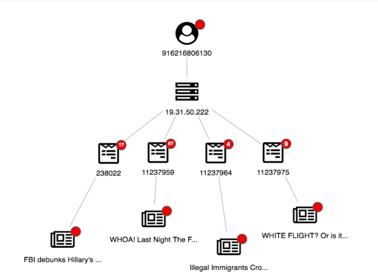
Another easily identifiable link that suggests fake news is one that is called “link farm” in which multiple accounts are used to increase the popularity of an account. Figure 3 shows this exact scenario where three accounts from the same IP address all share the same three articles which results in a diamond shape.
Figure 3: Link Farm
The above example is also a scenario which can be described as unusual behavior. It can be hard to detect using algorithm detection without graph theory.
In conclusion, it is important to stop the spreading of fake news as it can severely impact the outcome of various real life events. Thanks to Cambridge Intelligence, they have used the above to create such a program. This program is called KeyLines which attempts to filter fake news using the graph theory and a reliable data set from BS Detector and Buzzfeed Fact check.
Four weeks into the NFL season and teams have begun to realize exactly how successful they can be this year. Some teams are undefeated, while others have yet to record a single win. How exactly do team executives and coaches decide on signing or re-signing a player they believe can improve their team? One obvious way is to use player statistics from prior seasons. However, what if there was a way that did not involve using any player statistics. A study by Salim & Brandão attempted to use a NFL social network to predict team success.
In the study by Salim & Brandão, nodes in the network represented quarterbacks and teams. Edges represented the labor relations between quarterbacks and teams. The figure below is the NFL social network the researchers came up with.
The researchers calculated the clustering coefficient of the NFL social network and compared it with that of the Erdös-Renyi network. Since the clustering coefficients of these two networks were very different, the researchers were able to determine that the NFL social network was not a random network. In class, it was explained that the Erdös-Renyi Random Graph can be used to determine if networks are random or not, which is exactly what Salim & Brandão demonstrated in this study.
Using the Pearson coefficient, the researchers determined a positive correlation between node degree from the NFL social network and team success in one of two NFL conferences. Figure 11 displays the positive correlation between node degree and team success in the American Football Conference (AFC). This result is significant considering the researchers compared this model’s findings with another model that used a quarterback performance statistic called passer rating, to predict team success. In that model, there was no pattern of correlation between passer rating and team success (Figure 10). This meant that the passer rating metric did a poorer job in predicting team success, compared to the model that used the property taught in class called node degree.
In my opinion, the results from this study can have major implications in the sports world. What intrigued me to read and write about this study was how the researchers used concepts taught in our class, in order to make meaningful observations about one of my favourite sports. In the competitive world of professional sports, teams are always looking for an edge over their competition. Instead of using player statistics to make roster decisions like every other team in the league, team executives could start utilizing social networks to determine if they should sign or re-sign certain players. It will be fascinating to see if social network analysis can change the way professional sport teams conduct their business in the future.
In order for hackers to attack a corporation, they must first find a method to gain access to the corporation’s LAN. This can be done by phishing certain individuals within the organization and getting access to their workstation. However, that individual may not have enough privilege in the organization and their account cannot access the information sought after by the hacker. At this point, they must make use of the account they acquired in order to try to hack into an account with higher privileges.
To find accounts with higher privileges, a viable method is identity snowball attack or derivative local admin attack. This method uses the account they have acquired, and scan for other users on the network. Afterwards, a random user is picked as the pivot and the process continues until the desired domain admin account with all the necessary rights is found. The problem with this method is that it is possible to arrive at dead ends where the account does not give any further access. In this case, it is necessary to go back to the previous user, scan the network, and repeat the process again. So the problem with this method was that it takes a lot of time and especially larger organizations.
In this diagram, the red highlighted computer with no person is the initial account obtained through phishing or other means. The computer scans the network for other users and randomly chooses the next target. It goes up, and to the right. However, the top right user does not have any further access, so the hacker must go back to the previous user, and randomly choose again until they arrive at DA, which signifies as domain admin.
There is a much better way to perform such attacks using graph theory. It would be wise to construct a graph that illustrates the relationships between the users, their admin rights, and group delegations. An application called BloodHound was developed to do so. A graph can be constructed, giving the user an understanding to the network structure, and then algorithms from graph theory such as Dijkstra’s can be used to calculate the shortest attack path. Using the graph constructed, BloodHound‘s application allows for Cypher queries to be run in order to determine a user’s admin rights, group memberships and more. As a result, a lot of blind guessing-and-checking is omitted and a lot of time is saved for hackers.
Basic structure of BloodHound’s graphCypher queries that can be run on BloodHoundCypher queries that can be run on BloodHound
In conclusion, graph theory allows for hackers to represent the relations between users under a network in a meaningful way that allows them to model their organization’s network and plan their attack path according to the traversal of the graph. This method is much quicker compared to identity snowball attack. Additionally, this realization introduced efficient Attack Path Automation such as ANGRYPUPPY and GoFetch. These projects takes the results outputted from BloodHound and automates the attack, making hacking much easier and efficient.
Based on my “extensive” knowledge about police work from binge watching Brooklyn 99, I can conclude that most crimes involve suspects which are narrowed down by detectives to find criminals. These detectives investigate suspects by questioning them and come to a conclusion based on all the evidence they have gathered. So where does graph theory fit into all of this if Jake Peralta can seemingly solve every case that falls upon his lap? Well, it’s possible to significantly reduce the time taken to solve a crime with a few nodes and some basic math. We will consider a simple, but powerful example that displays the topic of discussion.
Jake is stuck on one of his cases and needs YOUR help in figuring out who the criminal is! There has been a fire at a local pizzeria (luckily nobody was injured). Arriving at the crime scene, Jake concludes this was an arson and gathers witness reports to understand more about the crime. After conducting a brief investigation, he comes to the conclusion that one of the owner’s of local competing pizzerias is responsible for the arson. The owners of these pizzerias are – Aidan, Brandon, Clara and David. Jake begins interrogating these four suspects. The following are their statements:
Aidan: “I did not commit the crime”
Brandon: “Aidan committed the crime”
Clara: “Brandon committed the crime”
David: “I did not commit the crime”
Jake is confused and has no clue who the real arsonist is. Let’s use some basic graph theory to help him out.
Complete graph
When suspect X says that he/she did not commit the crime, he/she is implying one of the other suspects committed the crime. Aidan states that he did not commit the crime. Hence, he is implying that it was either Brandon, Clara or David. So let’s draw a directed edge from Aidan to every other suspect. Now, Brandon claims that Aidan committed the crime. Therefore, we draw a directed edge from Brandon to Aidan, implying Brandon is accusing Aidan. We do the same with Clara and David to come to the graph depicted in the picture above. Now, based on the interrogations, we can clearly see that not everyone is telling the truth. Let’s assume that there is only one criminal and out of all the suspects, only one is telling the truth (we will see why later).
Graph when Aidan is the criminal
Hypothesis: Aidan is the criminal
Let’s assume Aidan is the criminal. This implies that Brandon, Clara and David did not commit the crime. We also know that only one suspect is telling the truth (based on our assumption). Hence, looking at their statements, Aidan is lying when he says he’s not the criminal, Brandon is telling the truth when he says Aidan is the criminal, Clara is lying when she says Brandon is the criminal and David is telling the truth that he did not commit the crime. However, we can see that 2 suspects are telling the truth which is a contradiction to our assumption (only one person is telling the truth). Hence, Aidan is not the criminal.
Graph when Brandon is the criminal
Hypothesis: Brandon is the criminal
Let’s assume that Brandon is the criminal. Therefore, Aidan is telling the truth when he says he’s not the criminal, Brandon is lying when he says Aidan is the criminal, Clara is telling the truth when she says Brandon is the criminal and David is telling the truth when he says he’s not the criminal. Here, 3 suspects are telling the truth which is a contradiction to our assumption that only one person is telling the truth. Hence, Brandon is not the criminal either.
Graph when Clara is the criminal
Hypothesis: Clara is the criminal
Let’s assume that Clara is the criminal. Therefore, Aidan is telling the truth when he says he’s not the criminal, Brandon is lying when he says Aidan is the criminal, Clara is lying when she says Brandon is the criminal and David is telling the truth that he’s not the criminal. Here too, we see that 2 suspects are telling the truth which is a contradiction to our assumption that only one person is telling the truth. Hence, Clara is not the criminal.
Graph when David is the criminal
Hypothesis: David is the criminal
Let’s assume that David is the criminal. Therefore, Aidan is telling the truth when he says he’s not the criminal, Brandon is lying when he says Aidan is the criminal, Clara is lying when she says Brandon is the criminal and David is also lying when he says he’s not the criminal. We can see here that only Aidan is telling the truth that satisfies our original assumption that only one suspect is telling the truth. Hence, David is the criminal!
Now comes the interesting part!
To simplify this entire process, we just need to look at the graph of each hypothesis and find the In-degree of the suspect node we are considering for that hypothesis. The In-degree of suspect X would clearly indicate the number of suspects telling the truth when X is the criminal. In the above example, we arrive at the final set: (2, 3, 2, 1) which is the in-degree of nodes (A, B, C, D) respectively, indicating the number of suspects telling the truth when that suspect node is the criminal (which is what we derived earlier). This is extremely powerful! Now, if we knew that two people were telling the truth, we would simply need to look at this set (2, 3, 2, 1) to find out who is the criminal and see that Aidan or Clara or both would be criminals! Similarly, if we knew that 3 suspects were telling the truth, we can conclude that Brandon is the criminal!
Conclusion
In real life cases, it’s not always possible to tell how many suspects are telling the truth (fake alibis etc). But look at how powerful this is. If we had a list of 10, 20 and maybe even 30 suspects, it is possible to significantly narrow down this list of suspects. In fact, advance modifications of such ideas are used indeed used in solving crimes. To conclude, although graph theory can’t replace the work of an actual detective, it can surely make his/her life much easier and provide critical information that is otherwise very hard to see.
Football (soccer) has been an immensely important part of my life from which friendships have been made and a great appreciation has been developed through watching and analyzing the game. More specifically, there are an infinite amount of aspects that can be considered including space, passing patterns, and player synergy or connections. Relating to CSCC46: Social and Information Networks, one would think some of these ideas can be directly related to network science. With the increased collection size of sport statistics collected throughout every game a soccer team plays, there surely must be someone who has applied network science to soccer, right?
J.M. Buldu et al. are a team of researchers who have done just that, and in their paper, Using network science to analyze football passing networks: dynamics, space, time and the multilayer nature of the game, they discuss in more detail this connection. The paper details multiple and more complex concepts, but here I will describe some of these concepts and how they relate to CSCC46. Specifically, for one network model, they constructed a network based on passing from player to player for one game. To construct this network, they used statistics collected for the team FC Barcelona in a game against Real Madrid CF in 2018 (Figure 1).
Figure 1 – Construction of a passing network for FC Barcelona. In this example, passes from the match Real Madrid –Barcelona of the Spanish national league “La Liga”, season 2017/2018. Link widths are proportional to the number of passes between players, whose position in the network is given by the average position of all their passes. Data provided by Opta.
Similar to concepts introduced in CSCC46, some of the key ideas J.M. Buldu et al. discuss are the directed and weighted nature of the network representing the direction and quantity of passing from player to player, the betweenness of edges which accounts how many times a given player passing connection is necessary for completing a passing route between any two players in the team, and the clustering coefficient which measures the number of neighbours of a player that have passing connections between themselves.
So, what meaning or practical information can be derived from these network attributes? Well it is hard to say exactly as this connection between network and soccer is relatively new, but some possible conclusions can be speculated. For example, most obviously and simplistically, highly weighted edges in both directions between two given players means they share many passes and might suggest these two players have strong synergy. Additionally (or alternatively), it may suggest that the two positions in which each of these two players play share a commonly used passing lane or connection. Perhaps some of these conclusions can assist coaches and managers to better construct their teams and develop tactics. On the other hand, opposition teams could also use this information to devise counter plans.
Either way, its clear that a plenitude of information can produced by applying network science to soccer statistics and perhaps this connection can be a useful tool in further analyzing the beautiful game.
Here we can see a paper on some simulations, predicting the differences on how COVID spreads throughout a UK town (Haslemere), where they compare the spread between no intervention and contact tracing prevention. In this network graph, each person represents a node and each contact an edge, as shown by the image below.
I think it should be fairly obvious that without intervention or prevention, the number of cases explode (left networks), while with contact tracing and quarantine, the number of cases increases but at a vastly slower rate (right networks).
In this graph, we can first see that the graph is not connected: there are nodes near the edges of the circle that come into no contact with any other node, and as expected they never get infected, though this is just a simulation and thus not overly realistic as most nodes come into some sort of contact with other nodes.
However, excluding the outside nodes, we can see that the core of the graph is very much interconnected. While not exactly like a bowtie as in the network of the internet as this graph is undirected (and thus cannot be SCC by definition), we can assume that there is most likely a huge connected core with smaller connected subgraphs scattered around. This of course implies that infections spread quickly with all the interconnected contacts, and indeed as seen on the left simulations it’s what happens.
Consider instead the method of quarantining the infected, as per the right simulations. Although the core of the graph is connected at first, by quarantining various nodes we will eventually (depending on how connected the graph is) segment the huge connected core graph into smaller subgraphs, or more precisely, into different components. This allows the infected to be localized and thus slows down the rate of infection.
Furthermore, by segmenting the graph, we destroy local bridges and this also aids in slowing the rate of infection. Each infected node will need a longer distance (more contacts) to spread to any other node. Eventually, if enough local bridges are deleted, bridges start being deleted and this will result in the above scenario where we’ll have smaller components.
I enjoyed how we could apply the knowledge of graph theory to actual contact tracing and actually apply the theory in explaining why it would work, and I found it fascinating that even on a fairly basic level without going into too much detail, we could find connections between course work and current events. I look forward to learning more about the network of contagions and epidemics later in the course and see how we can contrast that with what I have put here so far.
Both “5G” and “coronavirus” are hot topics of this year. One is the latest technology standard for broadcast cellular networks, while the other causes the serious pandemic that we are suffering at the moment. However, I was very confused when seeing these two terms put together and discussed seriously. How are they related, and what indeed is the “5G COVID-19 conspiracy”? I started reading with all these questions.
Early this year, there was a theory that “the spread of the coronavirus is associated to the 5G network technology”. This causes a huge number of tweets and retweets spreading this misinformation. To discuss the origin of such “5G coronavirus conspiracy”, how it spreads, which parties are involved, and what can we do to fight against it, the study performed several steps to analyze what was going on.
Firstly, it used the keyword “#5Gcoronavirus” and “5Gcoronavius” to target the English tweets that mentioned this topic. Then it used NodeXL to construct a graph where nodes are users and an edge exists when a user “replies-to” or “mentions” another. Vertices are grouped by cluster according to the Clauset-Newman-Moore algorithm, which is an algorithm to find community structure in a very large network. In the end, a manual content analysis was performed to analyze the purpose of those tweets – are they in favour of or against this conspiracy, or are they tweeting maliciously to make people believe in this conspiracy.
Among all these clusters, there are three most interesting ones that the article discussed – group 1, 2, and 4. Group 1 is an isolated group where those tweeter users tweet without mentioning or replying others. Therefore, the nodes that represent them are isolated from others. They might be tweeting their opinion, but do not contribute that much to the spread of the conspiracy.
Group 2 is the Broadcast group. Those users share contents regard the 5Gcoronavirus topic while also mentioning and replying to others. More users are told about this topic, and some of them eventually become part of this cluster when they started to tweet and mention others. The result is reflected by the increasing size of the group 2 cluster.
The last and most important cluster is the group 4 cluster. They are the accounts that actively spread the conspiracy. Among the total number of 408 Twitter accounts, the manual content analysis provides a report of the top ten influential accounts ranked by betweenness centrality score. We can see that most of them are just normal citizens that very actively spread the conspiracy. The tenth account is an exception. Donald Trump, indeed, did not tweet that much himself regards 5Gcoronavirus. Instead, he was mentioned on tons of tweets to comment on this conspiracy.
It is said that the reason why such misinformation can spread so quickly is due to a lack of authority. It is important that such a public figure or influential person can step out and battle against the conspiracy. I agree with this conclusion – it is too difficult to prevent misinformation from arising, instead, we defeat it when it shows up.
Overall this is a very interesting and detailed article that summarizes this event from both descriptive and technical point of view. I am very impressed by how the knowledge we learned in lecture is so closely related to the real-world event. It is also exciting to analyze the cause and the solution from a technical point of view. I strongly recommend others to also take a look at it when having time.
Reference:
Ahmed W, Vidal-Alaball J, Downing J, López Seguí F COVID-19 and the 5G Conspiracy Theory: Social Network Analysis of Twitter Data
If your friend was to rave about how much they’re enjoying a certain game, there is a high chance that the next time you’re shopping for a video game, you’d remember your friend’s comments and maybe even be influenced by them to purchase the product they recommended. At the very least, your friend has now made you aware of that product’s existence. Similarly, as you scroll through your social media feeds and see a post from a particular celebrity you follow talking about a certain product, you’ve now been made aware of that product and– oh would you take a look at the likes on that post –so have 100,000 other users just like you. So many trends, ideas and even products are spread because of one person in a network influencing another, who then influences another, and so on like a chain reaction.
The biggest goal of a company’s marketing strategy is to get the word out about a particular product or service. An effective means of doing so would involve having the most impact with the least effort i.e. maximizing the number of people who are aware of a certain product by setting off the chain reaction at a subset that only includes the “best and most influential” users they can reach out to. This is the basic idea behind every social media campaign – working to solve the Influencer Maximization (IM) problem. The goal of this maximization problem is to find a small subset of nodes that can maximize the spread of influence over a social network graph. Applying such a strategy is called Viral Marketing (“word-of-mouth” advertising).
A company that employs this strategy would select a handful of influential individuals and offer discounted products and services to them in the hopes that they would be recursively recommended, thereby starting a cascading effect in which the product goes viral and reaches a large number of people, as each node influences its neighbours/friends.
The IM problem can be solved through two steps: first, we create a diffusion model that describes how influence is spread over an Online Social Network (OSN) graph. Then, we apply a maximization algorithm that seeks out the set of nodes in the graph such that activating that particular node would maximize diffusion across the graph. The activation of a node is equivalent to bringing awareness of a product to a person.
In general, an OSN is modeled as a graph database that is an undirected edge-labeled graph. For example, take the case of YELP. YELP is an Online Social Network that allows users to foster friendly relationships and submit reviews on business objects (like restaurants). We can represent YELP as a graph in which the vertices set is made up of Users and Business Objects, while a friendship between two Users or a review between a User and Business Object counts as an edge of the graph. A social path is a particular edge-labeled path. In the image below, P1 = {vinni, friendship, giank} and P2 = {vinni, review, gamberorosso, review, giank} are two social paths connecting two Users.
Figure 1: OSN Graph Example Using Data from YELP
We can then derive the most relevant social paths by checking whether the elements of a particular social path match a set of conditions defined on the attributes of the nodes and edges belonging to that path. For example, in our above image, we can see how P1 and P2 are different ways by which a User can “influence” another User. The relevant social path is expressed by regular path queries on a graph database. A regular path query (RPQ) over a set of edge labels is the regular expression over those edge labels. By combining regular path queries with the set of conditions, we can effectively extract the relevant social paths. For example, by performing an RPQ that returns the set of Users who have reviewed the same business object, and attaching the conditions that the attribute “mood” of the review is the same and the attribute “timestamp” of the first User’s review is less than that of the second User, we can get the most relevant social path in which User 2 has given a similar review right after User 1.
Figure 2: RPQ Generated Graph Example on YELP Data
Using this information, we can then build an Influence Graph, in which each edge is assigned an influence probability. This technique employs the Combinatorial Multi-Armed Bandit (CMAB) framework in which we estimate the influence probabilities recursively using an Influencer Maximization algorithm that aims to reduce the regret (difference between the optimal solution and current influence probability). It does so through an exploration-exploitation trade-off technique (essentially, a coin flip). If the metaphorical coin lands on exploitation, a greedy strategy is used, and if it lands on exploration, randomization is used. Thus, we improve our knowledge each time to minimize the regret in the next step, ultimately obtaining the correct influence probability values that can help us determine who the most influential users are.
A rough overview of the entire process is outlined below: i. Data Ingestion – data extracted from OSNs like YELP etc. ii. Data Storing – data is cleaned and stored in a particular format containing certain attributes (like “mood”, “timestamp” etc. in the case of YELP) iii. Batch Computation – RPQs are used to help build the Influence Graph on which the Influencer Maximization procedure is applied iv. Data Visualization – results such as the Influence Graph and the most influential users are presented in a visual manner
Figure 3: Overview of the Viral Marketing Process
So the next time you see your favourite Youtuber sponsoring a product or playing a game that they were sent an early access code of, try to think about all the behind-the-scenes that went into choosing that particular person to spread the word about the product and ask yourself if you’re now more likely to buy it because you saw them using it. If your answer is yes, well… you’ve been hit by, you’ve been struck by, viral marketing.
Source: Cuzzocrea, A., Moscato, V., Picariello, A., & Sperlí, G. (2019). Querying and Learning OSN Graphs for Advanced Viral Marketing Applications. Proceedings of the 2019 3rd International Conference on Cloud and Big Data Computing – ICCBDC 2019, 117–121. https://doi.org/10.1145/3358505.3358525