For the past few years, NBA teams have been relying more on statistics and mathematics to scout draft picks, game plan for certain opponents, and decide how they wanna space the floor. In this article I found one application of game theory, which analyses how NBA teams decide to guard prolific three point shooters. The article focuses specifically on Steph Curry and James Harden, two of the greatest three point shooters in today’s game.
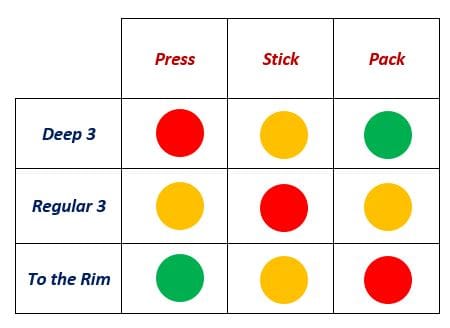
The authors of the article boil a possesion down to two players: The defending team and the attacker. Each player has three strategies: The defenders can either choose to send a player to press the attacker from half court, stick to a more traditional defense around the 3-point arc, or pack the paint with players.
On offense, the attacker can either choose to take a deep 3 (The authors gave no formal definition of a deep 3 here, but according to espn.com, a deep three can be a shot that occurs more than 3 feet away from the 3 point line), take a regular 3 pointer, or drive to the rim. The authors define payoff as a function of each player’s efficiency (Points per attempt) as a result of each person’s strategy.
Firstly, the authors create a generalized payoff matrix, that looks like this:
This is not for a particular player, and doesn’t show efficiency values, but its helpful to get an intuition for the general efficiency of each strategy. Intuitively, packing the paint counters a drive, sticking to a traditional offense counters the normal 3, and pressuring the defender from half-court counters a deep 3. Basically, the further away the attacker is from the defending team, the more likely they are to score points. The general matrix is nice, but we can actually look at the matrices for specific players and come up with some very interesting conclusions:
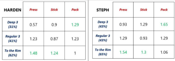
In class we talked about dominant strategies (There is no dominant strategy in the above matricies, by the way), but the authors here actually introduce something we haven’t talked about yet, a dominated strategy:
“A strategy is dominated if, regardless of what any other players do, the strategy earns a smaller payoff than some other strategy. Hence, a strategy is dominated if it is always better to play some other strategy, regardless of what opponents may do.”
Surprisingly, there actually is a dominated strategy in our matrices. Regardless of what the defenders choose to do, taking a regular 3 is never the best option. If the defenders press the attacker or stick players around the arc, it’s optimal to drive to the rim, and if they pack the paint, its optimal to take a deep 3.
The last thing I want to note (as an aside) is Curry’s bonkers efficiency on deep 3’s, especially while contested: 0.93/3 is the calculation (Points per attempt/number of points) works out to 31%. This article was written in 2018, and at the time, the league average from 3 was 35%. That means that curry shoots contested 3-pointers from way beyond the 3-point line almost as efficiently as the rest of the league shoots regular 3 pointers! I guess that’s why there are so many clips of him doing stuff like this:
Works Cited (Main Article, Definitions, statistics):
When we were discussing different importance of links and how we can connect two nodes together through decentralized search, I thought of how we can be matched to other people depending on certain factors, and a big one that came to mind was matchmaking in video games. There are two major factors that go into this matching; how good the network connection is between two players (which is also often affected by location, i.e. physical distance apart), and skill disparity between the two players.
To do this, usually the skill level of each player is targeted first, and the system will look for the player in closest proximity. In a paper on matchmaking strategies, they took the example of League of Legends, a popular online multiplayer game with millions of players worldwide, and analysed the way the grouped players together to be in a match. In this case, the main factor was the ranking of each player, and they would match to the closest players with similar ranking, broadening the scope of the search and the allowed difference in ranking as time spent waiting for the queue increased.
One of problems brought up in the article is that this matchmaking does not take into account latency, which would be part the network connections strength, and affected by physical distance between players. It suggests that to handle a multiple criteria search on such a large scale, decentralized architecture is required.
This is where something like decentralized search from our lectures could be used. Something like this already exists for player matchmaking in games, and is called peer-to-peer matchmaking. Peer-to-peer to put is simply, is a decentralized communication model, and in this context would be two players (nodes) communicating between each other to play a game, rather than a centralized system dealing with hosting servers and networks.
from bitcoinwiki.org, CC BY-SA
This network is the same as a Kleinberg model, and through the game, each player is given the matchmaking strategy to connect with other players in the P2P network, and can navigate through this searchable network for another player. Although this system still has it’s flaws, it allows players to quickly connect to others, and is an interesting example of the applications of a decentralized search and the analysis of large networks in the context of a popular video game.
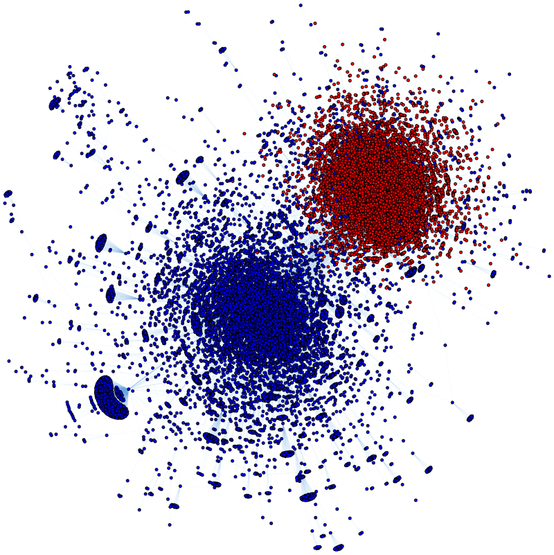
Sport Leagues such as the NBA are entering a new age of statistical analysis with teams trying to come up with new techniques from statistical analysis to gain an edge over their competitors. Houston Rockets has been in the lead in taking basketball analytics to the next level. Spearheaded by Daryl Morey, Houston Rockets GM, a former consultant and MIT Sloan Graduate who did not play basketball, his prior work as a statistical consultant helped him gain a deeper understanding of basketball and how teams operate inefficiently. Morey’s fundamental insight involved taking a tremendous amount of three-point shots, although more difficult than midrange, or driving in the paint, they boast a slightly higher expected value. Morey also recognized that three-point attempts made from the corner had a higher percentage of going in because the shape of the three-point line made it slightly closer to the basket, many of the Rocket’s set plays are specifically designed to get strong three-point shooters open for these corner threes. The Rockets are shooting more 3s than should be humanly possible, and it’s working.
The introduction is one of many examples of statistics taking over the sports leagues around the world. One of the biggest problems in sports is coming up with an accurate ranking for how good the teams are.
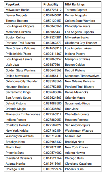
A directed graph of NBA teams.
This graph was constructed where the for every win team X has over Y, the weight of the arrow increased by 1. Using this graph, we can apply the Scaled PageRank algorithm until convergence to produce the PageRank score for each team.
Ranking obtained through PageRank in comparison with the NBA standings.
This is a simple and elegant way to rank NBA teams and so with the Lakers winning the 2020 champion ship last month, I have heard a lot of talk regarding how they had a relatively easy path to the finals and didn’t face much competition. I thought this was quite interesting so I decided to make a YouTube video where I use the PageRank algorithm to rank the teams in the last 6 seasons, and find out which championship runs were more competitive than others.
In the video, I constructed a directed graph of each of the NBA teams, then for every win team X has over team Y, the weight of the directed edge (X, Y) was incremented by (final score for X/final score for Y), and suppose team Y wins against team X, then the opposite directed edge (Y, X) was incremented by (final score for Y/final score for X). I was hoping that this would create a more accurate depiction of how the teams fair against each other because many wins are competitive, going to multiple overtimes where as some other wins are complete blowouts. For example on Sunday, Nov 3rd, 2019, the Miami Heat smacked the Houston Rockets with a 129-100 victory. Then next day, the Rockets beat the Grizzlies 107-100. I thought that these wins should be treated differently to create a more accurate depiction of how the teams match up.
After running the PageRank algorithm on all 30 teams from the 2014-2015 season, I plotted the highest ranking team (green) and and teams that won the championship if the highest didn’t win (red). This goes to show that the best team doesn’t always win and that there are many other random factors that determines which team ends up with the championship.
Green: Highest PageRank of each season, Red: Champions of each season.
Skipping over some plots, the most important one was the following. Here by looking at the average playoff opponent PageRank scores of each championship team, we get to see how ‘hard’ it really was for them to win.
Through this graph, we see that the claims of Lakers having an easy championship run is false (outside of injuries). As the only team that has faced better opponents in the playoffs in the last 6 seasons was the Cavs back in 2016, and that was mainly because in the finals they played the Warriors who had an astounding PageRank of 0.0650, highest of any team by roughly 0.005 in the last 6 years or so.
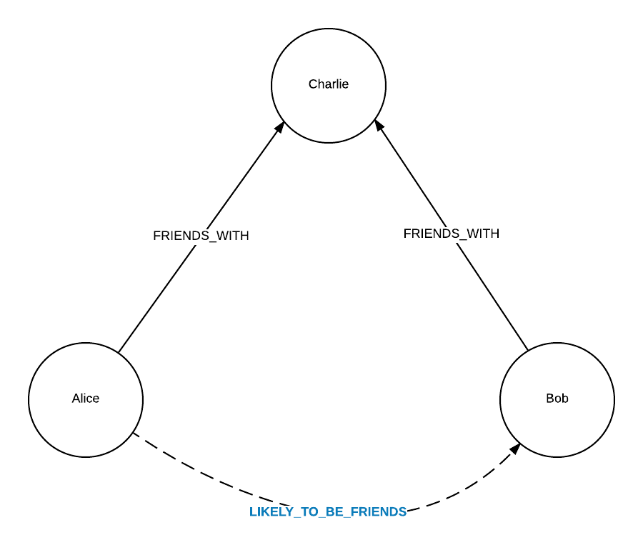
In a recent paper by the International Association of Crime Analysts (IACA), social network analysis (SNA) has proven to be a useful and important tool in crime analysis. More specifically, it helps law enforcement to better understand criminal networks, co-offending patterns, victimization, drug trafficking networks, as well as many more areas. The value in applying network analysis to crime lies in the main idea of identifying who a person of interest associates with, how strong these associations are and attempt to predict future actions of these POIs.
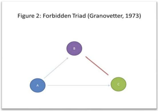
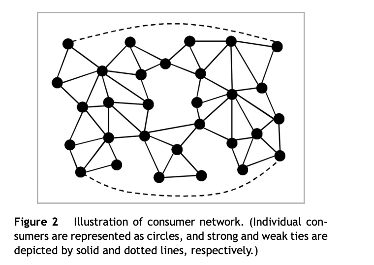
One specific idea this paper discusses is Mark Granovetter’s concepts of strong and weak ties between two nodes, or in this case between two people. For example, strong ties could represent family and close friend relationships while weak ties could represent acquaintances. In particular, the concept of the “forbidden triad” (Figure 2) is especially relevant to crime analysis. This concept of the “forbidden triad” is essentially the same concept as strong triadic closure that is discussed in CSCC46 material, which is the concept that asserts that if a node A shares a strong tie with node B and A also shares a strong tie with node C, then B and C should share at least a weak tie (B and C should share a weak or strong). In a real-life social sense, if these nodes were people, then persons B and C should at least have an awareness of each other. As described in this paper, “if John (A) is a suspect in a crime, it may be that while Bob (B) may have more information to share about John, Tim (C) might be more willing to share the limited (but potentially very useful) information he has with detectives assigned to the case.”
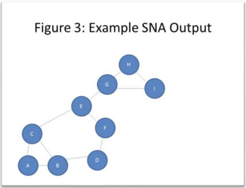
Another example of information that can be uncovered through applying network analysis to crime networks is the identification of “key players.” In an analysis of a given crime network, the visual output would resemble a graph (Figure 3), displaying nodes representing either individual persons or larger groups or entities and edges between these nodes representing an association between two persons or groups. From simple inspection and from further mathematical analysis (e.g. betweenness, closeness centrality) it can be concluded that nodes E and G play important parts in the flow of information in this network. The paper also explains that one of the most common network strategies to detect these key players centers around the concept of betweenness, which is an idea that has also been discussed in CSCC46 course material.
One case example of social network analysis having a positive impact on crime analysis involves the Richmond, Virginia Police Department searching for a homicide suspect for approximately one month, at which point their crime analysis department decided to construct a network analysis of the suspect’s social network. From this analysis, they identified key persons and quickly notified them that the suspect was wanted and were told to tell police if they would be in contact with the suspect. It turned out that because of the police contact, the suspect turned themselves in within hours. The paper explains that in this scenario, social network analysis assisted law enforcement in identifying key persons related to the suspect beyond just family members and close friends.
When Google created founders Sergey Brin and Larry Page created the RageRank algorithm in 1998, I doubt they realized how many applications it would have, and that one of those applications would be playing Tetris! In this blog post, I will analyze how Artificial Intelligence and PageRank can used to play a near perfect game of Tetris.
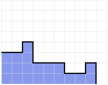
In Tetris, the goal is to stack pieces on top of each other without reaching the top of the board, where each piece is four blocks connected together. You can clear lines by filling an entire row of spaces, where each row is ten blocks long. A common strategy is filling a nine by four space with pieces, then using a one by four piece to clear four lines at once. This is called a Tetris.
An example of a nine by four stack, with a one by four piece ready to be dropped to complete a tetris.
We can use PageRank to build efficiently build a nine by four stack with no holes. With this, we can continuously create the opportunity for Tetris’ regardless of the order of pieces we are given. First, we define our nodes and edges. Our nodes are the contours of the stack. Each stack surface is represented a list of numbers in between -4 and 4, where each number is the change in height between columns in the stack.
Currently, the list of numbers representing this stack is 0, 1, -2, 0, 0, -1, 0, and 1. This can be represented as a positive integer value, with each number in the set incremented by four. Thus, this surface contour is represented as a node with the identification number 45244345. If adding a piece to a surface contour A will create a new surface contour B without creating any holes in the stack, then we say that node A points to node B.
If a piece was added to this position, node 45244345 would link to node 45244543. With this, given a surface and a new piece, we can calculate all the new possible surfaces by simulating all possible piece placements that do not create a hole in the stack. We then record the results of this simulation as a graph. Finally, with this new graph, we iteratively calculate the rank of each surface following the PageRank algorithm.
When playing Tetris, players are given a random piece. Using this piece and the players current surface, we place the piece in the position that forms the surface contour with the highest page rank. Following this, we continuously stack pieces in nine by four fashion until we reach a certain height in the stack. When this height is reached, we use a one by four piece to create a Tetris, clearing four lines and lowering our stack. This works because the only way to lose at Tetris is to have your stack touch the top of the board. For this to happen, you must be unable to clear any lines, and for a line to be unclearable, there must be a hole in the stack that gets covered by another piece. In our page ranking algorithm, a node’s rank corresponds to how likely the stack it represents is to not lead to stack contours with holes in future moves. By this logic, following the highest page ranks minimizes the likeliness of creating holes in the stack. Therefore, we can be sure the moves that are being made result in the smallest chance of losing.
Sometimes in Tetris, players are given a “next” bar, that shows the next upcoming pieces that are going to be given to the player. With this added information, we can “look ahead” and find the highest page rank along a path as opposed to the highest page rank across just one link. It turns out that having this extra look ahead drastically changes the number average consecutive moves where no holes are made.
Average number of consecutive pieces that create no holes after 15 iterations of the PageRank algorithm.
I think using PageRank in this way is interesting because it is a unique and creative way to play a game. The fact that PageRank can be used this way is astounding because it shows an application of the algorithm outside of data analysis. Another byproduct of this is that by analyzing the weight of the links created with the PageRank algorithm, we mathematically define that some orientations are better than others, and that each piece has an optimal placement when given a stack contour. The author created some guidelines to follow to achieve optimal piece placement during a game of Tetris, which is linked to below. I chose to write about this because I personally am avid player of Tetris, so I thought it was interesting that a PageRank algorithm could apply to the game. Finally, this relates the class material because we are learning about PageRank in class. This article also forces the reader to think deeper about the implications of a node having a high rank.
In lecture we have looked at PageRank through the ‘Flow Model’. Using this model, we were able to apply the Scaled PageRank algorithm to produce the equilibrium values indicating the best nodes to use in the graph. However, what happens when we apply this idea to sports?
In August 2020, Ryan Jones asked this question and decided to try to predict the 2020 Stanley Cup winner based on win/loss data throughout the season. Mr. Jones recognized that the best team could loosely be defined as the team who has beaten the most (unique) teams. This is because if a team was able to defeat all other teams in the league, although it’s not certain that they’ll win in a 7-game playoffs series, it shows that they have the potential to beat every other team, given that team rosters don’t change much throughout the season.
To set up this analysis, Mr. Jones created a directed graph where every team in the NHL was a node, and if team A lost to team B during the 2019-2020 season, team A would create an edge to team B. One interesting point to this setup is that it gauges the quality of wins. This can be done since using the ‘flow’ model, if a team is one of the worst, they will have many out-edges meaning that each node receiving those edges will receive less flow. Consequently, if a team is one of the best, they will have less out-edges, indicating that every team receiving flow from this team (one of the best teams), will receive more flow from this team than one of the worst teams, since the win with the better team is more meaningful than beating one of the worst teams.
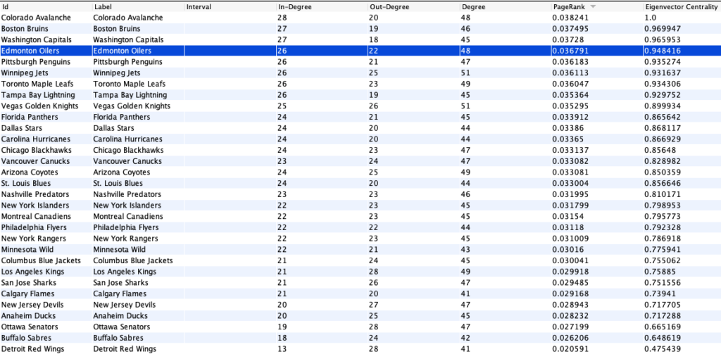
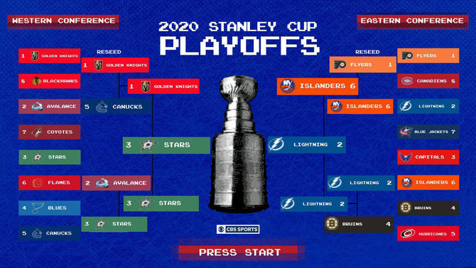
Let us look at the data and how Mr. Jones’ prediction lined up with the actual 2020 NHL Playoffs:
Mr. Jones’ data – teams have being sorted in descending order of PageRank.The Stanley Cup Playoff Results, The Dallas Starts won the Stanley Cup.
Looking at Mr. Jones data, we can see that Colorado, Boston, Washington, and Edmonton were the top 4 teams as they had the highest PageRank among teams in the NHL. However, Colorado and Boston were the only two teams of the four who made it to round 2 of the playoffs, and both teams lost in round 2. Whereas Tampa Bay and Dallas both made it to the finals even though their page rank was not even in the top 7. Using this information, we can conclude that at least in hockey, PageRank is not a very strong indicator of the team who will win the Stanley Cup. There are many factors which could have affected this outcome such as COVID effects on the league, randomness of performance, and veteran players who have more experience in playoff settings.
I found this article very interesting as it explores PageRank in an unconventional context, Hockey! Intuitively Hockey does not have much of a correlation with PageRank, however Mr. Jones was able to tweak the perspective of the data so that it would reflect a PageRank scenario yielding equilibrium values. Although the outcome did not strongly reflect the prediction from the data, it still makes a case for why certain teams have a better chance of winning the Stanley Cup. For example, it is very unlikely that the team with least amount of wins against unique teams will win the cup, not only because they have a lower win/loss ratio, but because if they have lost to teams during the regular season, what evidence points to them winning against those teams again in the Playoffs?
Perhaps there are certain pieces of data which can sharpen the accuracy of the PageRank used in the prediction of sports, and thankfully we will never run out of new sports data to keep trying out!
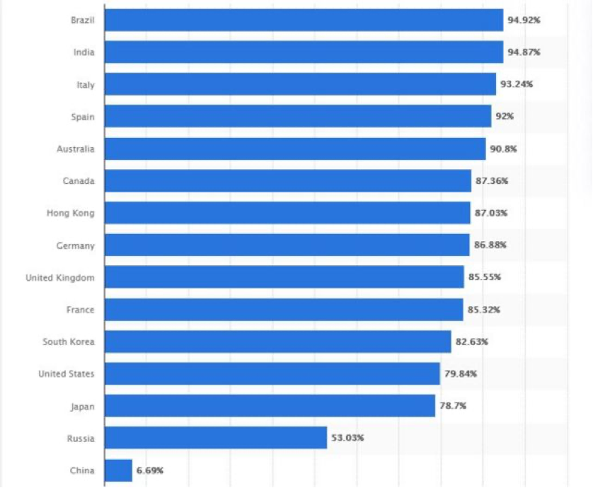
Google is the world’s largest Internet search engine company. Its market value is about $1 trillion. It also reflects the importance of the company in people’s lives. On October 20, the U.S. justice department filed a lawsuit with 11 states, alleging the Google monopoly. Google is always acting as the dominant gatekeeper to the Internet. Moreover, for years, it has taken steps to prevent others from encroaching upon its position. They did many things, such as exclusivity agreements that prohibit the pre-installation of any competing search services. Indeed, though the data collected by Statista, in which you can see the chart below, over 50% of the internet users in most of the leading countries choose Google as their searching engine.
Google has signed deals with business partners to ensure that these searches are carried out through Google rather than competitors. Moreover, it cannot be deleted, regardless of consumer preferences. Suppose you searched the water bottle, for the ads appeared at the top, Google can charge them monopoly prices because, as the customer, you would tend to buy items more advanced.
Because Google had done many things before to reduce its competitors, the lack of competition means advertisers have to pay more to appear in Google search results. At the same time, consumers are forced to accept Google policies, privacy protections, and the use of personal data. The Google monopoly here has been involved in disrupting the market, which is why the U.S. government is suing it. Google’s chief legal officer, Kent Walker, used the same opinion. He argued that the lawsuit did nothing to help consumers. Instead, “It will artificially promote alternative search engines of lower quality than Google and lead to higher prices on mobile phones while making it harder for people to get the search services they want to use.”
From the government’s perspective, the giants should be more tightly regulated and recommended structural separation, forcing companies to break up or restructure their businesses. Not only Google, but there are also many technology giants today which acting like a technology monopoly, such as eBay, Microsoft, Amazon. We have learned that a healthy economy should have networks through all big and small companies from the class. The technology giants deprive small and medium-sized businesses of the opportunity to survive in this network. Therefore, they dominate the network and monopolize the prices of their product, which negatively impacted the market.For example, suppose you searched the water bottle, for the ads appeared at the top. Google can charge the advertisers the monopoly prices because you would tend to buy items more advanced than the customer. That is why the U.S. justice department filed a lawsuit against Google.
We could remind the technology giants of their responsibility to maintain the stability of the free market and not to dominate the network. We all know that the power of capital drives resources to favor the technology giants. We need that the third party stand on the opposite side of the capital, remind them to keep an eye on consumers’ interests when the market is significant. They should also firmly maintain the market rules when the market is ineffective and make a quick response.
Reference Links:
For tech giants, a cautionary tale from 19th century railroads on the limits of competition
Google has been using the page ranking algorithm to best serve their clients with the most relevant search result. There was a time when page ranks are still visible to all users – it was no longer a thing after 2010 that Google hid all of them. However, not being visible does not mean that Google has stopped using it. According to Erika, not only that Google kept the PageRank algorithm after 2010, it is indeed updated in recent years and still plays a very important role in serving clients with the best search results in 2020. [1]
Many companies have tried to guess the latest Google’s page ranking algorithm. Some of them even developed their alternative algorithms. One example is SEO PowerSuite. Their self-owned Domain InLink Rank provides an alternative way to rank the most valuable pages. Similar to Google’s old page rank algorithm, it takes the number of incoming edges and their weights into account to calculate a page’s rank. However, there is no detailed formula found online that well-explained how these factors work exactly in the formula. Instead, this blog post is interested in one of the experiments conducted last year by SEO PowerSuite on how well their Domain Inlink Rank algorithm performed compared to Google’s SERP (Search Engine Result Pages). [2][3]
The experiment targeted around 33500 keywords and their search results. Only the first 30 results from each keyword search were kept, which results in over 1 billion pages. After comparing the results produced by the Domain Inlink Rank algorithm and by searching on Google, it turned out that they are positively correlated with a correlation coefficient of 0.128. This indicates that a page is likely to be ranked higher if it is also ranked high among all search results in Google. However, according to the definition of the correlation coefficient, any value under 0.3 is considered “weak”. Therefore, a coefficient value of 0.128 does not make a significant point.
Despite that, after comparing the experiment results from other page ranking algorithms, SEO makes a fair point that its InLink Rank algorithm has better performance than other alternatives. Comparing the “next best competitor” after SEO PowerSuite, Moz has published their experiment results on similar setups. It turned out that their highest correlation coefficient (0.12076) was even weaker by relatively 6%.
(figure. 1) Comparing the performance of InLink Rank with the four products by Moz, in terms of correlation coefficients. Image source: https://cdn1.link-assistant.com/images/news/google-page-rank-2019/screen-07.png
Aside from that, it is interesting to find out that SEO PowerSuite has been working on detecting spamming hub pages and providing some proper instruction for web page owners to improve on their page rank. The top two approaches are qualifying backlinks and making use of internal links.
On the one hand, backlinks refer to those the website points to. Under this InLink Rank model, all websites are authorities and hubs at the same time. Frequently checking if any of them has a low-rank score and removing those links that point to low-quality sites can prevent loss of page rank on the next round of page rank update. A tool named “SEO SpyGlass” checks InLink Rank scores for those backlinks, as well as for potential risks and errors for backlink pages’ authority.
(figure. 2) An example of using the SEO SpyGlass tool to analyze the InLink page rank for backlink pages. Image source: https://cdn1.link-assistant.com/images/news/google-page-rank-2019/screen-10.png
On the other hand, taking good use of internal links can save a lot of time. It is described that internal links act like a “page rank storage” under the InLink Model. To maximize the use of internal links, it is important to make sure there are no orphan pages under control because that will be a waste of source. Having pages linking to each other under a website makes sure page rank flows between pages. A tool named “WebSite Auditor” visualizes such processes and makes it easier to find any orphan pages.
(figure. 3) An example of using the WebSite Auditor tool to analyze the structure of a website and to detect if there are any orphan pages. Image source: https://cdn1.link-assistant.com/images/news/google-page-rank-2019/screen-16.png
It is exciting to see the materials we just covered in the lecture (3 days ago) are doing some work in the real world industry. It is also important in helping me understand these articles and diagrams better since they are so closely related to what we learned. All sources are put under “Reference” below, please feel free to dig in and read more!
Reference 1. Some description of Google PageRank and why it is still important: https://www.semrush.com/blog/pagerank/ 2. The experiment on Domain InLink Rank: https://www.link-assistant.com/news/inlink-rank-correlation.html 3. The analysis of the experiment, and more relative materials: https://www.link-assistant.com/news/google-page-rank-2019.html
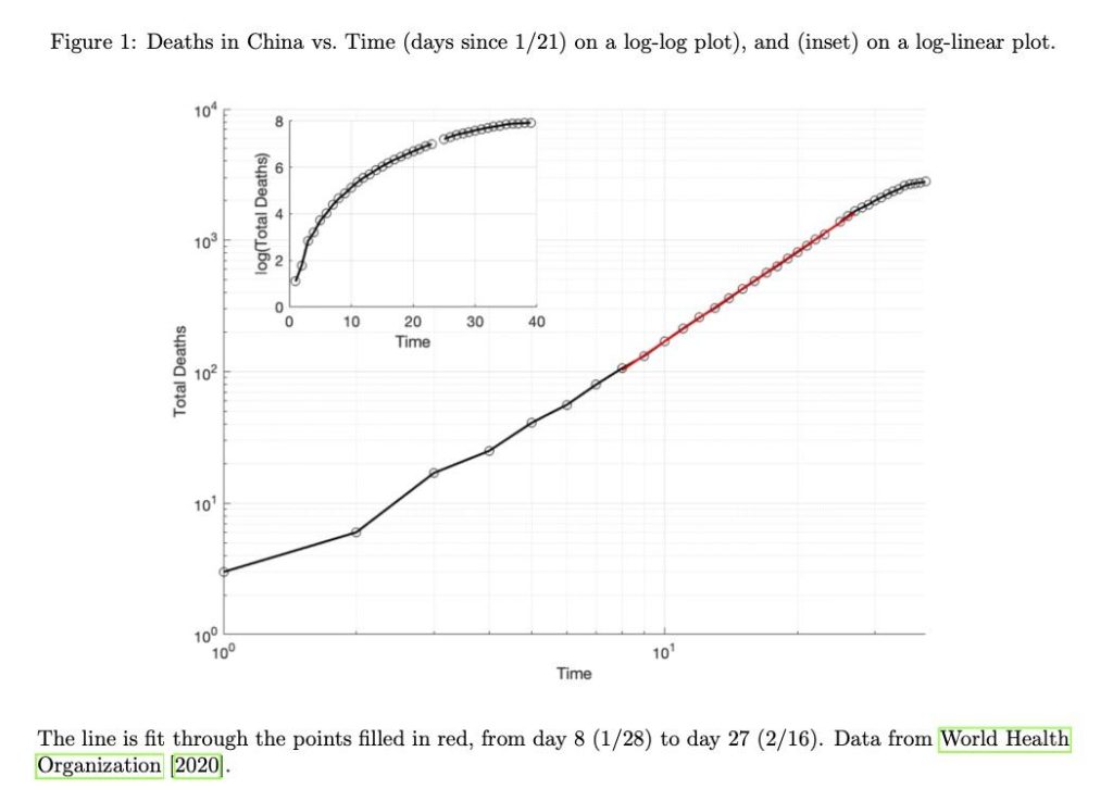
Two students at Duke University, Anna Ziff and Robert Ziff, analyzed data from the COVID-19 pandemic worldwide to learn about “fractal kinetics”. Kinetics refers to the study of the rates of chemical reactions, and fractal refers to an underlying structure of an entity. In this context, the entity is a network representing the rate of spread of COVID-19. This article discusses the relation of power-law kinetics to COVID-19’s growth. The figure below shows 2 different plots of the same data, showing how the death rate increases at different rates during an epidemic.
Figure 1: Graph of deaths due to COVID-19 in China against the time exceeded in the pandemic
Epidemics usually grow exponentially based on a fixed rate. However, with COVID-19, it was observed that the spread of the virus increased in 2 parts, followed by an exponential drop-off. The 2 increasing parts include:
Initially starting off exponentially
Transforming into a Power Law
Recently, we have studied power laws in class, which are a distribution. We emphasized the long-tail nature of these distributions and the applications of them in the real world.
Back to the study, the students attributed the spread of COVID-19 to a small world network. This is another topic we have delved into in class where we looked at the high concentration of shorter paths in social networks. This concept is highlighted by the Small-World study conducted by Stanley Milgram. Albert-László Barabási, a professor at Northeastern University researches the Small World Phenomenon. The article refers to Barabási’s book which looks into networks of infectious diseases. These networks are not random but are scale-free, as random networks would indicate exponential growth. In class, we looked into scale-free networks which are networks with a power-law tail in its degree distribution. Here, people have lots of local neighbours and few long-range connections. Barabási claims they follow a power law and have a long-tail as connectedness between people dwindles. This does not represent how fast a virus moves but shows that there are groupings, or hubs, that promote the spread.
The students from Duke use these models to make claims about the speed of the spread and of deaths due to the virus. After one individual is infected, the people in their network interact with them less as they find out they are sick, to try and prevent spread of the infection. Over the period of time the individual is sick, their local network will slowly dissipate as more people find out that they are sick, reducing the rate of infection so it is not exponential anymore. These models are used to make predictions about the number of deaths, and fortunately, the actual death rate has been slower than predicted. If the death rate was still growing exponentially, the mortality count would be much higher. Deviations above the power law indicate that society is doing poorly to contain the spread, whereas deviations below signify that society is doing better than expected.
It is really intriguing to see how graph theory and graph structure can be used to represent the spread and death rate of an epidemic, such as the COVID-19 virus we are currently experiencing.
In this class we have seen how graph analysis can be applied to many different topics of study, some expected and many surprising. A paper published by Martin and collaborators showcases yet another field where graphs can be of help: dream analysis.
The study of dreams can reveal early indicators for mental health disorders, such as schizophrenia or psychosis. They can also give us information about how the brain is functioning during sleep. Our brains undergo different phases of activity during sleep, and the nature of the dreams generated can inform our knowledge of the underlying processes in different phases.
Martin et al. (2020) studied dreams generated during REM and non-REM cycles. Common (non-graph related) ways to evaluate dreams include: recall rate – whether the participants remember the dreams at all, report length – such as the number of unique or total words, or narrative complexity – the story-like organization of the dream as evaluated by external judges according to a defined ratings scale. It is for this last item where Martin et al. employed the use of graphs.
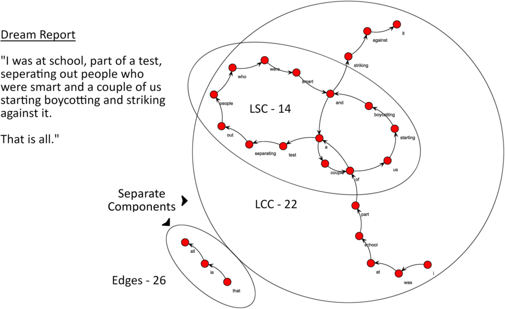
The raw data collected was dream reports, transcriptions of the participants recounting their dreams. To create a graph from a report, each unique word formed a node and edges were drawn between words that appeared consecutively in the report, such as in the figure below.
(Figure 1 from Martin et al., 2020)
From these graphs, they analyzed the size of the largest connected component (LCC), size of largest strongly connected component (LSC), and random-likeness (resemblance to graphs generated by random chance). They found that larger LCCs and LSCs were indicative of more complex dream reports. Lower random-likeness was also correlated with higher dream complexity. We can see that more connections between separate elements of the story and more unlikely story structure, elements that can make a narrative more complex, is captured in the graph analysis of the dream reports.
The methodology employed in this study was an interesting example of how graph analysis can be applied to data that is qualitative, especially where the relationship between the nodes seems almost arbitrary (order of the words). The complexity of a narrative is a very abstract concept that even with human judgement is difficult to analyze; this methodology lends a new meaning to “a picture is worth a thousand words”.
A recent study conducted at Uppsala University analyzed neural networks previously used to understand social networks and applied it to analyze mRNA production in human tissue.
Currently, the most common method to analyzing the presence of mRNA in a tissue at the microscopic level is using in situ sequencing. This method requires a lot of manual labelling and identifying of mRNA, cell types and tissue to allow for any substantial analysis to occur.
A good practice when building machine learning models is to ensure the model does not overfit to the data being presented to it. Overfitting refers to the concept whereby a neural network is trained with a certain set of data almost perfectly, but is unable to predict new data as it cannot generalize well. Keeping this in mind, many machine learning researchers will attempt to build models that can generalize to any data set.
The researchers of the study used a model previously analyzing social networks. The model identified clusters of individuals based on similar followers on Twitter, similar Google Searches and many more similarities and differences on the internet.
When the model was provided with the cell data (images of human tissue with dots marking mRNA presence), the model was able to correctly cluster different tissues, cell types and identify the mRNA markers. Seeing success from models like this is a huge breakthrough in mapping cell types and mRNA functions.
Not only does this help scientists within this field better understand their research, it also depicts how networks can be generalized to help understand various different applications. A map of social network similarities is able to map cell tissue today, who knows what we will be able to map in the future.
Over recent years the term “fake news” is getting used more frequently. Fake news defined by the Cambridge dictionary is “false stories that appear to be news, spread on the internet or using other media, usually created to influence political views or as a joke”. The recent increase in fake news has negative effects, one being that people believe the lies told as truth and another effect is that it changes the way people view legitimate news. It can be very harmful in certain scenarios such as spreading fake cures for coronavirus that is actually dangerous or spreading lies that can have a big impact on an election.
The paper, “Studying Fake News via Network Analysis: Detection and Mitigation” by Kai Shu, H. Russell Bernard, and Huan Liu examines the spread of fake news through network analysis. They talk about various network properties that helped them do analysis on fake news; Echo Chambers, Individual Users, Filter Bubbles, and Malicious Accounts.
Echo chambers refer to the idea that beliefs are amplified because the person is in a closed system. It is based on 2 factors; social credibility and frequency heuristic. Social credibility is a factor because people usually surround themselves with like-minded people, hence most people in a person X’s circle will have similar beliefs as them. Because everyone around X thinks that news, which could be fake, is correct, X will also believe it cause of social credibility. The other factor frequency heuristic points out that people are likely to believe something they hear more often. Therefore if a person is in a closed system and everyone in it believes the same info then they will not hear any other opinions. So if the fake news is what they are hearing the most then they will likely believe it.
Filter bubbles are similar to echo chambers but it’s isolation on social media. Almost all social media sites use algorithms to figure out what type of content you like. They then proceed to continue feed you content on that topic and things similar to it. Due to this users would get to see one perspective on their social media like they are in a closed system. Therefore if they are only fed fake news then they will believe it.
Both echo chambers and filter bubbles relate to strong triadic closure, a topic we learned in class. Looking at the figure above, Y is close to and agrees with what both X and Z say. So even if initially X and Z aren’t friends, because Y has a strong connection with both of them, X and Z will become friends and trust each other’s opinions. Therefore if Z is talking about some fake news to X, because Y believes and trusts Z, X will also believe that fake news.
It’s interesting to see that rise of fake news has been at the same time as the rise of social media. The echo chambers and flitters bubble help understand why this is the case through network analysis. We usually surround over selves if with people who have similar views and believes and only view content from one side perspective. Therefore it is important to educate ourselves with different perspectives, rather than believing something from the first and maybe only perspective you see.
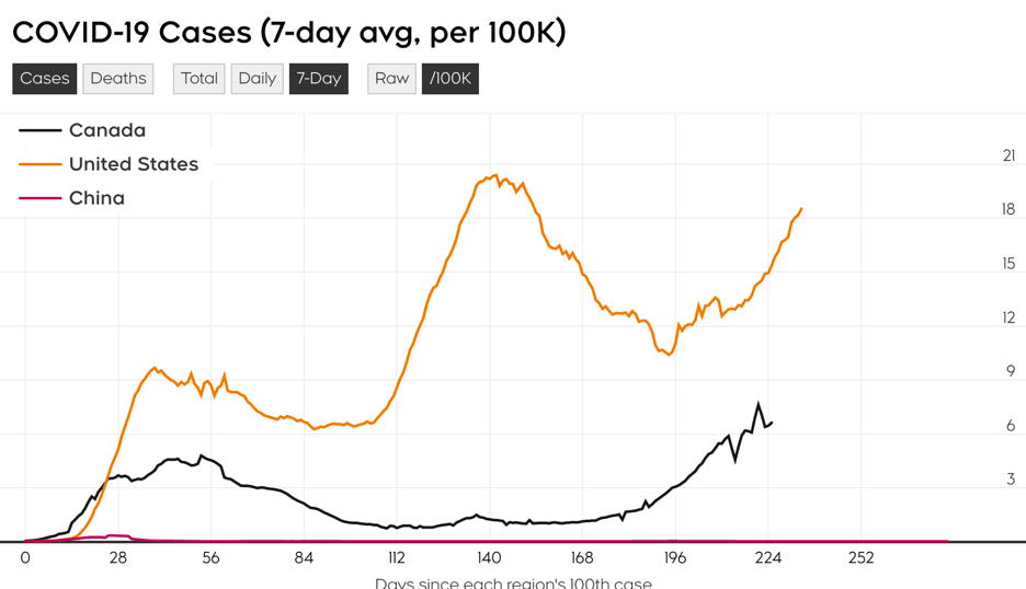
Ontario Department of Public Health shows that 841 new cases have been reported in the past 24 hours, and over 821 on Tuesday. This is the second-highest number since the second wave of the epidemic and the second-highest since the beginning of the year. There were 335 new cases in Toronto, 162 in Peel, 106 in York, and 72 in Ottawa. Toronto had more than 300 cases for three consecutive days, and York had more than 100.
As the epidemic continued to spread, hopes were raised for COVID-19 vaccines. Recent promising ones from Oxford and AstraZeneca fell apart, with a 28-year-old man from Rio DE Janeiro who died on October 21 from “complications of COVID-19”. The data showed that the man was a volunteer in a vaccine trial. But involved in such an incident, neither Anvisa nor the lab-confirmed whether the volunteers had received only a placebo or the real vaccine. However, according to Globo media, sources related to the international vaccine study said participants received a placebo. If something really goes wrong with the vaccine, it could affect Canada a lot, after all, as Prime Minister Justin Trudeau announced last month that he had signed a deal with Cambridge’s AstraZeneca to buy 20 million doses of the covid-19 vaccine.
The Oxford vaccine incident has led many people to question the safety of vaccines. However, a vaccine developed by China has been administered to up to 60,000 people, and not a single person has suffered a serious reaction. The chief biosafety expert broadcasted that the vaccine would be available to the general public around November or December.
From the chart, we can see that America is now experiencing the third wave of outbreaks. Canada is now experiencing the second wave of outbreaks, while there are only a few infected people in China. From the lecture, what we could know is that there do not exist two networks that are exactly the same. China and Europe, which have taken the lead in containing the outbreak, are developing vaccines. After the success of the development, the North American region is bound to carry out a large number of procurements. Because of the globalization of the world, when the vaccine is successfully developed, the epidemic situation in various countries will be significantly alleviated. The curve on the graph also tends to flatten out.
With the number of large scale political and economical disruptions this year. We are going to examine the current networks of relationships between the top countries and identify the balance between them.
In 2020, many world changing events has happened, will happened or is still ongoing in many parts of the world. To name a few, the one most people are familiar with is the current worldwide pandemic of the Coronavirus, affecting nearly the entire world and bringing us into an unprecedented time. Moreover, it has visible effects on the political landscape for the major powers, straining the relationship of many countries with China. In addition, this pandemic has incited the banning of Chinese technology from U.S. and India. Furthermore, the resignation of Japan’s prime minister Shinzo Abe, leaves way for a new prime minister who has the power to steer Japan into a different political mindset. Lastly, the 2020 election for U.S. will be conducted soon and depending on who gets elected, it will again steer another superpower into a different direction in terms of international relations.
Today, we will examine the top countries by their Nominal GDP (one of the measures for a country’s international economic prowess) in 2019 with their respective percentage to the global GDP:
U.S. Nominal GDP: $21.44 trillion (23.6%)
China Nominal GDP: $14.14 trillion (15.5%)
Japan Nominal GDP: $5.15 trillion (5.7%)
Germany Nominal GDP: $3.86 trillion (4.6%)
India Nominal GDP: $2.94 trillion (3.3%)
Relation of each country with each other
U.S. – China:
Through the outbreak of the novel Coronavirus, the two countries has soured their relationships in recent years. The animosity began brewing since 2018 when the trade war between the two countries, with increased tariffs and duties from both sides. Lately, the U.S. government also threatened to banned one China’s best international technological success, TikTok, after the blacklisting of another Chinese tech giant Huawei.
U.S. – Japan:
The two countries have extensive military cooperation in which the JSDF would train together with the U.S. military. In addition, Japan is considered one of the United State’s major non-NATO allies.
U.S. – Germany:
Both countries are allies under NATO, and has a close relation since the 1950s, with Germany outsourcing its military security to the United States. During the reunification between East and West Germany, the U.S. had also given its fellow NATO member massive support and was a major player in pushing for German reunification.
U.S. – India:
India and United States are working towards strengthening their relationships through various exchanges; such as economic, military and cultural to name a few. Furthermore, U.S. is assisting with the installment of nuclear reactors in India to provide alternative energy sources for its ally.
China – Japan:
The two government are working together to amend the past animosities and aiming to forge a new era of relationship. The two countries have bonded over the global pandemic through sending each other P.P.E equipment and testing kits. However, the general public of Japan still has a negative view of China, although the opposite has as generally positive view of Japan.
China – Germany:
The EU has been harboring animosity towards China for its human rights abuse and the recent outbreak of the novel virus.
China – India:
With the ongoing skirmishes between the two countries, followed by the clashing investment in Africa, the relationship between China and India is strained and dire. Recently, the outbreak of the global pandemic has worsen the situation and India strikes back by banning 100 plus Chinese apps, including TikTok and PUBG, hugely popular apps in India.
Japan – Germany:
Japan and Germany have a long-winded partnership with each other. Through its alliance in WWII to the current day economical partnership. The two countries are in great terms with one another and continues to further strengthens its relationship.
Japan – India:
Like many others, the two countries has a strong economic relationship and has extensive trading arrangements with each other. Japan is stated to double its direct investment and number of Japanese companies in India, hoping to build a stronger relationship together. Furthermore, India responded by providing the “Japan Plus” office, where Japanese companies can leverage to resolve problems faced in India.
Germany – India:
There is a great economic bond between the two countries through its extensive trading relationships with one another. Also, Germany is the largest trading partner of India within Europe.
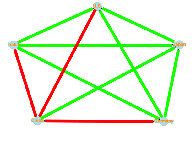
Network representation of the relationships
The following network is the representation of each countries’ relation with each other. Red represents animosity and green represents friendship or collaboration.
The relationship network of the 5 GDP leading countries.
Analysis of the network and its structural balance
We can quickly identify the unbalanced triangles within the network, China-Japan-Germany, China-Japan-U.S. and China-Japan-India. Here we can quickly see that the root cause of the unbalanced nature of the graph is because of Japan and its friendly ties with China. Without, Japan’s friendly tie with China, the top 5 economic power of the world will be able to achieve structural balance, with a global coalition of China against the rest of the top countries.
As it stand, the network is not even able to achieve a weak structural balance, as 3 out of the 4 triangles formed with China are unbalanced triangles with 2 positive edges and 1 negative edge.
Conclusion
In summary, Japan is a vital key to the current balance of the network. With the resignation of Shinzo Abe, who proposed the goal of achieving a new era with China, the Japan-China relation might head towards a different direction with China’s poor reception in the public eyes of Japan. However, the ongoing 2020 U.S. election might produced sway the currently relationship between Japan and United States as well. Although the two countries have had a great military and trading partnership, it is undeniable that the United States has caused the greatest atrocity to every hit Japan. Furthermore, if U.S.’s relationship with China continues to worsen, Japan will have to reconsider its stance and might have to ultimately choose a side between the two superpowers of the world. Ultimately, the 2020 election and the new prime minister of Japan will be the key to deciding the structural balance of the top 5 countries’ relationship.
Before talking about the paper, let me ask you a question: Have you ever formed a hobby because of your close friends? For example, I started doing sports, playing League of Legends, using Gmail, and so on because the classmates around me were doing so.
Weak ties are more potent in many real-life applications because weak ties can disseminate brand new information more effectively while the information circulating within strong-tie relationships is often redundant.
In the paper, Strong ties versus weak ties in word-of-mouth marketing, the authors suggest that weak ties are overestimated because of its structural advantages over strong ties. There is growing evidence to show that the closed triadic relationship is a more predominant factor that promotes consumers to purchase products. This paper compares the importance of three types of marketing activities: advertising, word-of-mouth of strong ties, and word-of-mouth of weak ties. And it is mainly focusing on comparing the two interpersonal ones.
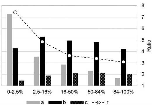
The researchers conducted a simulation called agent-based modeling (ABM) to prove their hypothesis that strong ties have more aggregate impact than weak ties on the spread of word-of-mouth, which promotes sales. And the figure above is the bar graph of this experiment, that divides the process into 5-stages: 0- 2.5%, 2.5-16%, 16-50%, 50-84%, and 84-100% of the market being reached, where a, b, c, r represents the impact of advertising, strong-tie word-of-mouth, weak-tie word-of-mouth, and r is the ratio between b and c. This graph shows that advertising plays a vital role in driving product growth at the initial stage (0-2.5%). Starting from the second phase, word-of-mouth of strong ties becomes the primary driver of the product growth while advertising experiences a dramatic decrease in promoting sales. Although the impact of weak-tie word-of-mouth is increasing, it is still much less influential than strong-tie word-of-mouth.
This experiment challenges the widely-accepted idea of “weak-tie versus strong-tie,” but it is limited to interpersonal ties. The authors argue that the importance of weak-tie word-of-mouth is sabotaged heavily by firms that advertise their products because advertising and weak interpersonal ties share the same ability to disseminate information globally, but advertising is more powerful than weak-tie word-of-mouth at spreading messages. The writers also bring in the findings from other papers, which suggests that word-of-mouth is seven times more effective than newspapers and magazines, four times more effective than personal selling, and twice as effective as radio advertising in influencing consumers to switch brands. Combining with the truism that people are more likely to buy a product because of the introduction of close friends than the introduction of acquaintances, it is obvious to see that strong-ties can play an essential role in marketing.
I didn’t eagerly dive headfirst into the Game of Thrones fandom by choice. Rather, after several years, I eventually bent to the will of the surrounding culture and our algorithmic overlords (another topic relevant to this class!), reading the posts, memes, and videos seemingly everywhere on the internet discussing and analyzing the popular series. After beginning to watch and read the series myself, I too was highly anticipating the final season bringing answers to long-speculated fan theories and ominous prophecies that were presented earlier in the story.
With such a large cast and different plot threads, one of the frequent topics of discussion I constantly read about was how important certain characters were to the overall story. For one, being integral to the plot would very likely keep the character alive a while longer, at least until their purpose had been fulfilled. Another reason was to make predictions for who would ascend the Iron Throne as the ruler of the country and who would become “The Prince that was Promised,” the prophesied saviour to end the ice zombie apocalypse known as the Long Night. Some argued these roles would go to the true heroes of the story, while others argued being too important would actually invalidate their candidacy, due to the series’ penchant for breaking traditional fantasy tropes.
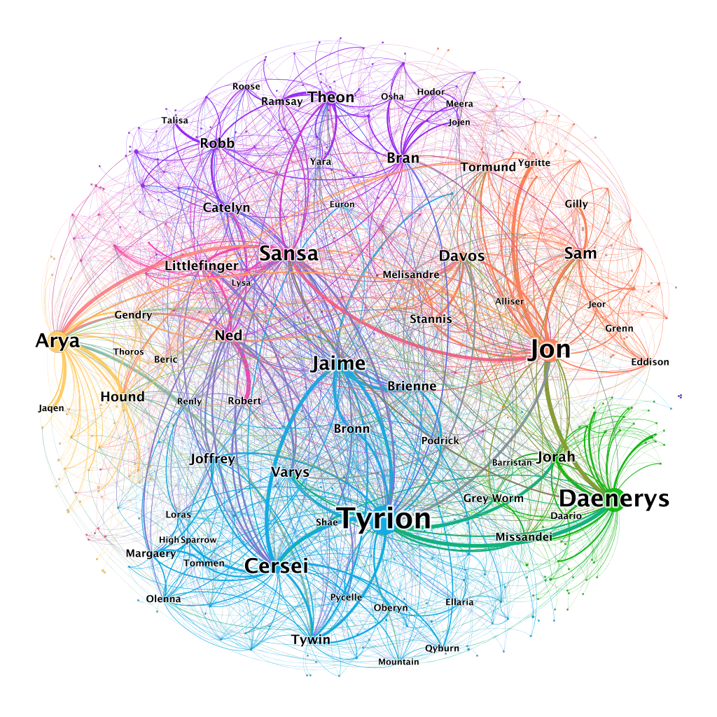
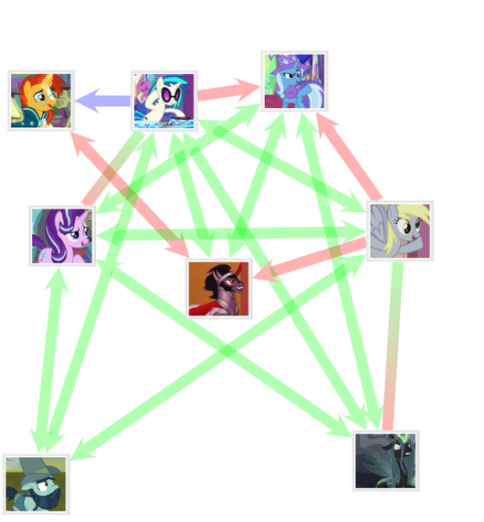
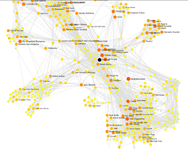
The Network of Thrones project has done an astounding job visualizing all character interactions from the 8 seasons as a weighted, undirected graph, using many of the concepts about graphs discussed in CSCC46. Each character is represented by a node (most are unlabeled for clarity), and the edges are interactions, which include simply being together, speaking together, being mentioned together, or mentioning each other. More interactions between two characters (including longer dialogue) affects the weight of their edge, represented by increased thickness on the graph.
The colours denote the 7 communities of the graph, which roughly represent the different plot threads and settings.
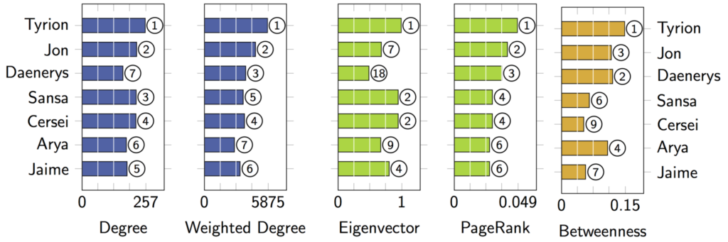
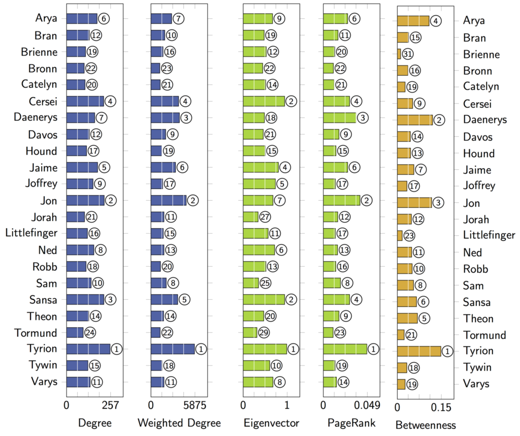
Furthermore, five metrics of importance are analyzed for each character:
Degree measures the number of edges (ie. connections) that a character has
Weighted degree measures the weights of all edges connected to a character (ie. number of interactions)
Eigenvector centrality measures the number of connections that a character has to “important” characters.
Pagerank centrality measures the number of interactions that a character has with “important” characters.
Represented by the size of the label
Betweenness represents how important a character is for connecting different groups, measured by how many short paths pass through that node.
Represented by the size of the node (can be a bit hard to see sometimes)
(spoilers ahead)
Across all metrics, Tyrion ranks in first place, meaning he’s been interacting with plenty of characters and was critical to the plot development. Despite his scenes in Season 8 being cringe-inducing and forced to many viewers, it seems likely that he would have always ended up playing a crucial role in choosing the future of Westeros.
Jon and Daenerys come in second and third place, respectively, and they are considered by many viewers to be the main characters of the series. Not only are both the only survivors of the overthrown royal dynasty, but both go through easily identifiable Hero’s Journeys. Given both spent several seasons in isolated communities away from the main cast (the Night’s Watch and Essos), it makes sense that they score low in eigenvector centrality but high in betweenness.
From my own experience reading fan theories over the years, these three characters were by far the most popular candidates to be the ruler at the end of the series, and the latter two to be “The Prince that was Promised.” Bran and Arya, the characters who actually ended up fulfilling these two respective roles, are both considerably less important by measures of centrality, and although sometimes mentioned, they were far less expected by fans as well.
More than just being an impressive feat visualizing 47,168 interactions between 407 characters, this graph seems to provide a good representation of character importance that matches viewer perception quite well.
With the recent pandemic, many infrastructures are moving online. Be it businesses, schools, government, they all utilize some form of the video call to replace face-to-face communication. However, this is not a perfect solution due to the serious issue of bandwidth. Bandwidth can cause a video call to appear disrupted and interrupt the video call experience.
NVIDIA Maxine, as defined on its website, is a platform SDK that allows video conferencing developers to utilize AI to create models in the cloud. It works by establishing neural networks to predict facial features based on a set of static points. This technology is similar to image recognition where neural networks are also utilized. Maxine works by sending an initial image to base the calculations on, then sends just key points around the eyes, nose, and mouth in order to adjust the initial image. A visual demo can be seen here in this video:
Visual demo of NVIDIA Maxine
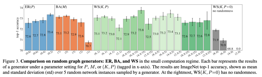
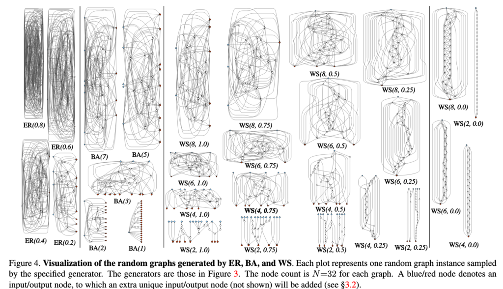
As mentioned in the scholarly article by Xie et al., image recognition can be explored via randomly wired neural networks. These are similar to what we learned in CSCC46, such as the Erdos-Renyi Model, Watts-Strogatz Model, and Kleinberg Model. All of them utilize a form of randomness to populate the edges in the graph. In the scholarly article, the experimenters actually used the ER model and WS model to compare against the actual results, as demonstrated below.
Figure 3Figure 4
Surprisingly, it was found in the study that no random rewiring actually resulted in worse performance when it came to image recognition. This was tested using WS model with P=0, meaning there is no probability that a edge will be rewired. The results of this can be seen in Figure 3, where no randomness performed worse than those with randomness.
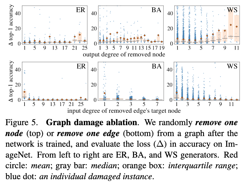
Relating to NVIDIA Maxine, the random model results on image recognition can provide a foundation in the prediction of movements. Furthermore, we can also measure the damage that a node removal or an edge removal introduces. This would help understand the importance of articulation points and bridge edges. The results of such a process on the models can be seen below:
In conclusion, using neural networks, we can resolve bandwidth issues by ensuring less data is transported over the Internet. To do this, neural networks can use image processing and image recognition techniques to predict frames simply by using a number of static points for reference. With NVIDIA Maxine, we may see more online video calls in the future without the issues of bandwidth.
Although we are in the middle of a global pandemic right now, but surprisingly these days the hot topic of news, social media, and websites is the US presidential election. Results of election of United States has always been really important not only to Americans, but also to the globe. Election of 2020 in particular, is even more controversial than the ones before. Many people, especially Non-Americans are looking for ways to predict the result of the election beforehand. With that being said and based on the result of national polls conducted across America, which is recently extracted and provided by the Non-American news company, BBC News, it is easy to see that Joe Biden is leading the election by 8 percent which is a significant number, but what does this number really explain and could you rely on it? In order to answer this question, we can use the power of graph theory and social networks to find our answer.
Most of the Americans have access to social media platforms and discuss the results of the election and who they might possibly vote for. Based on International Conference on Web Information Systems in 2014, research shows that what people say on social media platforms regarding elections turns out to be a good indicator of who they would vote for. The social platforms usually include polls which people do. One can imagine social platforms such as News channels and Twitter as a Social Network and convert it to an undirected graph. Each node represents a person in who contribute in a political discussion and has filled out a poll about who they might vote for, and edges represent that two persons vote in the election. It is easy to see that majority of people usually contribute in the election and vote for their party of interest. Therefore, in this network majority of people belong to a big connected component and there are people who are not legally eligible to vote or are not interested to vote at all which are isolated nodes in our graph.
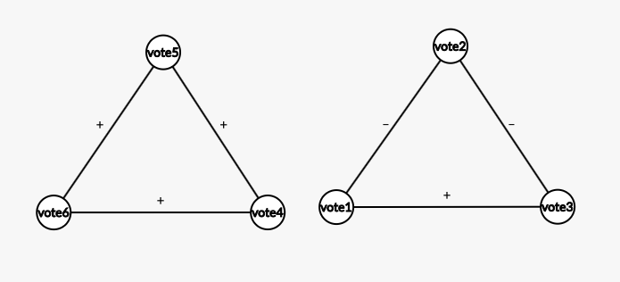
Keeping that in mind, we tweak the graph explained above and we convert it to a signed graph. In this new graph, we only consider the people who vote in the election, and edges have + and – tags. + edges represent people who vote for the same party and – edges represent people who vote for opposite parties. This graph is complete because every node in this graph represents someone who is voting or considering voting, hence there is an edge between every node. Additionally, our graph is balanced. The reason is: (1) three negative edges is impossible because there are only two political parties here and (2) two positive edges and one negative doesn’t make sense because two people vote for the same party as a third person but at the same time they vote to opposite parties relative to each other which is counter intuitive. But it is easy to see that all positive and 1-positive 2-negative edge triangles are possible
Figure 1: The two triangles represent the only possible triangles that can form in the graph representing people going to vote and their part of their interest.
Consider all this, since our graph is complete and balanced, by balance theorem we can divide this graph to two global coalitions which one represents Biden and the other Trump. The two coalitions can be considered as two disjoint sets. Hence, they don’t have any commen elements. Considering this we can divide the cardinality of each set (number of people in each coalition) by the total number of nodes in graph (Total people going/considering voting). This simple divisions give you the numbers that news represents as the result of polls for Trump and Biden, and what was explained is the whole story behind these simple two-digit numbers.
Figure 2: Visualization of political discourse on twitter.
With all that being said, it would be fair to say these polls, assuming they are represented by a reputed source, explain potential voting behaviour that might happen on the election day. Now, as a CSCC46 student, with a little bit of knowledge about information/social network and graph theory, with a little combination of simple algebra, you can checkout out the history and results of these polls, which are happening since past few months, from well-known and well-reputed news companies to roughly predict the outcome of the election. After that, just go relax and have a cup of tea and just wait for the day of elections and its result! NO SURPRISES this time!
In a normal regular season, major league baseball teams play a total of 162 games over the course of seven months. During the long and competitive season, it is important for teams to develop chemistry as it directly correlates to the team’s performance. The article written by Danielle Jarvie examines the effect of long-term teammates on the performance of an MLB team. Metrics such as network density, network centralization, and average weighted degree were collected and analyzed to predict team wins and performance.
The network density represents the total shares years the players have spent together on a team, while the network centralization measures the shared time the players played on the current team together. The average weighted degree depicts how well a player is connected to other players on the team.
Figure 1: Represents nodes that show a player’s connection to other players. Larger node shows a longer time spend on a team together.
Through analyzing the results, it was found that there was a correlation between the overall years spent by a team together and their rankings for that season. More years spent together meant the team was performing well during the season. However, if only a few of the players have spent increased time together, then the team performed worse overtime. Overall, it was found that for every year the team as a whole spends together, they gain 14% higher probability to win their division.
With the world series (MLB finals) in full swing between the Dodgers and Rays, it was interesting to read about the correlation between social networks and team performance. The Dodgers have kept their core players intact for the last few years and as a result they’ve made it to the finals in 3 of the last 4 years. Connecting the in-class material to real world examples has allowed for a deeper understanding of the topics and their applications. Social networks play a big role in the success of team sports as evident by the findings of the article.
It is no doubt that Uber and Lyft have gone on to become household brand names, similar to other large tech companies such as Facebook and Twitter. In this day and age, it is often found that one could use these ridesharing apps to not only travel to different locations more quickly but to also do so with ease and safety. After all, time is one of our most valuable assets. Especially in a world ridden with the coronavirus, many people have done their best to avoid the use of public transportation and have instead turned to ridesharing.
Founded in 2009, Uber Technologies Inc offers many different services, arguably the most popular of which is ridesharing. Uber allows users to call for vehicles to give them a ride to their chosen destination. Similar to other map applications, Uber then proceeds to provide the driver the best route from the pick-up location to the destination. There is a large number of movement data that Uber gathers and utilizes when making these decisions and calculations, and it was in 2017 when Uber decided to release this treasure trove of movement data that it collected.
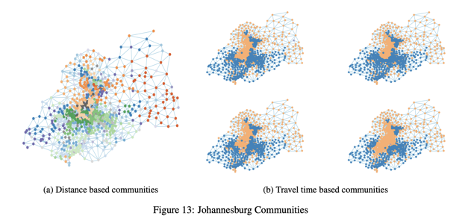
Using this data, it was possible to make a number of analyses about the city in which this data was based in, starting from traffic bottlenecks, rush hours, and even traffic flow. This data was initially released by Uber for city planners and researchers to improve urban mobility. The dataset contained over 2 billion trips in cities such as Boston, Johannesburg, Manila, Sydney, Paris, etc.
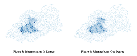
From this data, researchers used many network analysis algorithms and techniques to analyze these cities and find significant patterns with the time of day and things such as closeness, in-and out-degrees, and communities. It was found using weighted in- and out-degrees that the most central nodes in the city of Johannesburg during the rush hour of 9 AM was in the city centre, as expected. As the rush hour continued on into the morning and afternoon, the city centre darkened showing that both the in- and out-degree displayed this behaviour of the central nodes being more connected to other central nodes.
Johannesburg In- and Out-Degrees. They are larger in the centre of the city.
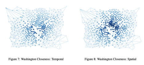
In this next figure we see the closeness scores for the temporal and spatial graphs of Washington DC during the rush hour of 9 AM. We once again see that darker regions tend to be situated near the centre of the city, suggesting that these areas are quite well connected and more frequented while as we move away from this centre and the nodes grow lighter in colour, the city became less close, perhaps implying that these parts of the downtown city are less developed. Here, an urban planner may think to themselves that they could utilize these areas to create more access points so as to alleviate some of the traffic stress that the darker regions tend to be under. This would not only help with the traffic flow but would ease up congestions during these rush hours. It is also noted that, as expected, the large lighter area in the centre is from the river in the city.
Washington DC Closeness for both Temporal and Spatial graphs.
Another of the more interesting findings was community detection. Using the Girvan Newman algorithm that we have learned in our course, the researchers were able to detect communities in the city of Johannesburg. There were two primary communities found, in blue and orange, showing that as the day went on from 12 AM, 1 AM, 5 AM and all the way to 10 AM, these communities changed in size. The orange community would grow along with the traffic during morning rush hour. This was a demonstration of how some communities were based on what the time of day it was, while there were also some communities that were found through distances. As the day went on into the night, the orange community might once again shrink to its initial smaller size before it had expanded in the morning rush hour.
Communities detected in Johannesburg based on their distances as well as the time of the day.
The data generated from rideshare services such as Uber and Lyft are quite efficient at gathering large amounts of data that can be used with the help of network analysis algorithms to aid urban planners and other professionals plan out the whole structure of cities to make travel, and in turn the life of the general populace, more efficient and safer. With further studies, more patterns may arise that not only tell us about our transportation habits but can help us in learning more about ourselves.
Movies are one of the most popular entertainments in our lives today. Some mathematicians found an interesting method to reveal all scenes during a movie, which is called “character-net”. Character-net was a graph that showed a social network by the different dialogs between characters. We named it G=(V, E, W). Each character is matched to a node( V), each dialog’s direction is matched to an edge(E), and each dialog’s time is matched to a weight(W).
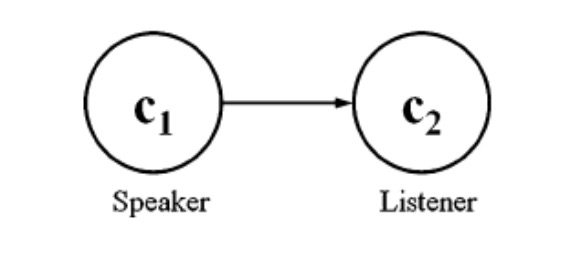
A simple character-net graph
The above figure is a simple case to represent a character-net, which only consists one dialog from character c1 to character c2. We called the character who starts the dialog “speaker”, and called the other one who receives the dialog “listener”. The arrow between c1 and c2 is the direction of the dialog. Also, we name w12 as the time that this dialog spends, which is the weight in the graph. The whole graph can describe one scene in a movie. Let’s imagine, if we need to construct all scenes through a movie, how many graphs should we use?
The whole character-net graph
From the above figure, we can get some useful information. In this related movie, there are totally seven main characters. We classify a node with the most adjacent nodes and dialog directions as a major character. Oppositely, those who have the fewest adjacent nodes and dialog directions would be classified as extras. These information is very useful to measure each character’s importance in the movie. Also, they help us understand the specific character relation.
Usually, we divide movie roles into three categories: major role, minor role and extra. But how to distinguish them?
The classification of roles
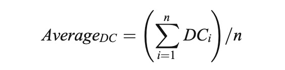
Here we bring in a new concept called “DC value”. It can be calculate as follows:
As we can see, characters below the average DC value are classified as extras. Characters over the average DC value are classified as major and minor roles. Then, the value that divides major and minor roles is the biggest gap among characters.
I think character-net makes a nice connection between art and science. On the one hand, it shapes an artistic mathematic model to make these programmed science theory more attractive. On the other hand, people can learn more scientific knowledge during their daily entertainments. If some of you love watching movies, try to draw a character-net graph to the related movie, it’s really interesting!
In thinking about social and information networks I explored less mainstream (but still well known) organizations and names such as Bing and Pinterest. I wanted to explore what differentiated various media giants in the world. In addition, why would advertisers even consider paying for less popular sites (other than reduced cost and targeted audience)? Eventually I stumbled upon a well-written paper published by Twitter themselves.
I found out that not only are each of the most common internet platforms unique, but their uniqueness can be illustrated in the powerful quantities that we have already learned in class. So pay attention, as I’m about to illustrate what fundamental ideas in class were used to produce useful information for a social media platform.
Twitter is a platform in which people choose to follow others to see their posts (called tweets). This is a one-way relationship.
Social vs. Information Network
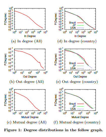
So first, let’s get the scope of this experiment. Twitter analyzed over 173 million active users and their follow graph for the second half of 2012. There were 20 billion edges, 42% of which were reciprocated followings. Due to the sheer size of the graph, manual computation was not feasible and so they used approximations such as the HyperANF algorithm and HyperLogLog Counter. This was all done on Twitter’s Hadoop analytics stack using Pig. They wanted to determine what kind of a network Twitter was and what were its unique features?
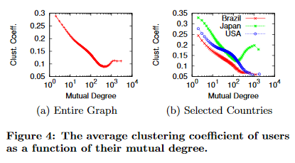
Perhaps most surprisingly the largest strongly connected component in Twitter was 68.7% of all vertices – a jarring gap from Facebook and MSN’s +99%. This mean that many nodes were not strongly connected into the largest SCC. We can also see a significant decrease in clustering coefficients when compared with other social media (for vertices of degree 5, 20 & 100 respectively):
Twitter: 0.23, 0.19 & 0.14
Facebook: 0.4, 0.3 & 0.14
Many of these facts provide evidence that Twitter does not have characteristics that many social media platforms have. They instead point to the idea that Twitter is an information network. In fact most of the first people that users follow have higher inbound degrees. Simply put: many twitter users first come onto the platform to keep up with popular figures that interest them.
A Hybrid Platform
But Surely Twitter is still social media right? While there is no definition of a social media platform, the answer is still almost surely yes. Twitter still exhibits other traits that are indeed those of a social media platform. For example the shortest path length in Twitter is 4.05 (4.17 for only mutual followings), whereas Facebook resides with 4.74. If you also kept your eye on clustering coefficients you may have noticed that as users follow more people, the clustering coefficient becomes much more like that of Facebook’s. It is hypothesized that this because once users are more acquainted to the platform they also add other people who they know and form communities
Many more aspects of Twitter do show that is a social network, but more importantly the statistics show how it is unique. Twitter’s use as a hybrid (between information and social networks) show one of the many reasons why politicians and public figures would consider to post on this platform instead of the giant that is Facebook. Twitter is extraordinarily efficient at disseminating information to a wide audience in very little time.
Only Scratching The Surface
I am not talking ideas from the whole field of statistics, but only using the ideas that we’ve learned in class. For example, the paper also found that the in-degree distribution and mutual distribution of Twitter accounts were best fit using a power law!
There are other factors such as two-hop neighbourhoods that demonstrate why Twitter might be better than Facebook to reach wider audiences. And if you paying attention, you might have noticed a unique quality of Japan from Figure 4. Japan’s clustering coefficients actually increase after a certain mutual degree! This may very well imply that Japan has massive cliques in their society.
Other Social Media Platforms
Clearly, other social media platforms also have their usefulness and it’d be foolish not to think of which ones any entity advertises themselves to. Facebook and Instagram may be some of the most popular platforms, but make no mistake: the others are here to stay. If you want to learn more about some statistics consider going to some of the following links:
It has been very fascinating to me how quickly infants learn a language and the importance of the processing of sounds in the adoption of a language. For that very reason, I am talking about a research study that examines the organization of words in the lexicon and how that may influence the acquisition and retrieval of phonologically similar words. Two words are phonologically similar if we can get one word by replacing, deleting, or inserting a phoneme into another word. For example, “hat” is a phonological neighbour of “cat”. In this study, phonological transcriptions of approximately 20 thousand words were added from the 1964 Merriam-Webster Pocket Dictionary. A node in the network corresponded to a phonological word from the dictionary and a link was present between two words if they are phonologically similar.
There were ten thousand “lexical hermits” in the network – basically nodes that do not have any neighbours; two thousand nodes with a few neighbours but isolated from the largest connected component in the phonological network. The largest connected component contained six thousand nodes. The average path length between any two nodes in the network was 6.05 comparable to a similarly sized random network – it was higher for the largest connected component at 9.105. The clustering coefficient for the nodes in the phonological network was 0.126 which shows neighbours of a word have a higher tendency to be connected with each other and it influences the spoken word recognition.
Degree distribution for the largest connected component of the phonological network
The average path length between phonological words and high clustering shows the small-world characteristics proposed by Watts & Strogatz in this phonological network. The small world characteristics of the phonological network mean less processing required to traverse through the words in the network and could potentially answer why lexical processing is so fast and accurate. This study attempts to explore the structure of the phonological network and provide insights about mental lexicon and lead to future studies that further dive into language understanding and processing.
tl;dr? Try visiting this link to try out the webapp I made, and then come back if you don’t understand what you’re looking at. >>> https://spaulmark.github.io/project-lsg/ <<<
Background
Earlier this year, I collected real data from an anonymous Online Reality Game (ORG) where the primary mechanic is elimination by majority vote until only one winner remains. I put that data into an interface I made that lets you see how people’s relationships in the game changed over time.
These games take place on private online forums in which players can send private messages to each other, compete in online challenges, and cast votes to eliminate one another until a winner is declared. Every 48-72 hours, one or more players are voted out of the game. Games typically last 40-60 days. Throughout the course of the game, players were divided among many different subgroups (tribes). Communication was only allowed among members of the same tribe at any given time. Eventually (usually around 13-11 remaining), the tribes all merge into one tribe and remain that way until the game ends.
The three initial tribes of the game: Power, Courage, and Wisdom.
I signed up as a spectator, meaning I had access to all the boards of the game. As a spectator, I did not have access to the private messages that players sent to each other, but I did have access to private “confessional” subforums for each player, in which players were encouraged to post their thoughts and plans for the game.
A snippet from Riju’s confessional in which she gives her opinion on Robbie.
Dataset
Over the course of the entire game, I monitored each confessional and kept track of players opinions on each other based on what they wrote in their confessionals.
The end result was over 700 lines long, about 100 of which were added in the first 72 hours.
The dataset, as seen in the picture above, is a list of statements that can be used to construct a directed signed graph with players as nodes and relationships as edges. As players are voted off (or return to the game), special statements serve to delete or re-create the node as appropriate.
From this dataset, I used the constructed directed signed graph to model the relationships between players based on the sentiments they expressed in their confessionals. A positive edge (like) from A to B signified that A intended to keep B in the game. A negative edge (dislike) from A to B signified that A intended to eliminate B from the game. No edge from A to B meant that A either never expressed any opinion on B, or that A did not feel strongly about B.
Motivation
Analysis of a social network in an ORG is different than ordinary social network analysis. A spectator of the game is not only interested in the overall structure of the network, but also the individual relationships and social position of each player. Furthermore, because of the high social density of the network, simply drawing a graph, even for small tribes, is insufficient to communicate meaningful information about the game to spectators.
A graph from a previous game displaying the relationships between tribe members, only 72 hours after the game began. It is already unreadable, and the game lasted 57 days.
Please note that I had nothing to do with the my little pony theme of the game.
Some of the questions that a spectator may want to ask about a game are: Who is in a good position? What are the relationships of any given player? Who is likely to be voted out soon? Who will be voted out next? What major alliances (cliques) exist? What opposing sides exist in a tribe? Who is in a central or influential position?
In order to display the data in a way that can quickly answer the questions spectators might have, I made an interactive web app meant to address these questions.
Features
As a bonus, web apps are more interactive than pictures, so you can use a slider to see how the network changed over time.
The number of people in the game who like or dislike each player is displayed under them at all times, making it easy to see who is at the top or bottom of the social hierarchy. You can also click on players to see their relationships.
Relationships are not necessarily mutual.
Once players have swapped tribes, their old relationships are still displayed, though they may not be relevant to their current situation. To get around this, tribes can be viewed in isolation by clicking on their titles.
I also added an experimental feature that lets you select multiple people at once, and make it so only their opinions were displayed. This was intended to be useful for collecting the opinions of a group of aligned people to find common friends or enemies.
A group of four allies that have a long list of mutual enemies.
One issue with this feature is that it only shows the outgoing direction of relationships once at least two players are selected. From this sequence of operations, you can’t tell that Epona and Prince Sidon actually have a non-mutual relationship: Prince Sidon likes Epona, but Epona dislikes Prince Sidon.
Problems Solved
I was able to receive some feedback from the other spectators when I shared this with them. Given their feedback and my own opinions, I believe this interface is does a number of things very well. It is very easy to see which players are in a good or bad position based on the number of people that like or dislike them. The timeline slider also makes it easy to see how relationships changed over time, seamlessly adding a second dimension to the interface. Clicking on a player to view their relationships is also extremely useful as a spectator. All of the major features in this interface, aside from the multiple selection feature solve the problems they are intended to solve very effectively.
The multiple selection feature, as seen above, can give the user misleading information. Furthermore, it requires many clicks and lucky guesses to get a good picture of the overall tribe structure. Since you can only view one group at a time, this has a high cognitive load.
Problems Not Solved
This interface does not address all the questions a spectator could have. In general, it is easy to get detailed information on one player, or a general idea of the tribe hierarchy, it requires a lot of clicking and cognitive load to gain a complete understanding of the overall structure of each tribe, even using the group select feature. The logical next step would be to create an interface that can identify, display and compare (potentially overlapping) groups of players. Whether or not it is actually possible to create such an interface is left as an exercise to the reader.
This interface is also lacking some critical game information, namely vote counts and who voted for who each round. Also missing are individual players that were ineligible to be voted out each round. While this isn’t a function of the graph itself, it provides extremely valuable context to someone who has no prior knowledge of the game played (ie. you).
A careful observer may also note that on the first round, on the Power tribe, Magda was voted off, despite the data saying she had 3 friends immediately before being voted off, meaning she should have had enough votes (4/7) to keep her safe that round. The missing context is that the two vote options being considered as votes that round were Magda and Patricia, and Patricia was one of the players that liked Magda, meaning they were forced to vote for each other, and as a result, Magda was eliminated 4-3 over Patricia.
We can also observe the issue that players sometimes do not give information they deem to be obvious simply from reading their confessionals. On the Wisdom tribe, Karson was voted off unanimously, despite only having 3 out of 6 players say they disliked him in their confessionals. Throughout the game, there is a common issue of some some votes coming as a surprise based on the data, simply because some players don’t mention what is happening in real time in their confessionals. Examples: (Episode 4, Ancient Oven voted out; Episode 9, Royal White Horse voted out; Episode 11, Oaki voted out… etc.)
Incompleteness of the Dataset
As mentioned earlier, all data was manually collected by me. It is possible that I missed things from player confessionals or misinterpreted things I read. This incompleteness is further exasperated by the fact that some players chose to use their confessional far less than others (Epona, and Royal White Horse, to name and shame a few). Information volunteered by players in their confessionals is not even necessarily accurate, as some particularly paranoid or emotional players can flip flop back and forth between opinions, making it difficult to read their intentions, if they have any at all.
Conclusion
This interface is a good start. It solves some of the basic problems that spectators have. However, it is far from being a complete solution to the problem of visualizing the small, dense social networks we can observe in ORGs. Perhaps I will learn something valuable in this class that I can apply to this problem in the future.
There has been a lot of talk and work done on the data set of COVID-19 infections which shows that the growth of infection is exponential since the growth does not seem to be linear. However, that does not seem to be the case here. There was an exponential growth pattern in the early stages of the virus, however it was followed by the power law distribution.
The possibility of exponential growth exist in random network since there is an equal probability of two people coming together. However, the real world network of this infectious disease is not like random network where people come across each other randomly. The structure of this network shows that majority of the population have scattered connections with their neighbours and that the connectedness of people is less than exponential, which is similar to a small world network.This can help to show that the spread of COVID-19 happens in small world interaction network such as neighbours or people travelling together with the infected ones. A small world network is a distribution which comes between a random network and a well connected network.
This analysis can also be seen practically as the disease is talking longer to double the deaths as shown in the image below. This is because the susceptible individuals around the infected are decreasing because of they might have higher immunity or mild symptoms which are not be worth getting tested.
This topic is very essential to be talked about because this performs a more detailed analysis on the data of COVID-19 infections and predicts a more accurate infections rate which is necessary to correctly educate the government and general public to make help them make the right decisions for themselves and the community.
Ethereum is a blockchain very much like bitcoin that allows for secure, anonymous, and decentralized transfer of funds. However on top of allowing currency exchange, Ethereum also allows for “smart-contracts” or code that you run on the Ethereum network. This allows for the creation of ERC20 Tokens which are basically cryptocurrencies that piggyback on the Ethereum network using the feature of executable code.
At the height of the cryptocurrency bubble in 2017-2018 many startups used ICO (initial coin offerings) to raise funds. This caused the creation of various new cryptocurrencies on a massive scale. Victor and Lüders looked at the first 6.3 million blocks on the Ethereum blockchain and gave an overview of 64,000 ERC20 tokens while finding some interesting facts about the movement and transfer of funds.
In this paper they describe vertices or nodes as individual accounts or public/private key pairs as an account in the crypto world is simple a combination of a public key (an address to where funds can be sent) and a private key (a string that allows verification that the legitimate owner sent these funds). Edges are transfers of funds/currency between 2 nodes.
The first item of note is that even though there were 64,000 different ERC20 tokens on the Ethereum network most of the network transfers (over 90%) were in the top 1,000 token contracts (ERC20 tokens). This indicated that a power-law existed in just the contracts themselves where certain tokens were much more popular than others and most were sparsely used.
The second item of note is that the degree distributions for each of the individual token networks within the Ethereum Network more or less follow a power-law. In an ironic twist the distribution of the alpha (exponent value) follows what seems to be a normal distribution for the top 1,000 tokens.
For both the indegree and outdegree the alpha of the top 1,000 tokens clusters around the high 4, low 5 values. This is generally high considering most alpha’s fall within the 2-3 range, there are external factors that may cause this like a lack of trust between entities, and the fact that services, stores, and middlemen for transfers are common unlike a social network.
This leads naturally into the third matter of note, clustering coefficients. The global clustering coefficient for the entire network of token transfers is 0.0001062 and it has a local clustering coefficient is 0.3042.
In general, the network of ERC20 on the Ethereum Network gives us insight into how fiat currencies (centralized, government back currencies) may move. In addition, these networks tend to have a large amount of in and out edges around very few nodes that are exchanges or other large institutions that provide services for the given token. Most entities then interact with these high edged nodes, and sparsely between individual entities.
Design pattern is one of the important things we learn in computer science. In real-world software architecture – particularly large and complex systems – detecting and understanding design patterns can be a challenge. And it can be crucial to know such information during large scale refactoring or system redesign.
This paper classified existing design pattern detection methods into 8 categories by approaches and 4 categories by properties. They then showed their approach, which consists of 5 steps: preprocess, constructing graphs, constructing subsystem graphs, final matching and analyzing behaviours.
Overview of the proposed detection process.
The part that particularly relates to this course is step 2 which is graph operations intensive. After the program gets a UML diagram from step 1. Along with a pre-defined table specifying common design patterns, the algorithm generates nodes and edges and assigns a distinct weight to each edge representing its type. (Algorithm 1, Table 1) The algorithm later also employs a graph enriching process to expose more design patterns.
Visualizing different steps of the algorithm.
Finally, to test their model, they applied their technique on three open-source projects: JHotDraw, JRefactory and JUnit. For most design patterns, it achieved precision and recall rates of 100%, outperformed some of the other methods they mentioned for comparison (nrp, Sempatrec, DeMIMA, SSA).
A merging Factory Method instance in JHotDraw, which this approach correctly handle while other techniques did not.
Online Social Networks (OSNs) provide conveniences to connect people online. For example, a popular social media platform like Facebook has over 2.5 billion monthly active users. But are you aware of the users you are connected with might not be a real person?
A research group at the University of British Columbia conducted an infiltration test on Facebook with a Socialbot Network where researchers operated social engineering bots to gain access to users’ personal information such as birthday, addresses, and phone numbers. They started with creating fake user accounts and profiles for the bots. Each social bot was automated and linked to a Facebook account. Social bots could make posts and sending friend requests. Then, these bots tried to mimic real users’ activities and make as many friends as possible. Because most of the Facebook users publish their personal information to their friends only.
Triadic closure in social networks
Then, things get interesting as the social engineering strategy that bots used was to send friend requests to the friends of their friends they already had. This was related to the triadic closure principle which shows that if the connections between A-B and B-C exist, then there is a tendency for the new connection A-C to be formed. This strategy increased the likelihood of accepting bots’ friend requests about three times higher given the existence of mutual friends.
The research group had to take down the bots since they caused heavy traffic to Facebook and resulted in a successful acceptance rate of 80% after 8 weeks of starting the experiment. With this large-scale infiltration, it is easy to collect users’ personal information for malicious purposes such as identity theft. To further elaborate on the experiment, we can see that it is dangerous to leave our sensitive information on OSNs like Facebook. The protection that Facebook used did not appear to be effective in detecting social bots, and this is only one of the vulnerabilities in the network. Defending against such threats will be just the first step in maintaining a safer network.
Boshmaf, Y., Muslukhov, I., Beznosov, K., & Ripeanu, M. (2011, September 27). The Socialbot Network: When Bots Socialize for Fame and Money. Retrieved October 23, 2020, from http://lersse-dl.ece.ubc.ca/record/258?ln=en
Some of us are avid music listeners, constantly spending the day listening to playlists and mixes whether it’s for relaxation, for jamming, or as background noise to help us get through a particularly challenging assignment. Some of us also love sharing music with our friends. Inevitably, one might create a playlist containing their current favourites in the hopes that the receiver of the playlist might add a few of those songs into their own. Before sharing them, we’ll commonly preface them with “My playlist might be a bit all over the place. It’s got a little bit of everything so you might not like all of it”. I wanted to know; are the artists I’m listening to really that different from each other? Can we identify communities within the artists I’m listening to? To help me answer this question, I’m using this tool called the “Spotify Artist Network” to help me visualize the network of artists. For this blog, I’m going to use American alt-rock band Wallows as the root of my network. This is the resulting network.
The related artists network of alt-rock band Wallows.
It is important to note that the clusters represent related artists and not artists who have worked with each other. How does Spotify determine related artists?
The tool does a great job of organizing artists into clusters for us. The root node is in black and the node size and color indicates popularity of the artist. In the center cluster, we have related artists like Conan Gray, girl in red, Beach Bunny, Cavetown, mxmtoon. The sounds of Wallows’ songs are backed with the sounds of snares and crash cymbals and arguably can not be compared to the soft ukulele instrumentals of mxmtoon’s bedroom pop. Despite the difference in sound, Spotify’s algorithm has decided that they are closely related. This may be due to the fact that their songs are commonly used in TikToks, and they’re also popular social media personalities. In a distantly related cluster, we have hard rock artists who are commonly compared like My Chemical Romance, Mindless Self Indulgence, and Pierce the Veil. In another cluster, we have intimate indie-pop artists like Peachy!, Shiloh Dynasty, and khai dreams. All of whom are commonly featured in hours-long lo-fi mixes on YouTube.
Spotify does have an actual answer to the question. In short, Spotify analyzes the number of fans shared by two artists proportional to their total number of fans and also the way they are described on other media (i.e. blogs, magazines, social media). The number of shared fans has a higher weighting but artists getting a surge of attention in the media are also a significant factor. This is clearly shown from the observations above. Some of the clusters are highly connected due to the genre and the common comparisons in media between them. Other circumstances like social media trends and challenges are also heavily influencing how the artists in this network are clustered.
So yes, we can definitely find communities and see how these seemingly disconnected artists share a large portion of the same fans. In addition, using these clusters, we can determine which songs could be classified as a different genre, but we would still enjoy it. Of course, there are also clusters consisting of a single node between clusters so those songs can be seen as an entry to another cluster.
For further technical investigations of Spotify songs and artists, one can look at the Spotify Developer API.
For more information on the “related artists” algorithm, check out Spotify’s blog post: How “Fans Also Like” Works.
The Yale School of Forestry and Environmental Studies has mapped the supply chain of five products.
The objects in modern society that we make use of in our day to day lives are made of many different materials. For example, a cellphone is comprised of many parts made from different materials, from the silicone and gold, as well as other rare earth metals that are used to create the microprocessors, as well as various plastics and glass that makes up the screen and casing of the phone. All these various materials are refined, processed, and assembled at different locations worldwide. The institute mapped the supply chains for 5 product platforms: 2 types of solar cells, a turbine blade, a lead acid battery, and a hard drive magnet.
The mapped supply chain of the CdTe Solar cell
The research defines a supply chain “consisting of companies that produce and supply materials and parts and those that transform them into products”. In that sense, the links in a graph can be made based on their supplier-customer relationships.
From analyzing the 5 products the Center for Industrial Ecology has looked at several factors into the risk of portions of the supply chain. For example, companies that are multinational or countries that have a lot of raw material extraction (e.g. mines) often have many production sites and are less likely to be impacted by supply chain disruptions. And materials that are only processed by a small amount of entities are higher risk.
In conclusion, graph analysis can be used to analyze potential risks in manufacturing and identify key parts of the market and supply chain. As well as identify problem areas that are at high risk of disruption and to develop replacement materials for them if the need arises.
Sources:
Nuss, P., Graedel, T., Alonso, E., & Carroll, A. (2016). Mapping supply chain risk by network analysis of product platforms. Sustainable Materials and Technologies,10, 14-22. doi:10.1016/j.susmat.2016.10.002